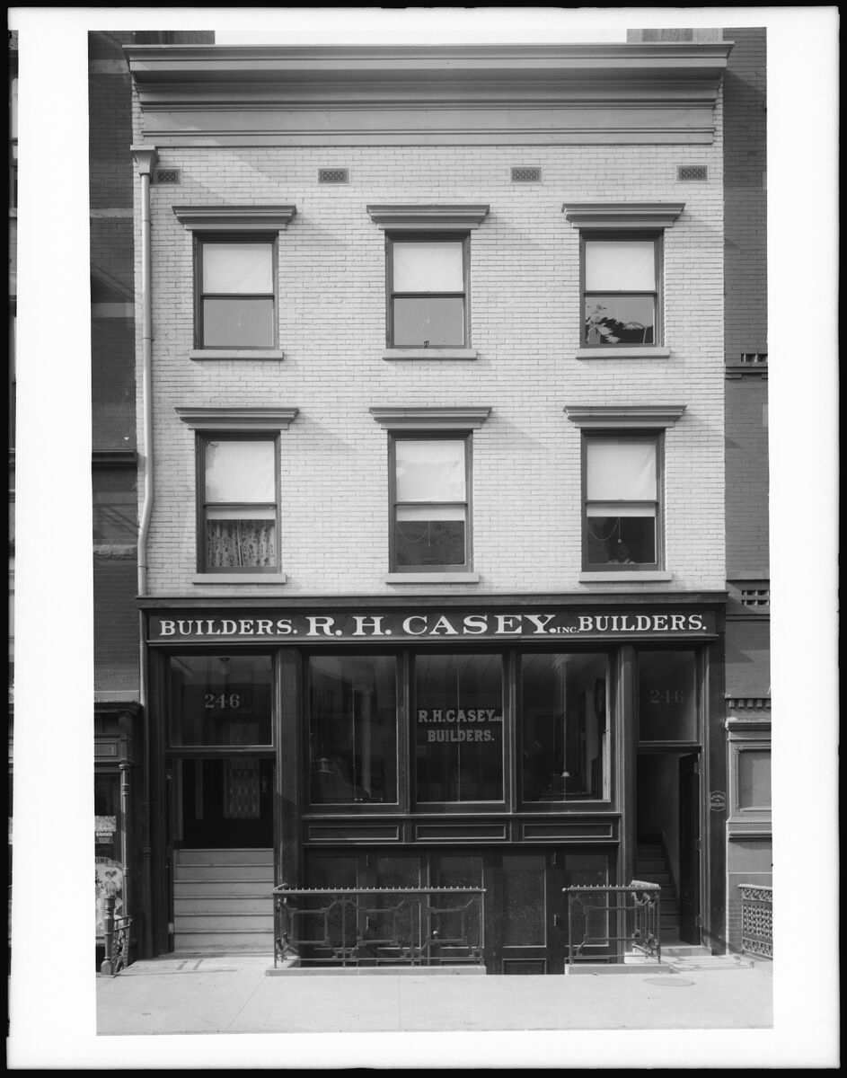
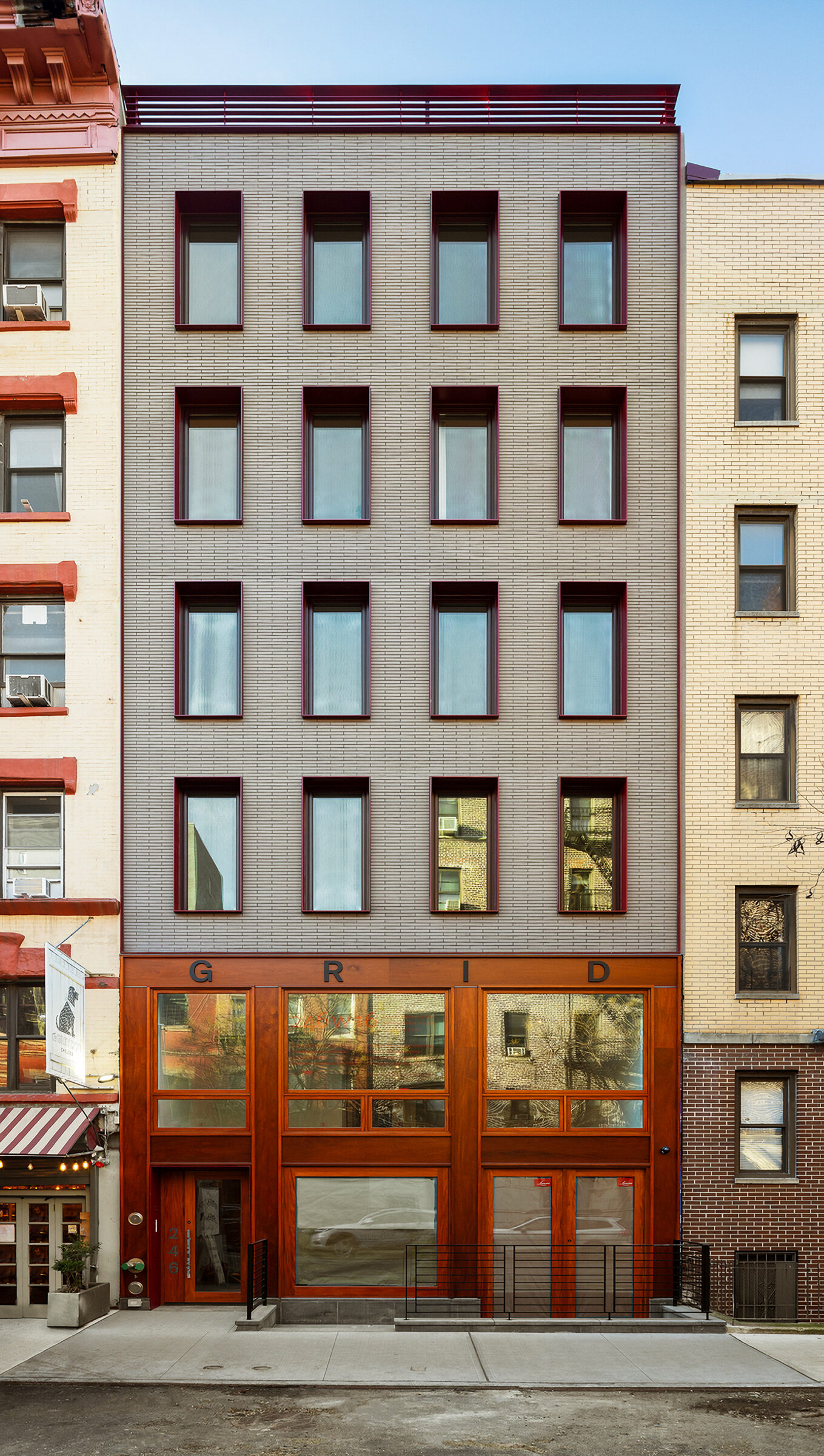
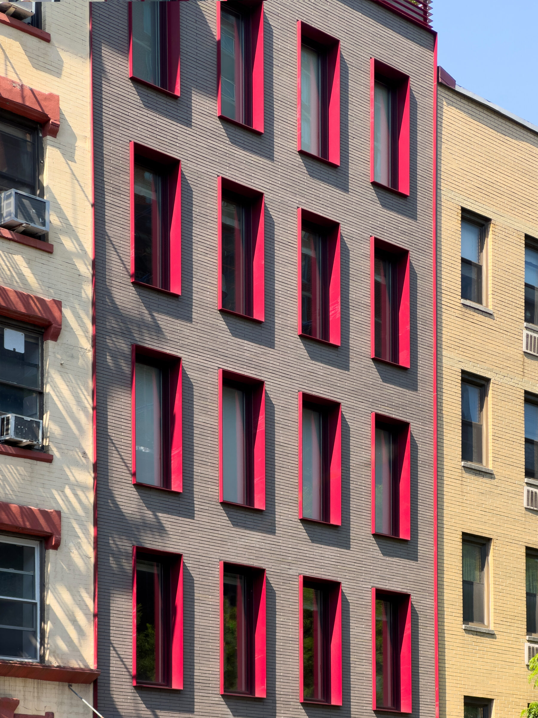
Situated on a small infill site in Lower Manhattan, the existing structure featured a split-level office for a local builder with a two-floor residence above. Over the years, the building deteriorated and its details were badly degraded. Taking cues from the original composition, the new 21st-century design scales up, delivering a referential yet clearly modern interpretation of the historic form. The residential portion of the façade is clad with narrow rectangular bricks, contains windows with red powder-coated aluminum frames, and includes a slender guardrail at the roof terrace, a nod to the historic cornice. In contrast, the commercial storefront is clad in mahogany, unifying the two-story space and differentiating it from its residential counterpart.
The new commercial volume features clean, airy, and light-filled loft-like spaces. A three-story steel stair, floor-to-ceiling glass partitions, and large south-facing windows combine to unify the space and provide visual and spatial connections across the levels.
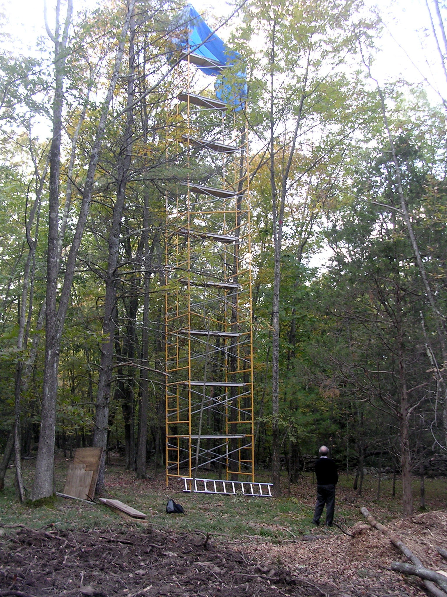
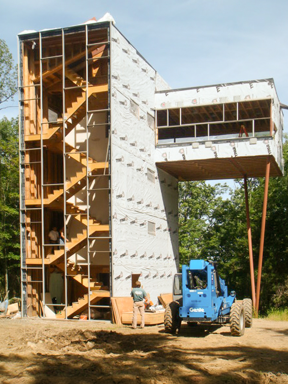
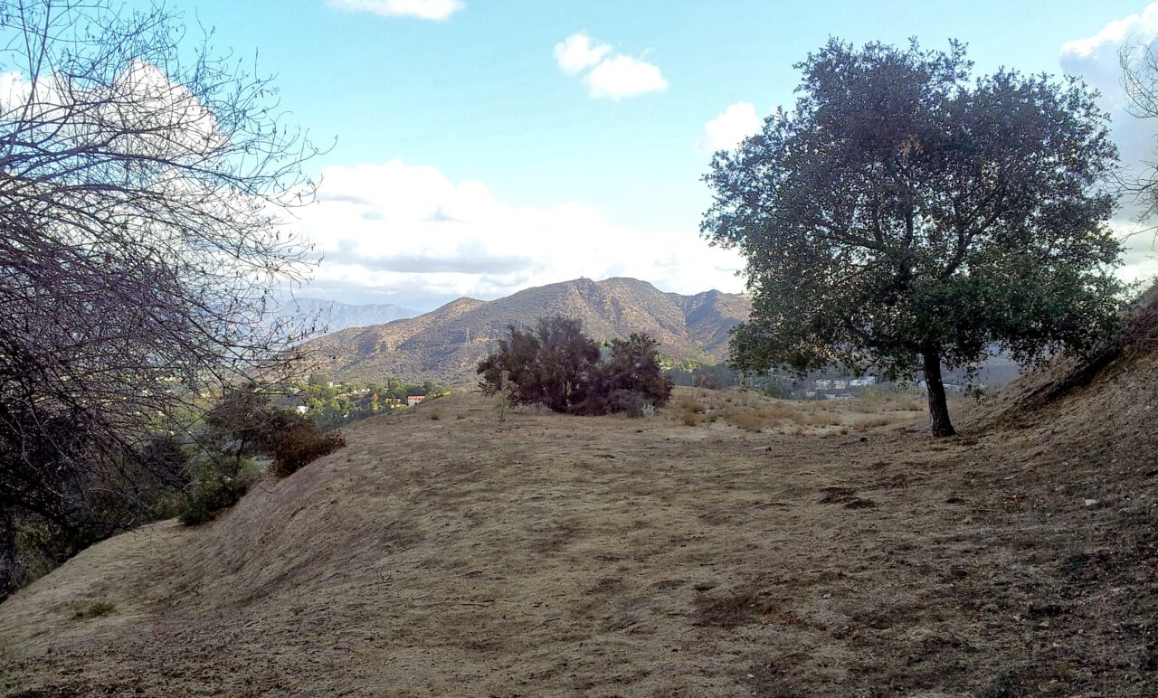
How to raise a living room above the 40-feet-high forest canopy?
Tower House takes the traditional residential hallway, with bedrooms connected to it, and tilts it up, stacking the bedrooms one on top of the other with floor to ceiling windows. The hallway is then swapped with a glass enclosed yellow staircase—a vertical procession to the living room up in the trees. Corner windows frame moments of the forest and an open ribbon reveals the panoramic view.
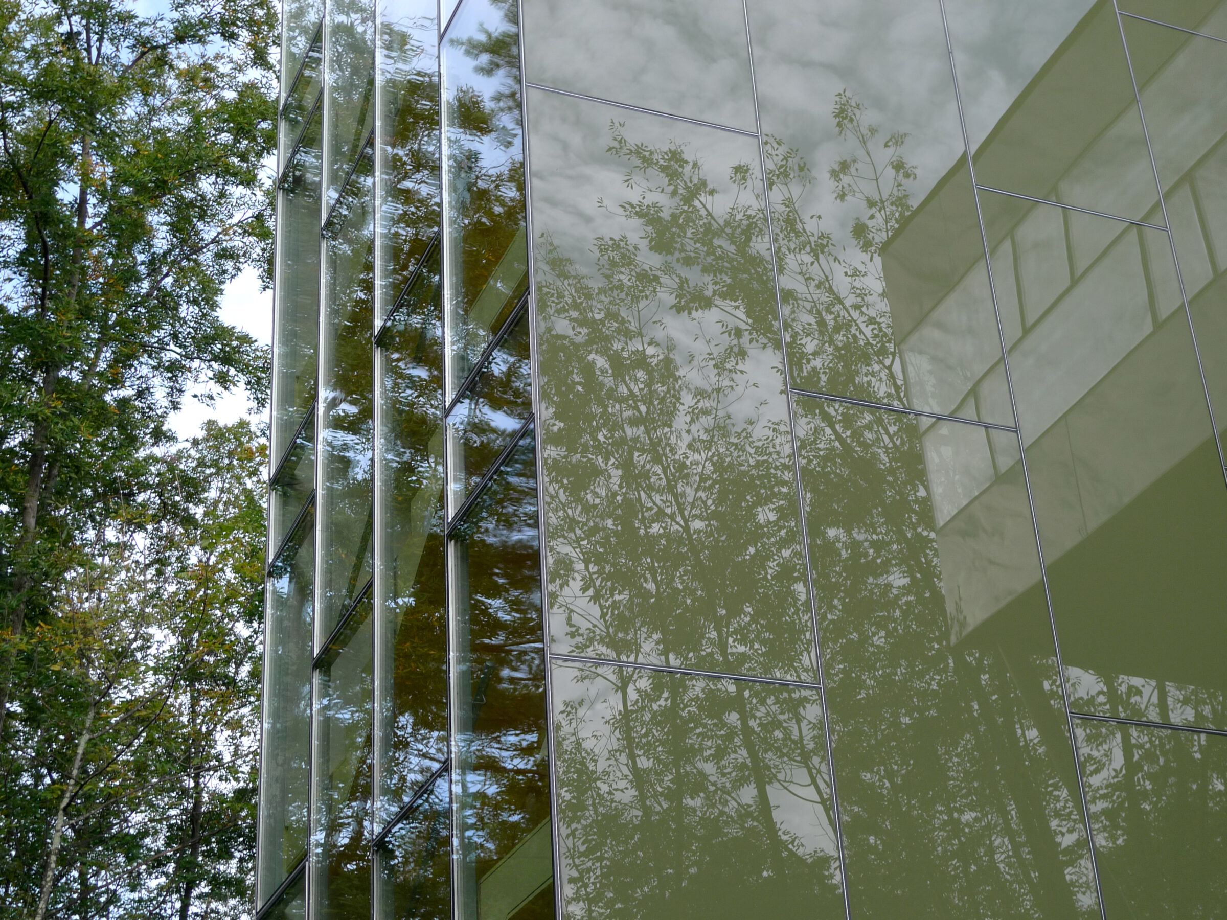
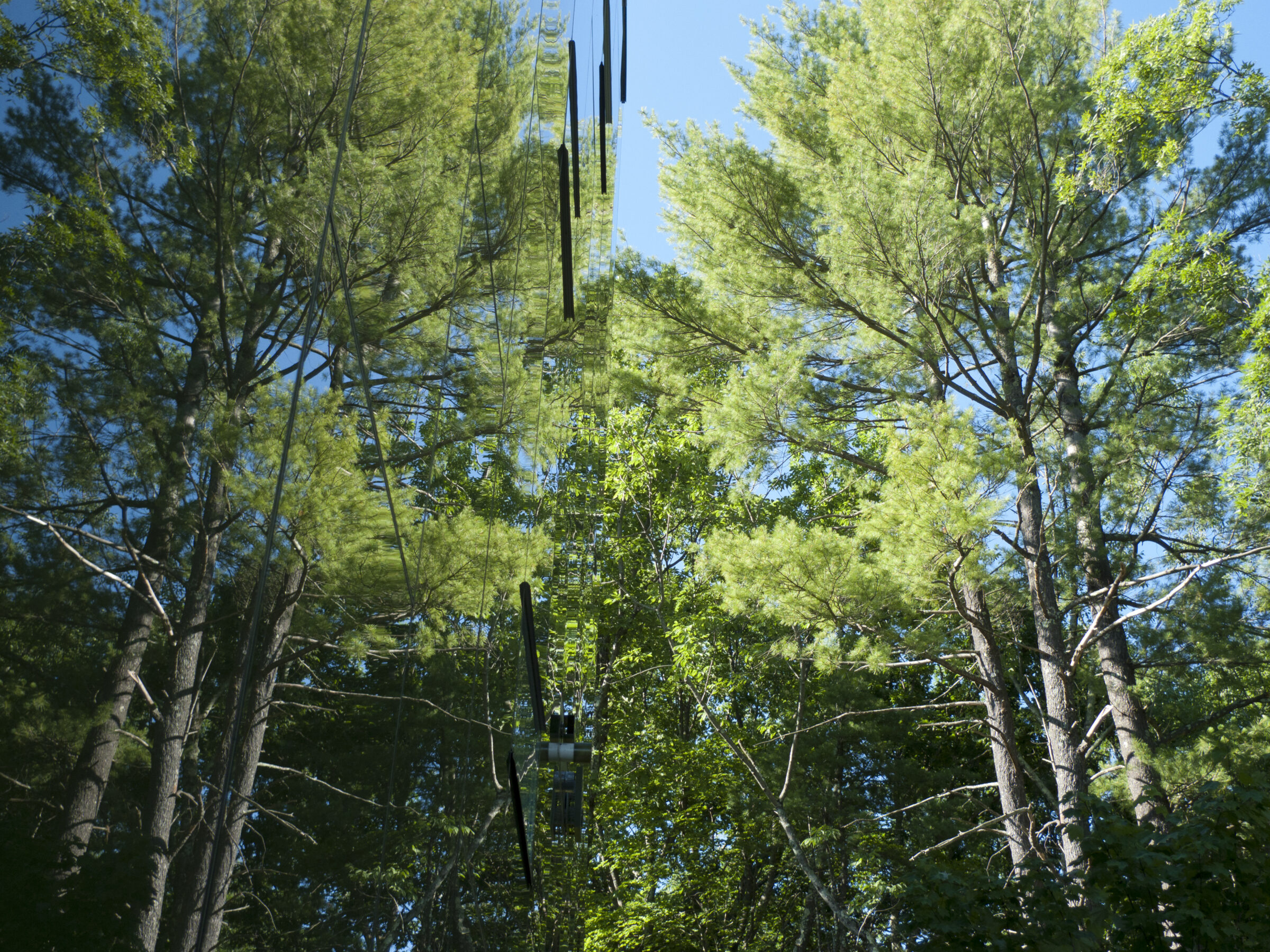
Steel and glass evoke a skyscraper in the city, not a cabin in the woods. Counterintuitively, the dark green enameled back-painted glass of Tower House camouflages it by reflecting the surrounding woods and dematerializing its form. The house disappears, or even better, it becomes part of the pervasive canopy. A gesture as whimsical as it is rational.
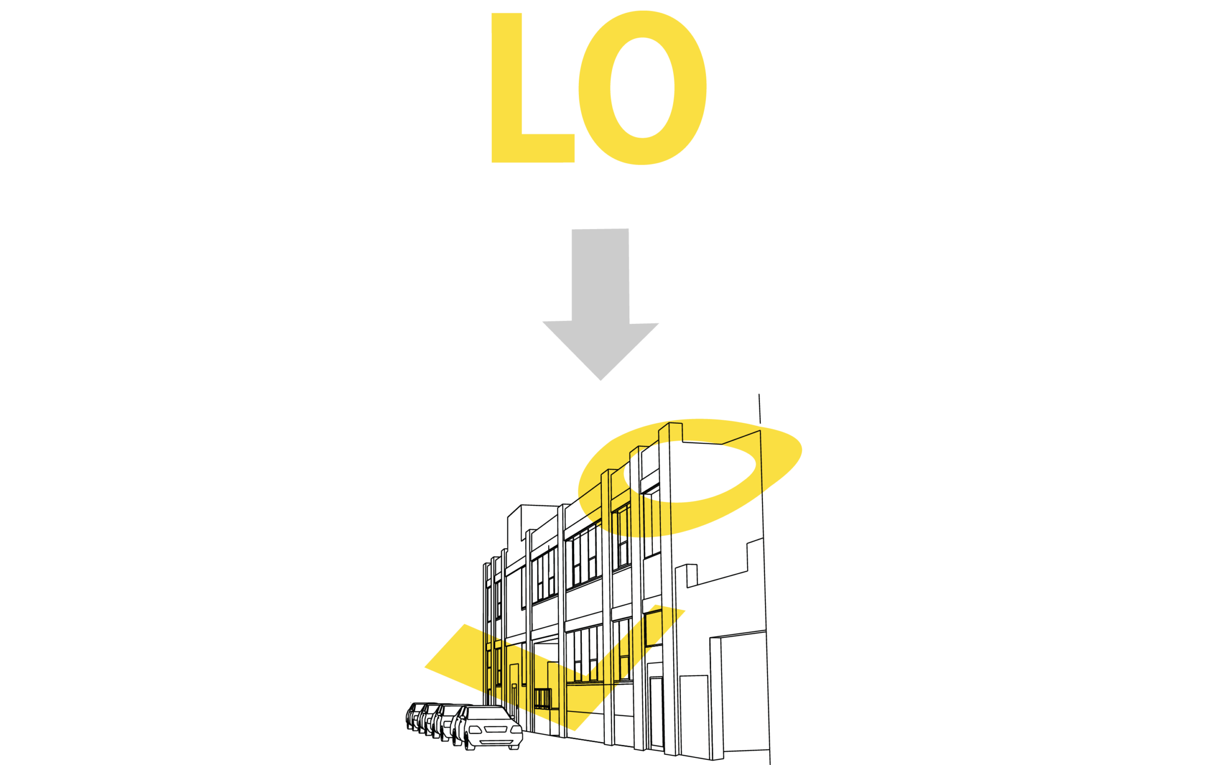
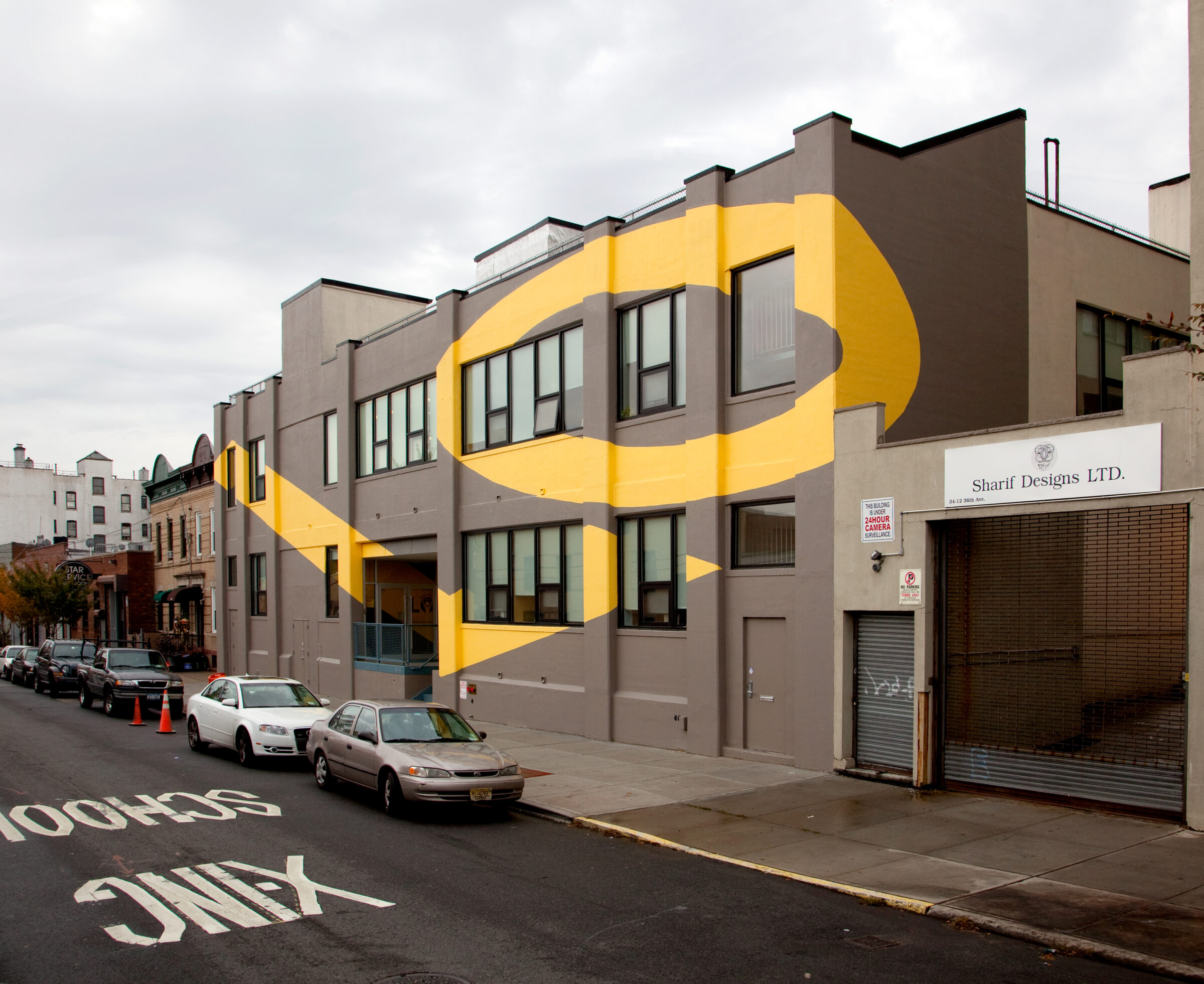
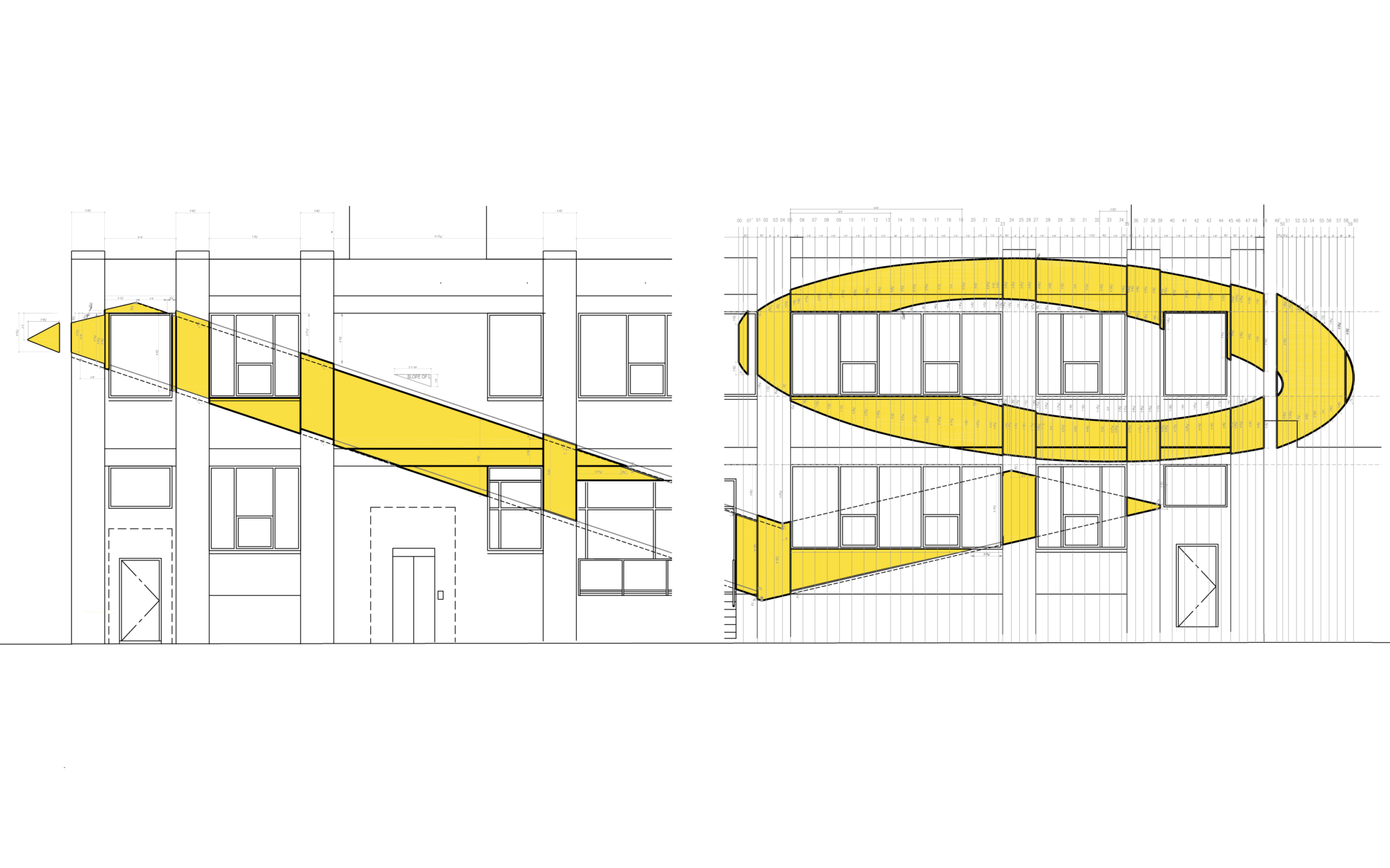
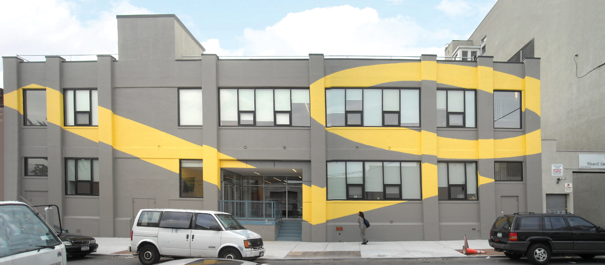
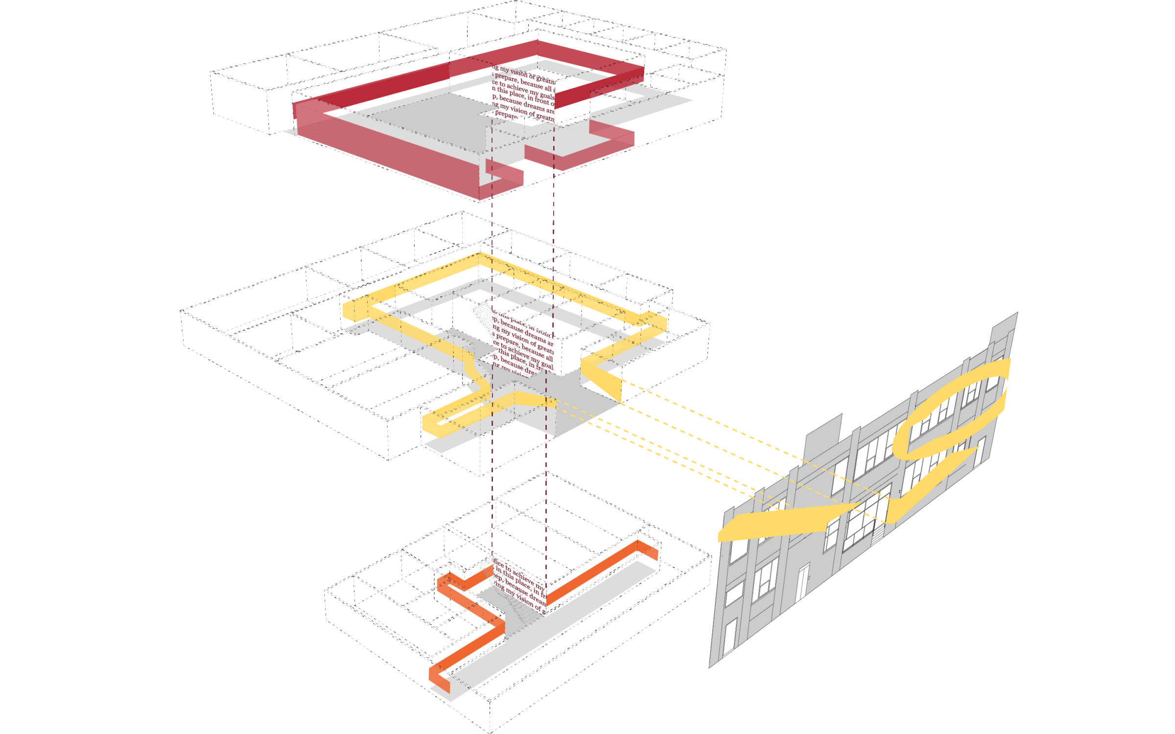
This adaptive reuse project overlays the ethos —the culture and mission— of Legal Outreach onto an existing industrial building. This overlay is programmatic, spatial, and graphic. The project façade is painted gray with what appear to be abstract geometric shapes in accent yellow. An oblique approach along the street reveals their true meaning: a modified version of LO, the Legal Outreach logo, offering a glimpse of the special world happening within.
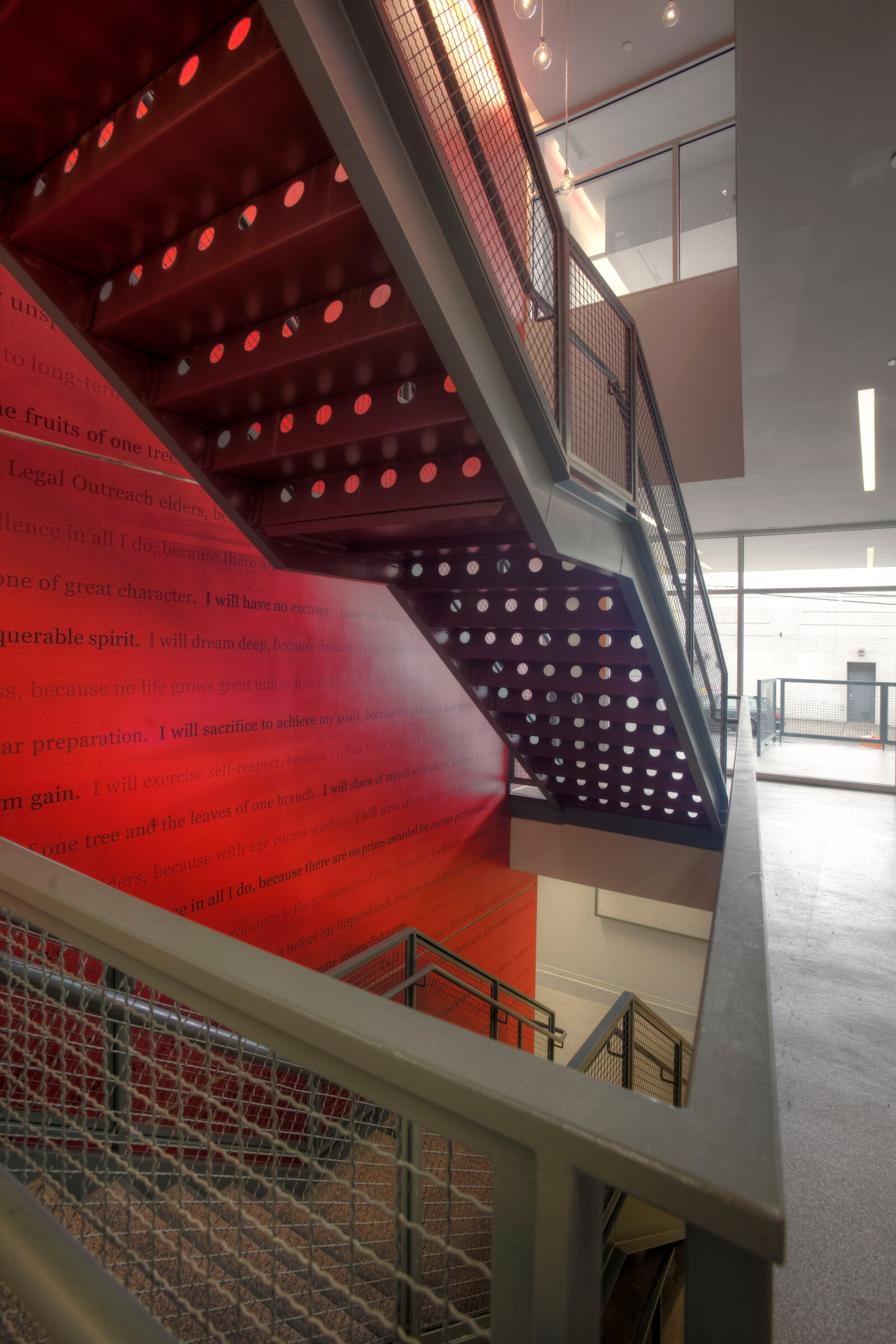
The graphics then fold into the building’s entrance and continue through the three interior levels. Three ribbons of color guide students and staff, creating a colorful canvas to share news or showcase remarkable work. A central metallic stair, the only architectural insertion of the project onto the original skeleton, is paired with motivational words. Imprinted on the three-level wall, the vertical connection becomes the core of the building, a constant reminder of the power of words, respect, and hard work.
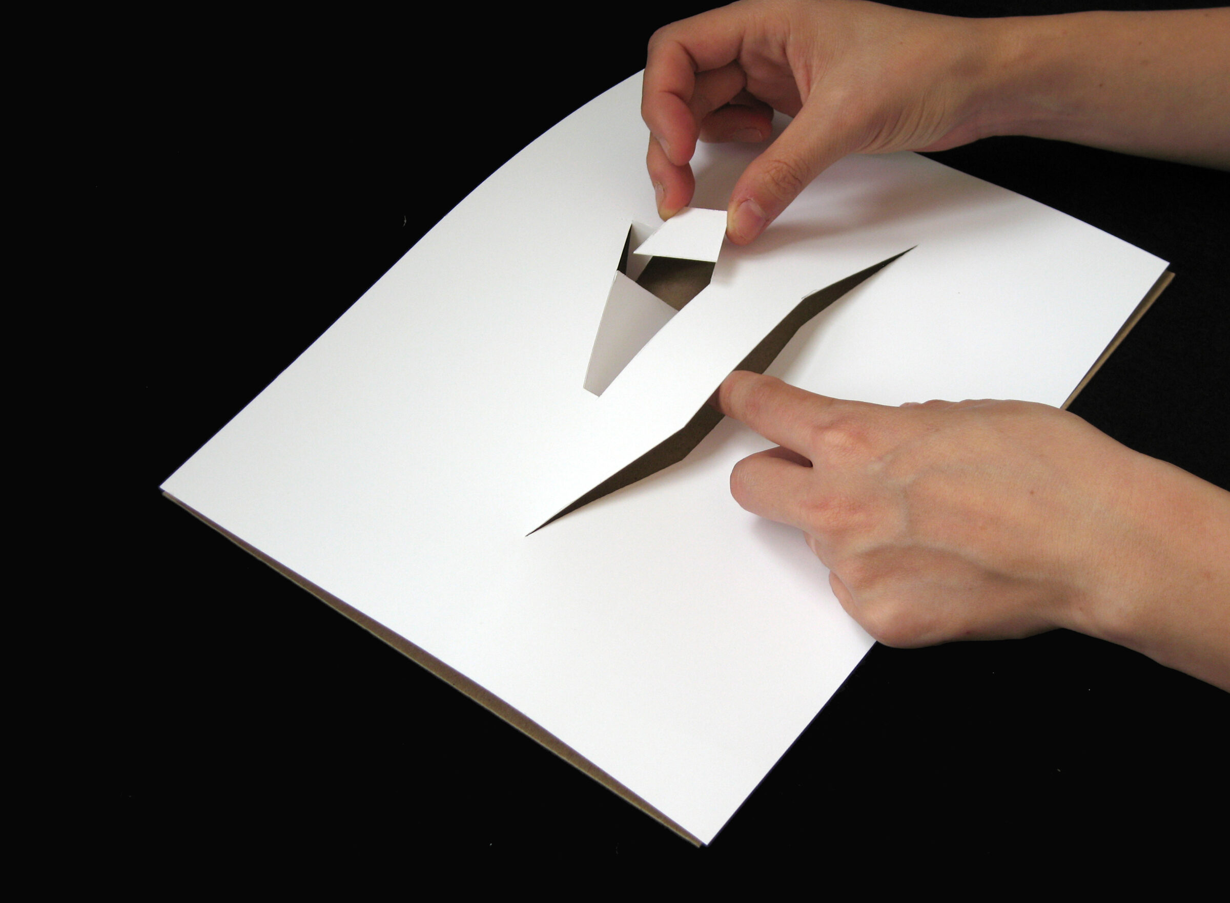
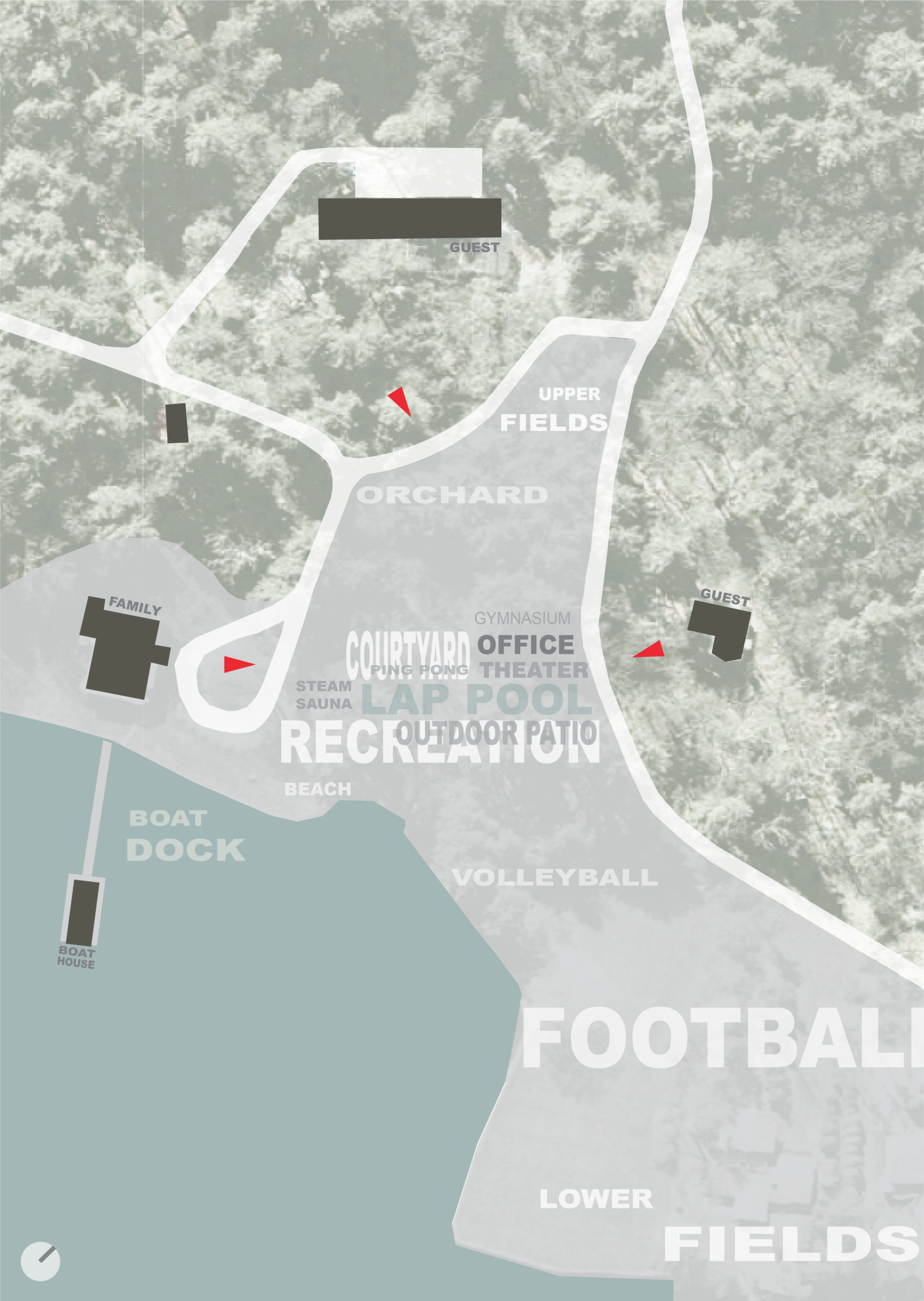
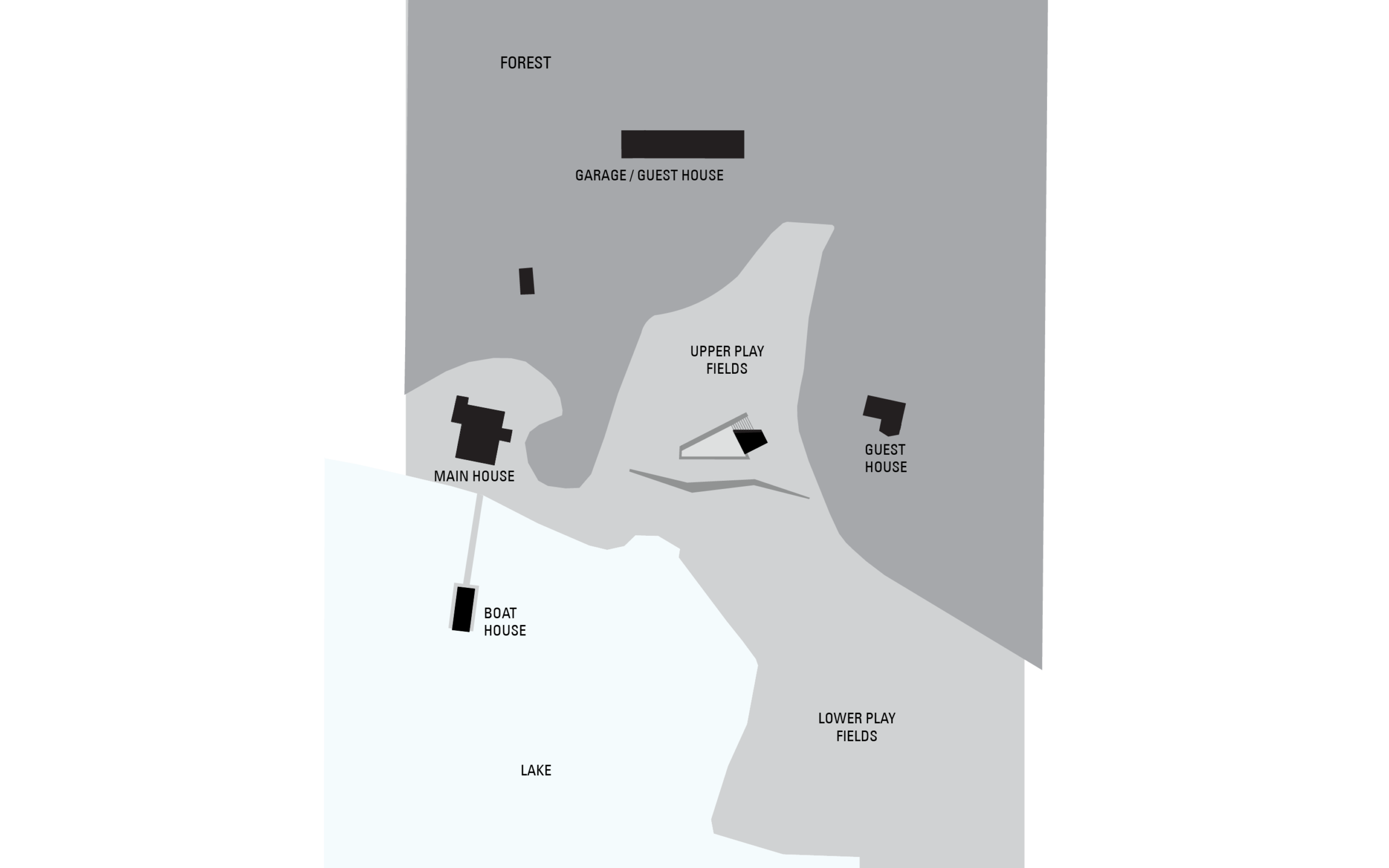
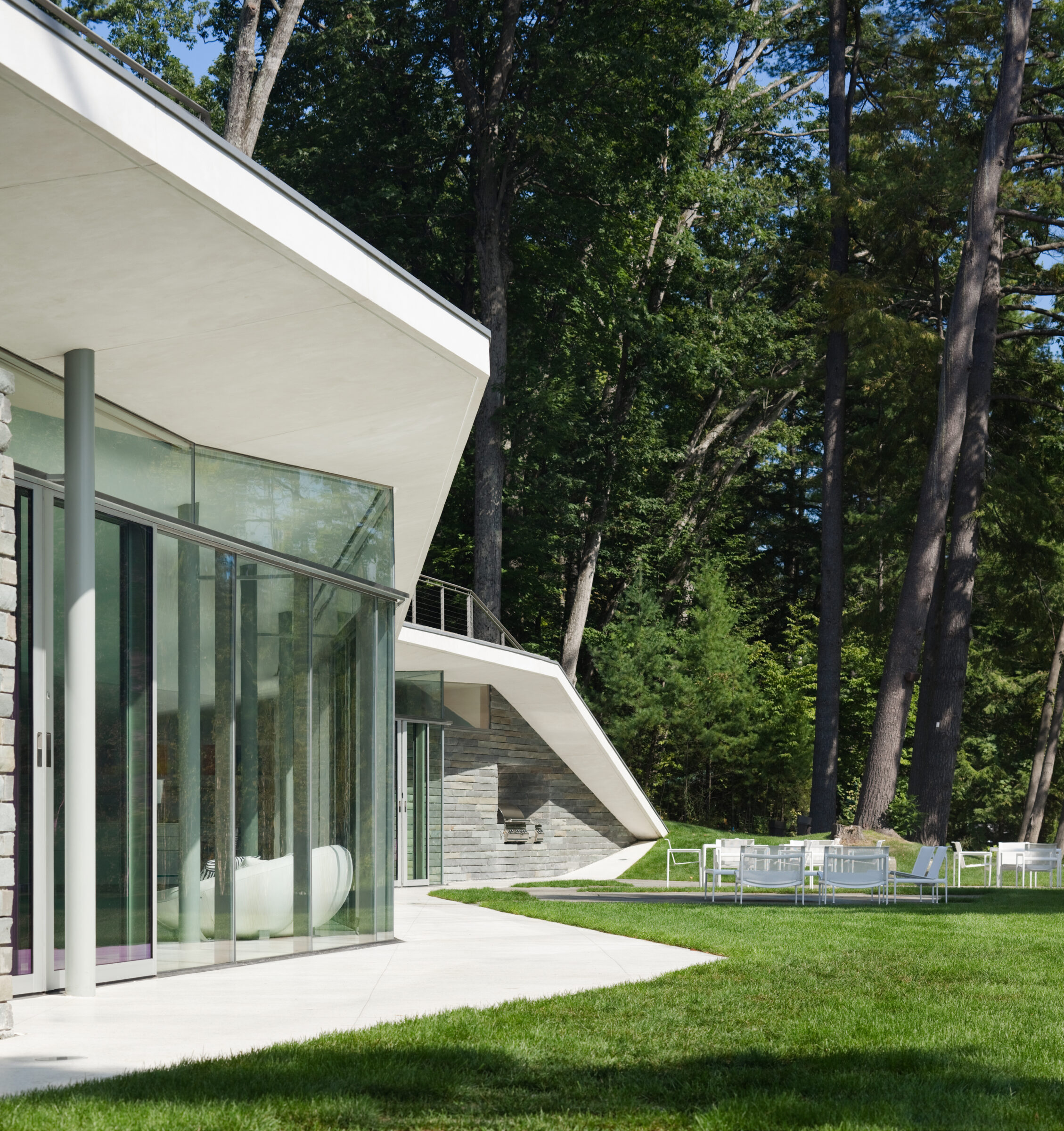
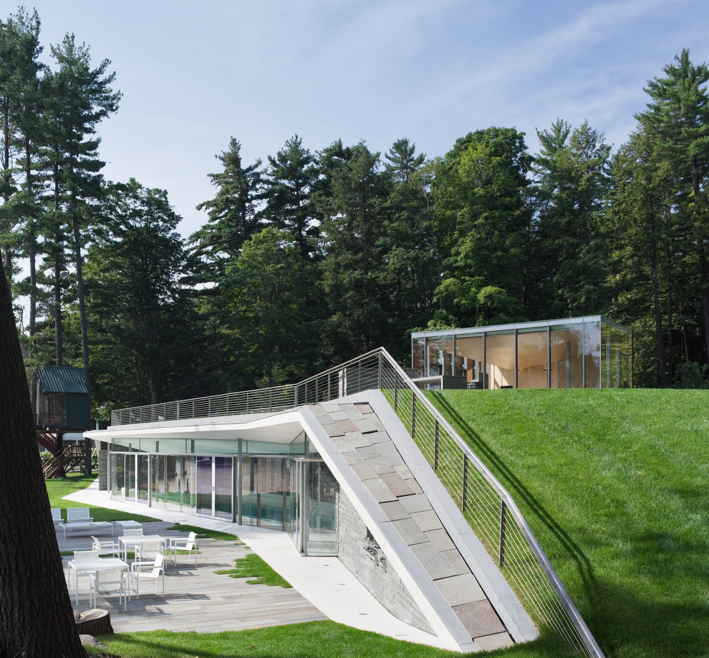
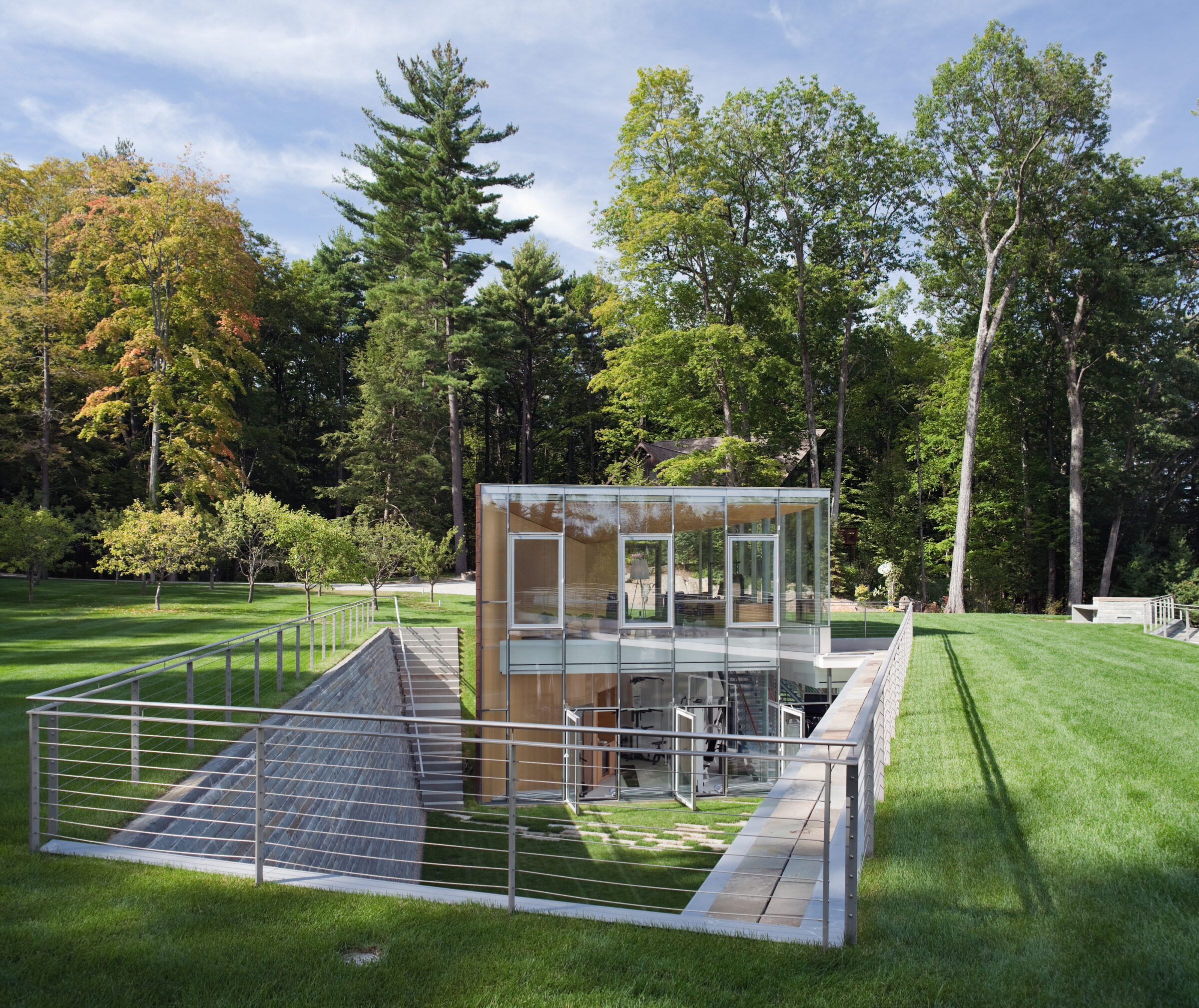
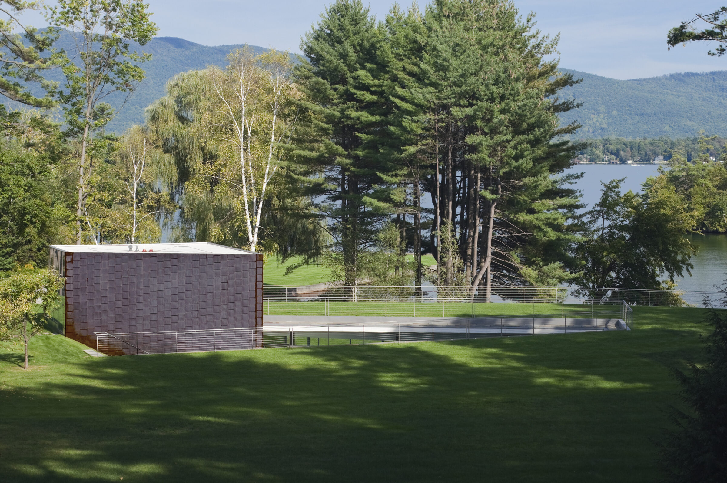
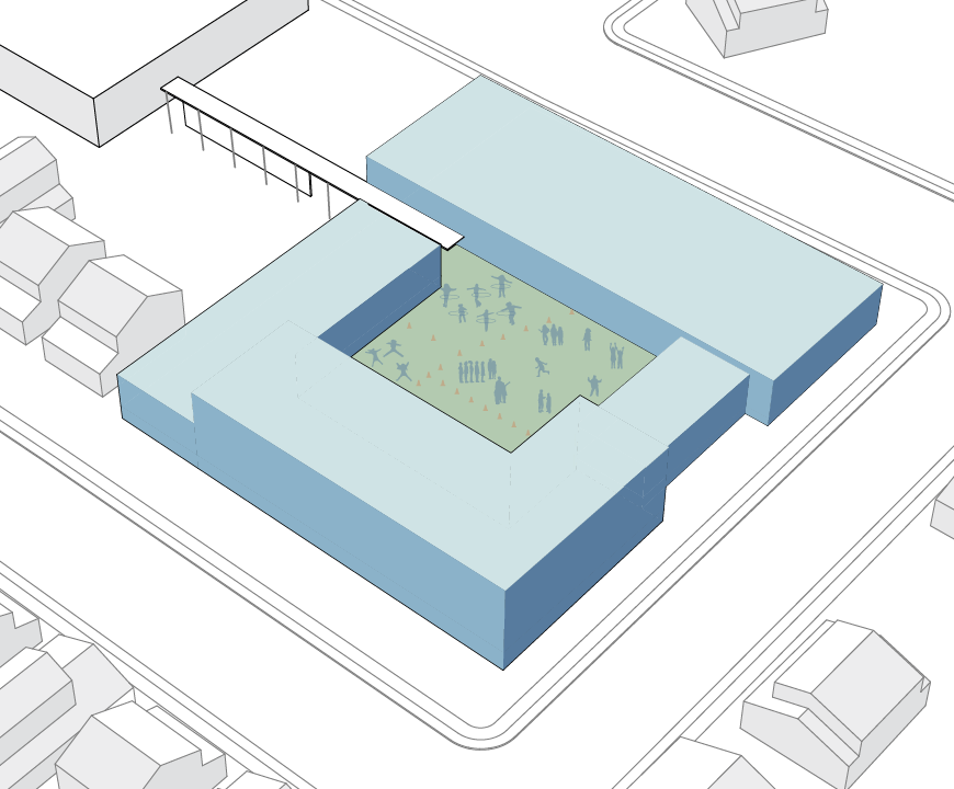
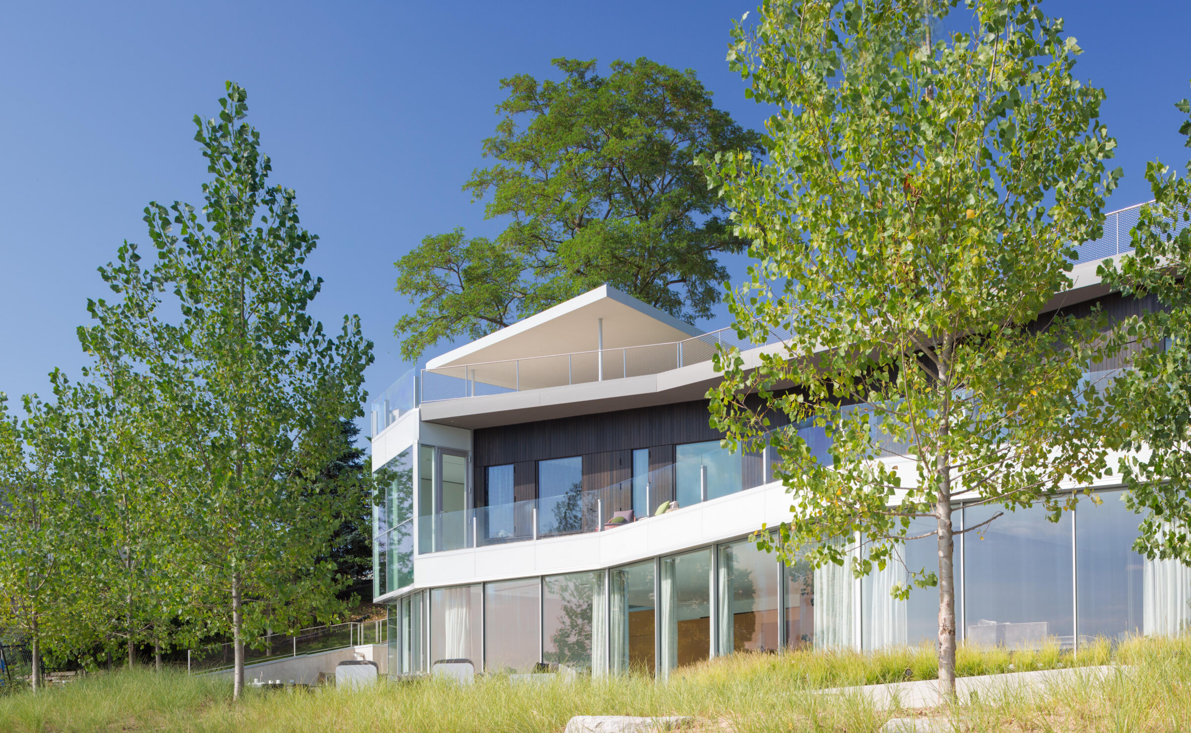
On a thickly forested site, a group of buildings and play fields stand disconnected. The shore and waters of the lake are the only consistent features throughout; nevertheless, somehow always over there. To bring together the lake, forest and disparate elements on the property, Pool Pavilion’s site strategy implements a series of precise landscape and architectural interventions.
First, the project clears a central area of the forest. The clearing becomes the locus of indoor and outdoor programming, a central gathering space, a viewing platform for the rest of the site. The sloping cleared ground is then cut and lifted. This rift allows the program to bifurcate between two ground planes, the Pool Pavilion itself becoming the transition between the newly created upper and lower levels. Finally, the rift is sculpted to orient spaces towards views and to create a unified and disappearing whole. An opening is punched into the surface to create a sunken courtyard. A portion of the sunken courtyard is popped up to create a vertical element, an interior “lookout” space.
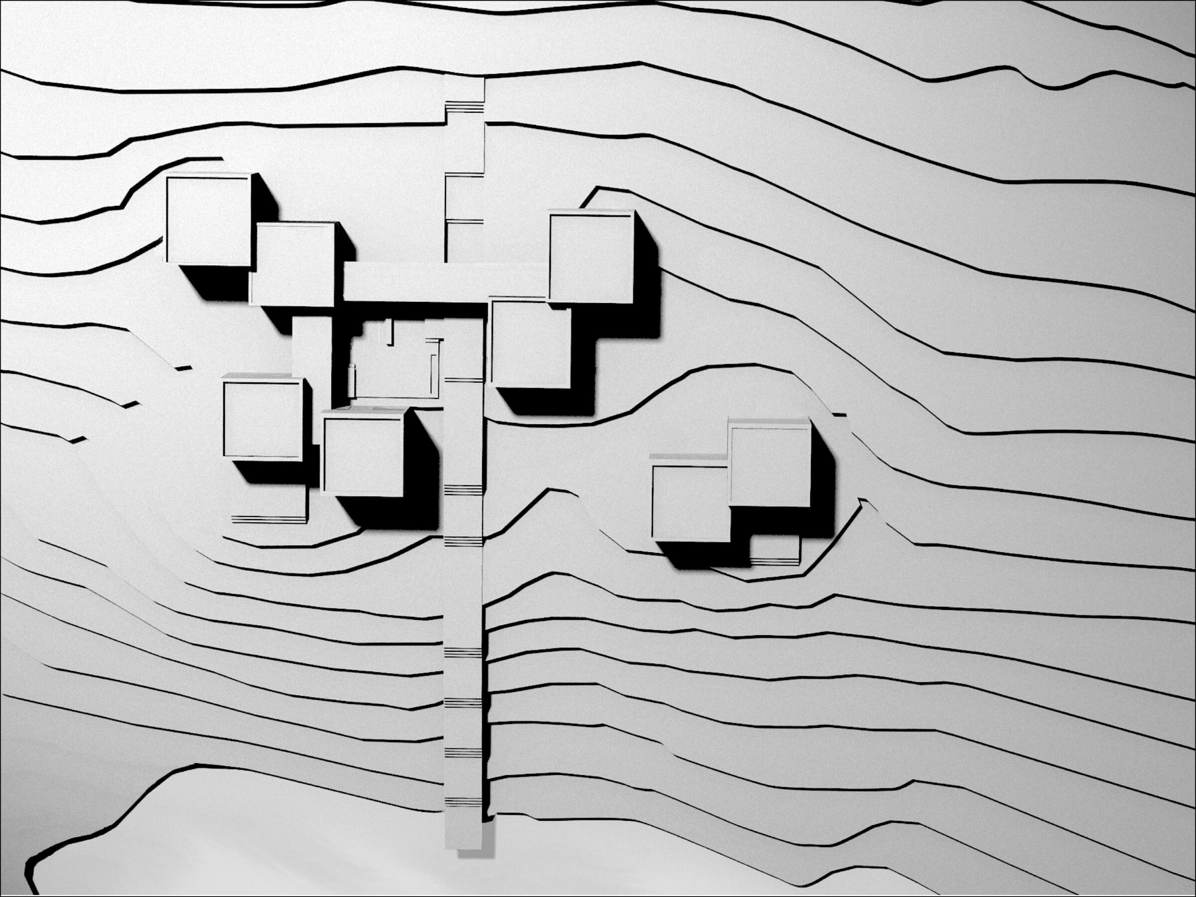
Arranged to mirror the region’s agricultural fields, Artist Retreat offers a perfect blend of private creative spaces and communal gathering areas. Its eight single room structures are divided by function—live, sleep, create. Living, dining and bedrooms comprise the main cluster, centered around a shared outdoor space, while a detached pair of cubes house the photography studio and darkroom. Each of the individual bedrooms contains a private bathroom, a window opened to a specific view, and intimate space to think, write, contemplate, offering each guest their own world.
There is a porosity to the interior world of this retreat. Glass hallways link the boxes and transform into open air bridges that surround the central deck. The result is privacy between the different programmatic elements in each cube, with a visual layering of space as the land is slowly revealed.
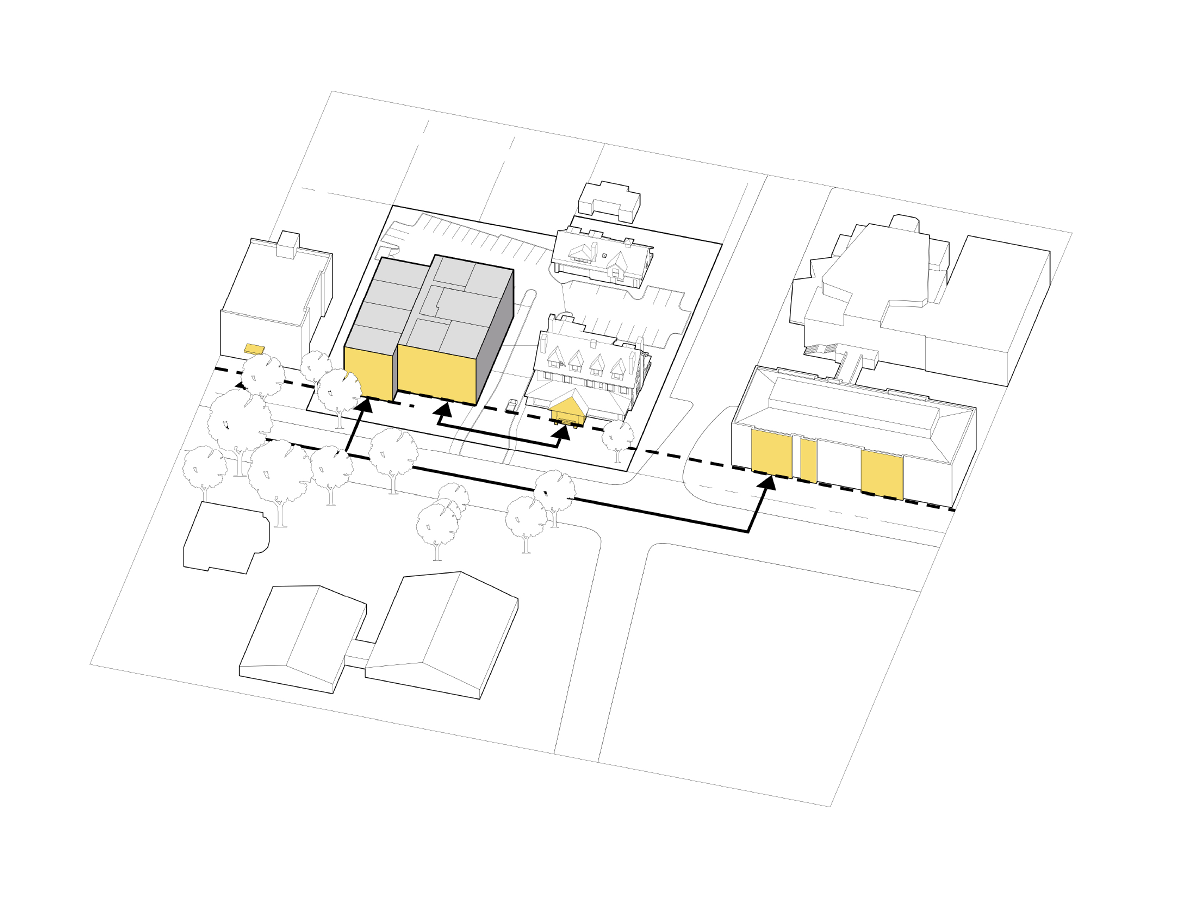
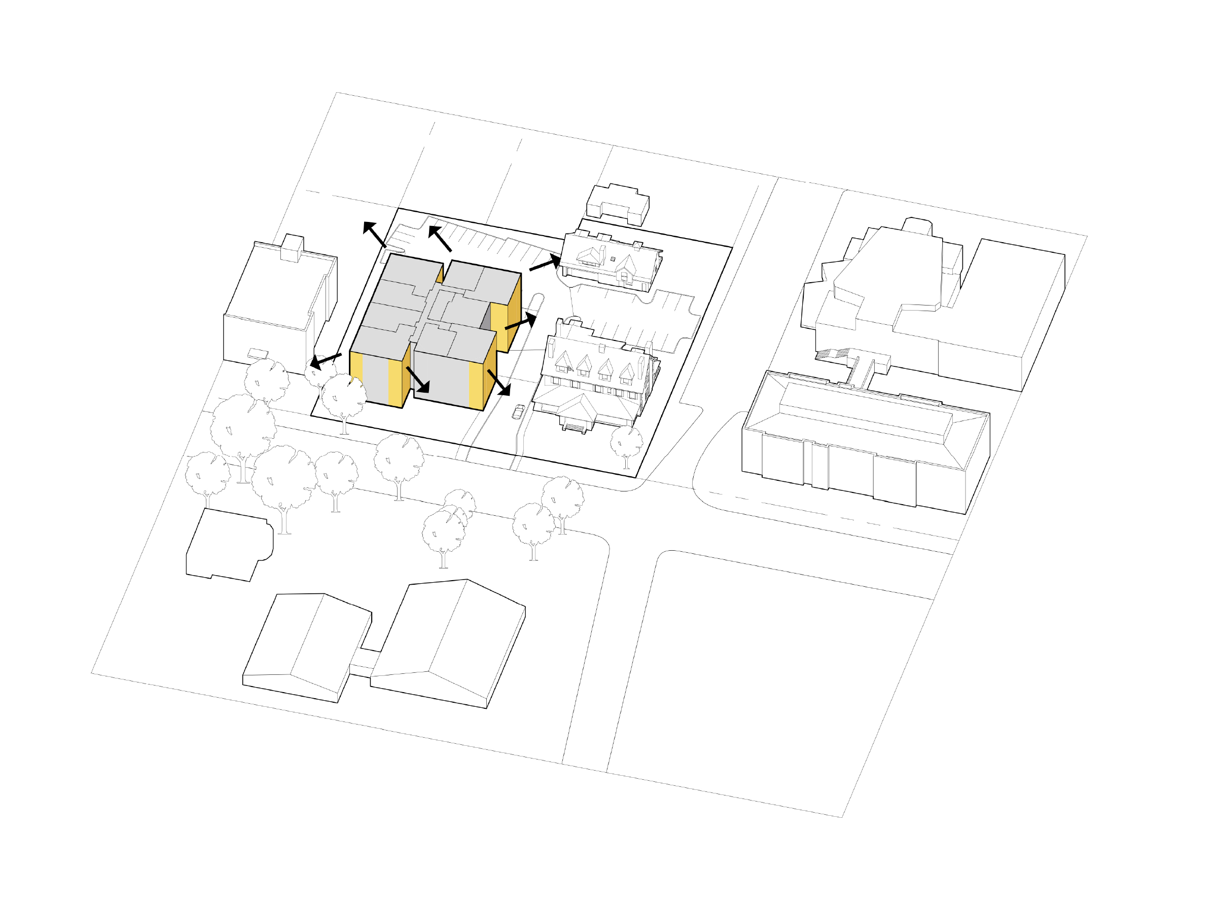
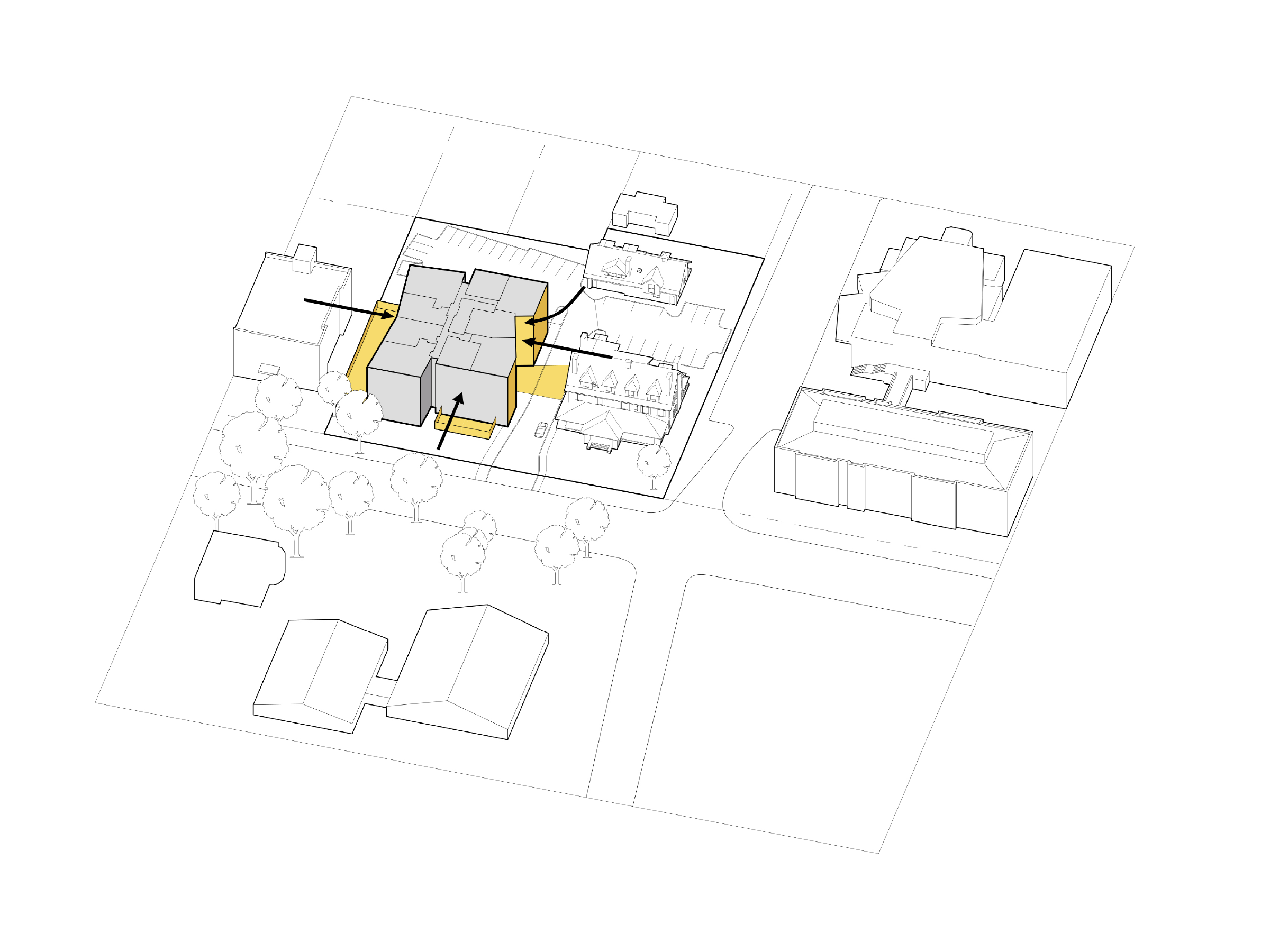
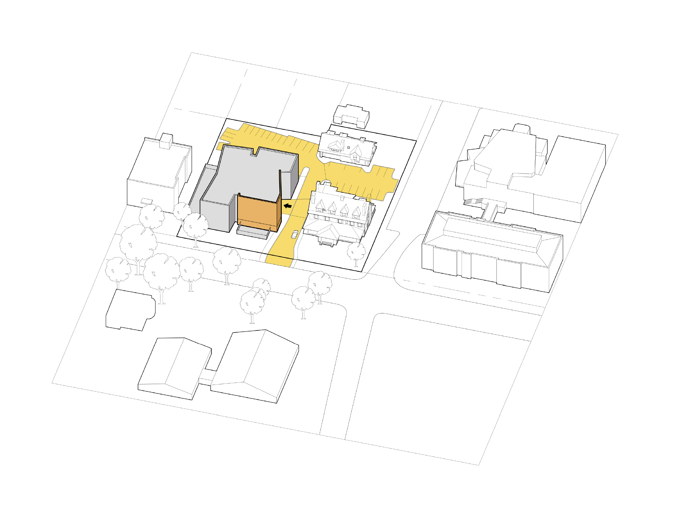
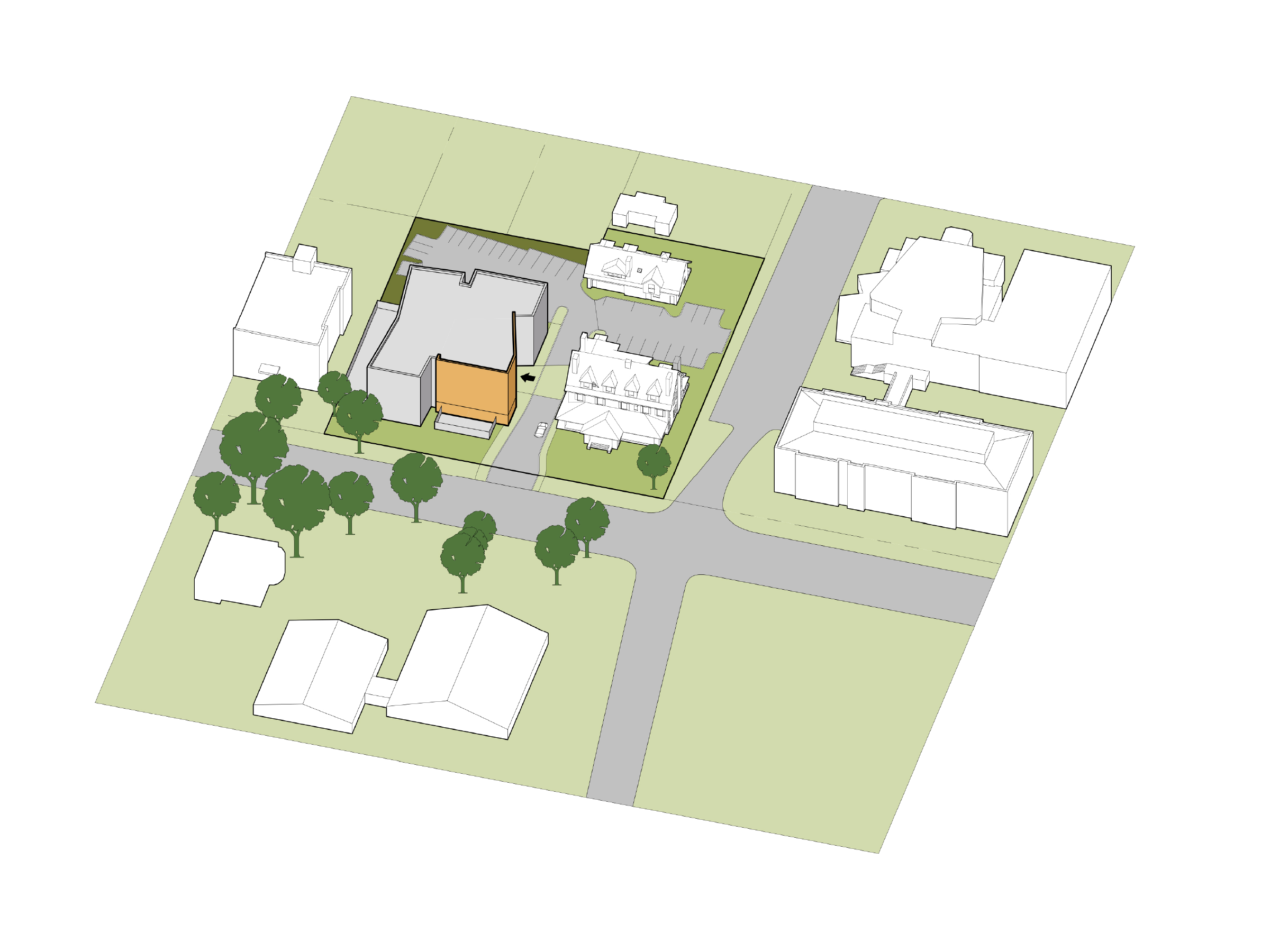
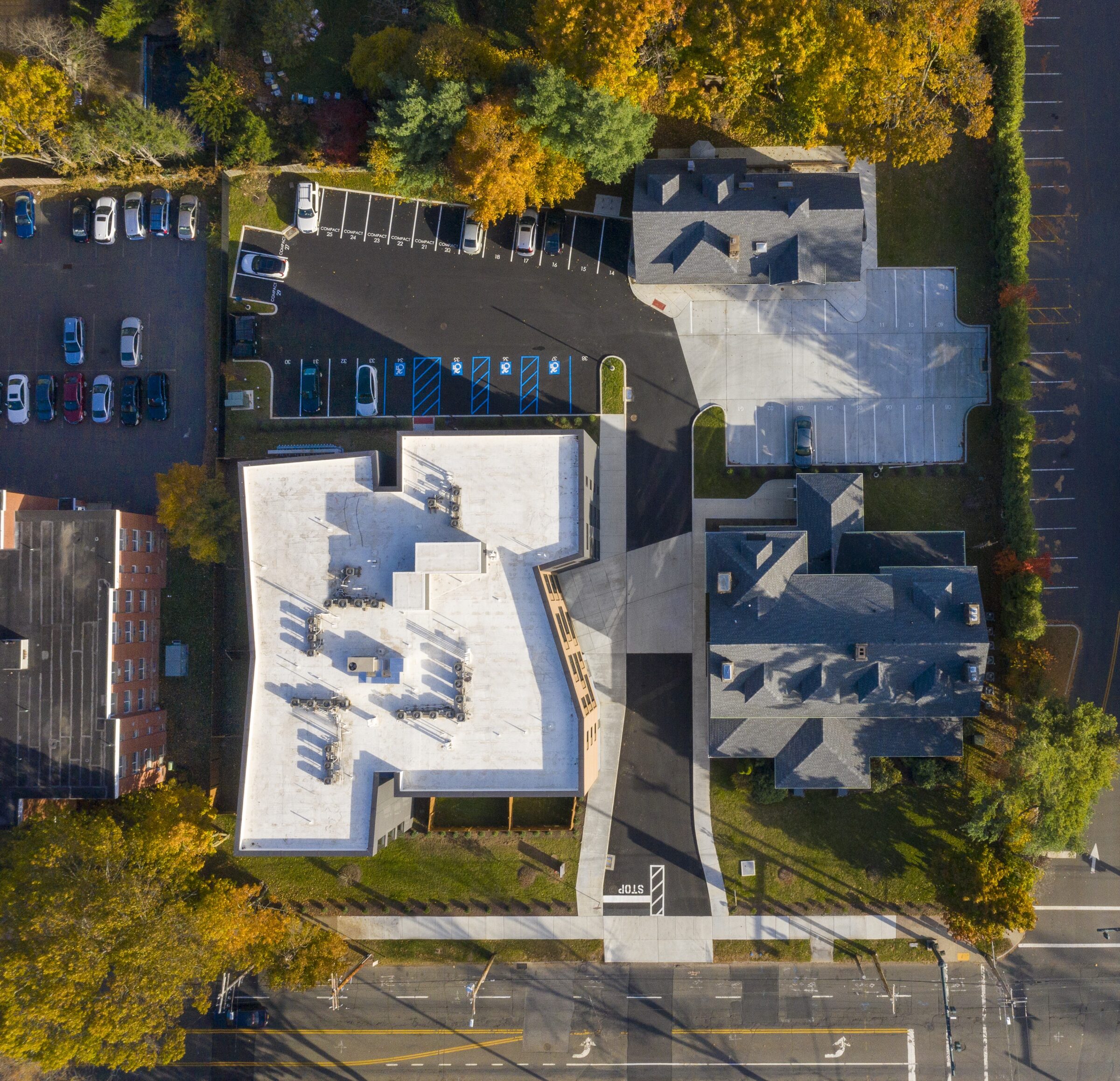
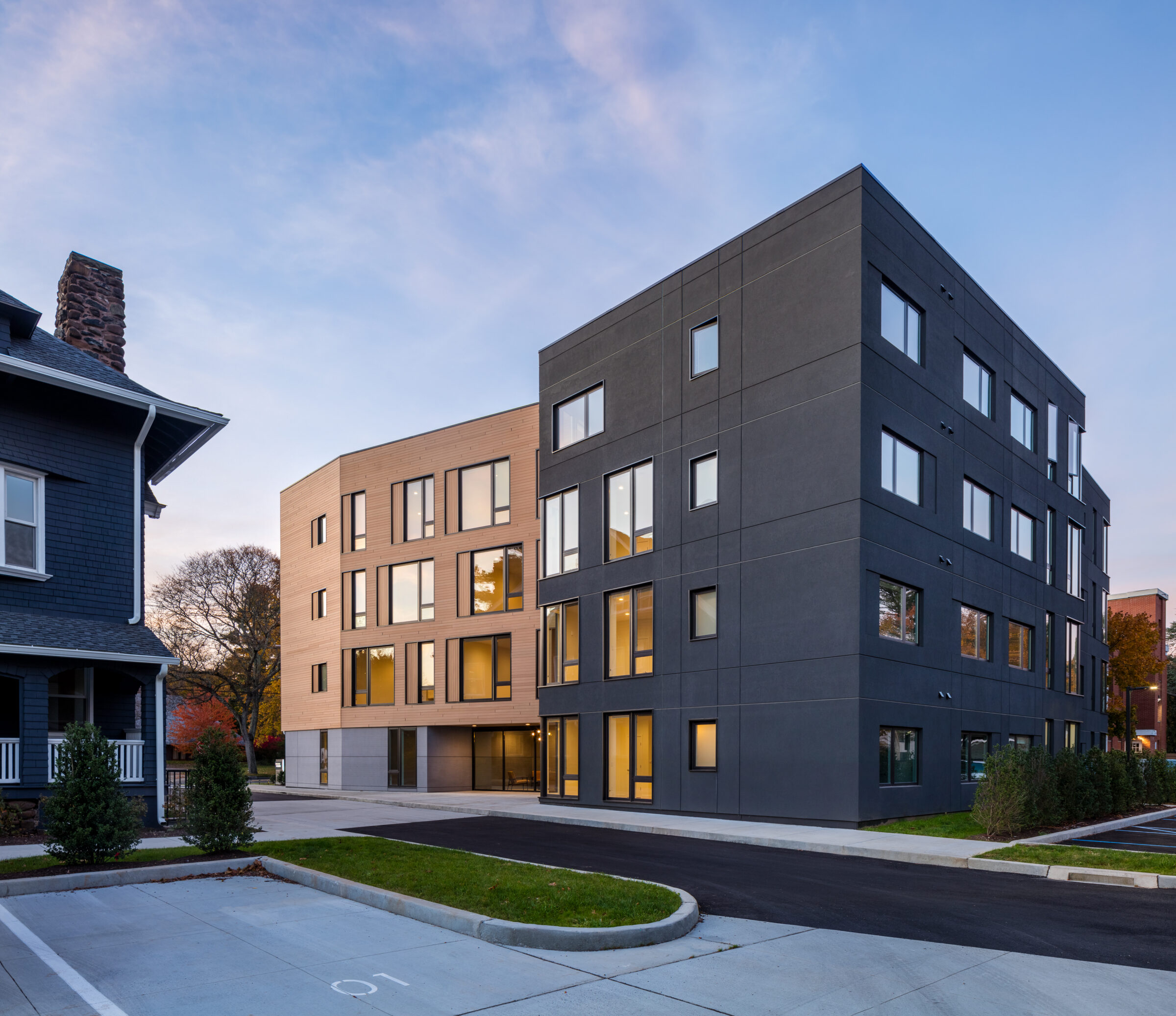
Integrating larger multi-family structures into single-family residential areas is a challenge when densifying modern suburbs and small cities across the United States. Since the 1990s, New Haven, and specifically Whitney Avenue, has witnessed the construction of several multi-family apartment projects that attempt to emulate the city’s Victorian housing stock. However, these efforts fall short due to an increase in scale, inherently low-cost detailing, and the resulting disconnection when mimicry replaces authenticity.
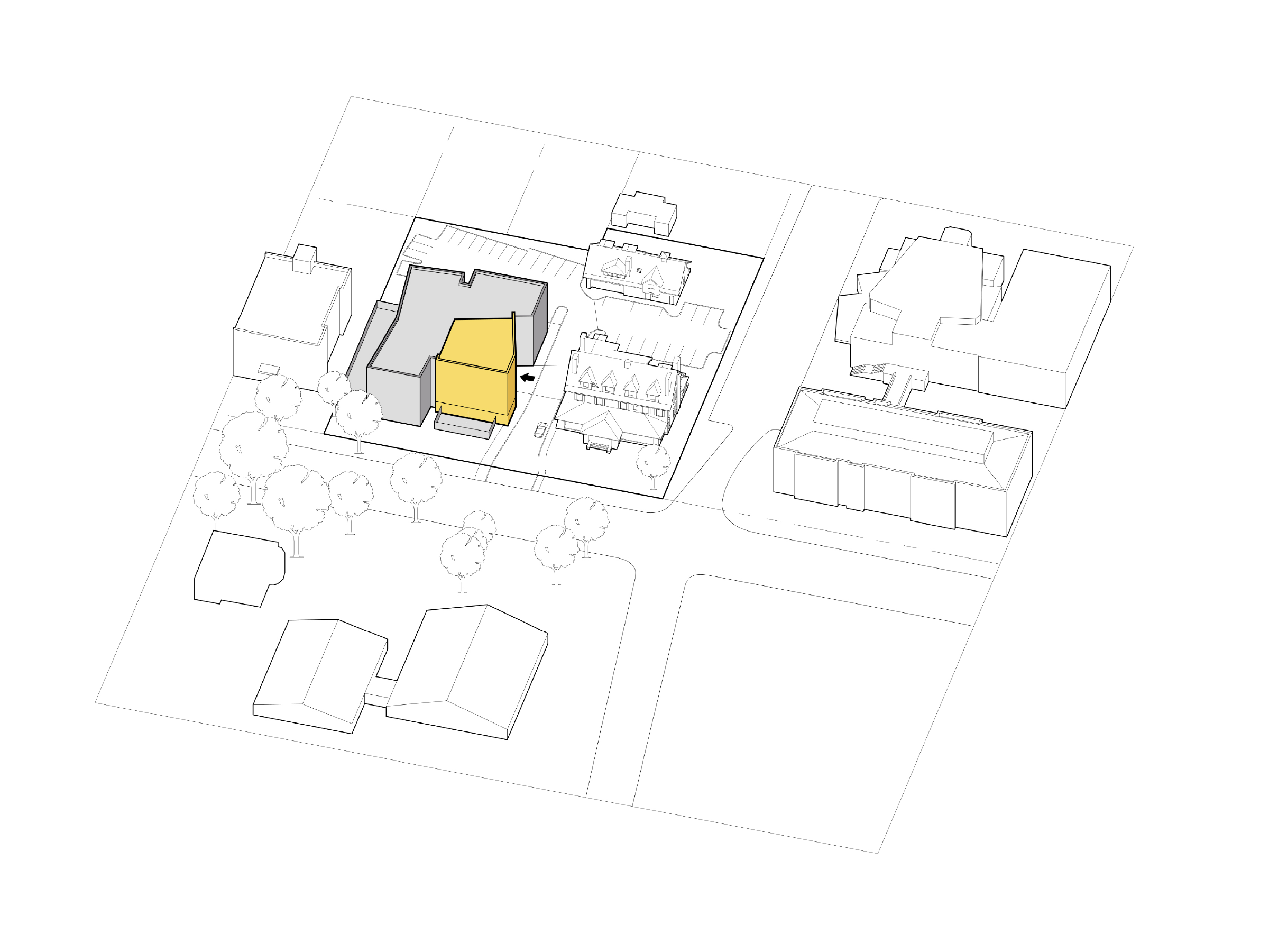
The design of Whitney Modern takes a different approach, reinforcing the existing context while engaging in a dynamic architectural dialogue with its older neighbors. First, “The Modern” steps back and preserves the front yard to the street, continuing the urban character of the neighborhood. Contrary to convention, the entry of the new building faces the historic Abner Hendee House rather than Whitney Avenue, transforming a typical asphalt driveway into a well-defined urban facade with sidewalks, plantings, and streetlights.
The overall building mass is bifurcated into a neutral “wrapper” and a warmer, more intimately scaled volume. Clad in wood, the more inviting scale of this building highlights the entrance and creates a plaza, extending the residential fabric and bringing it into the project.
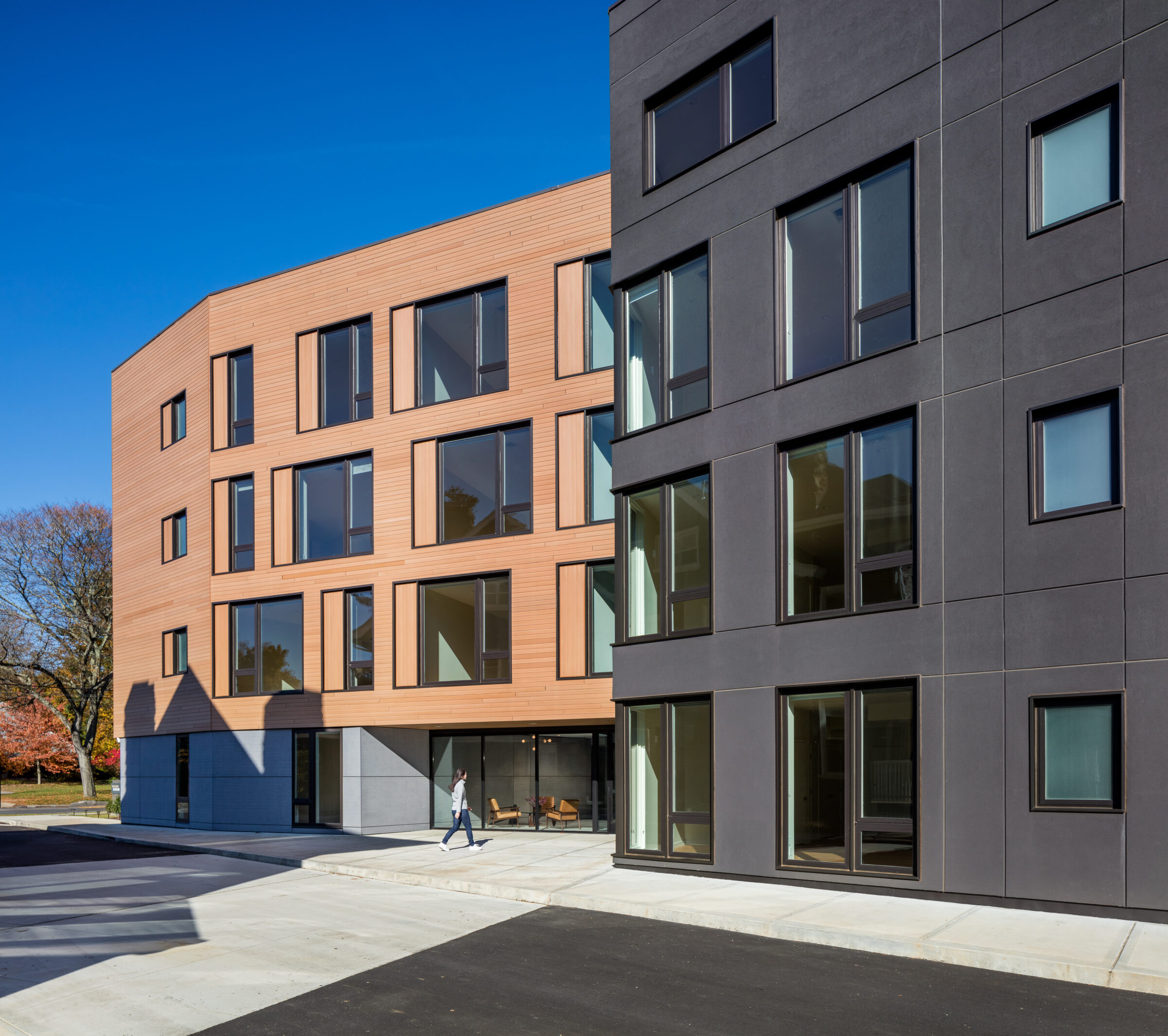
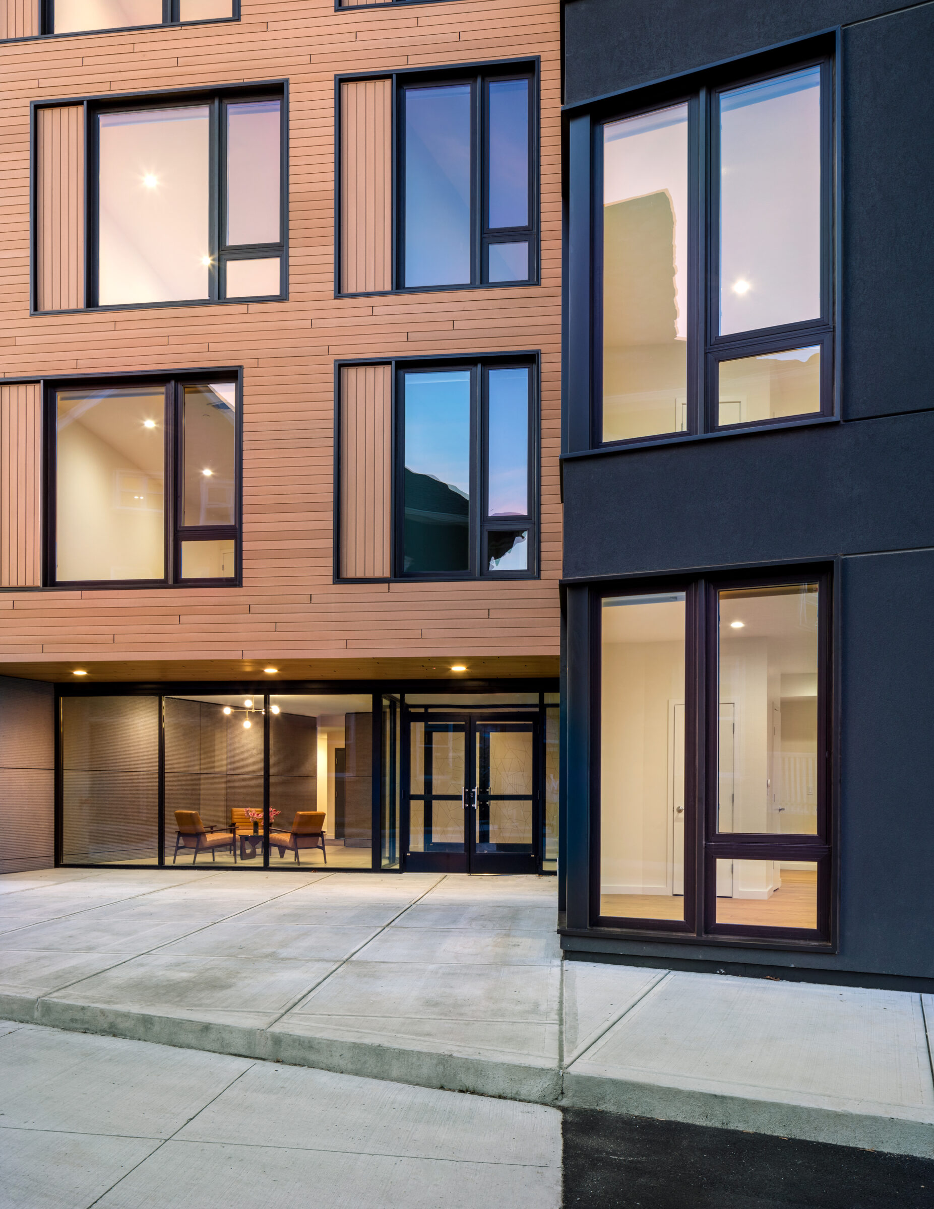
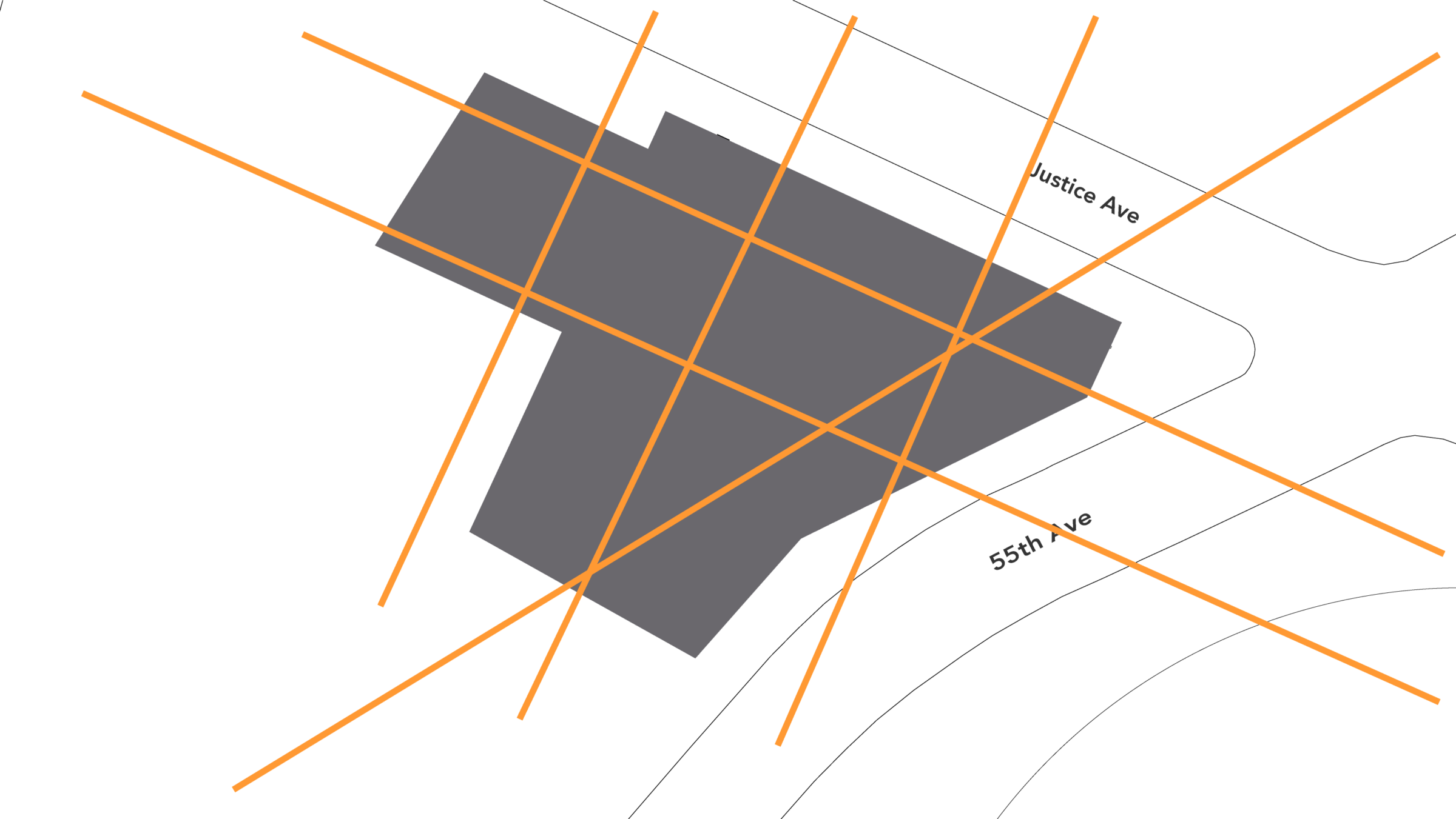
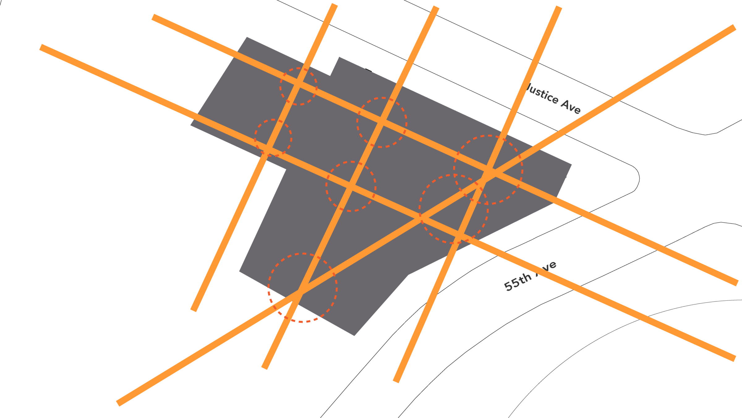
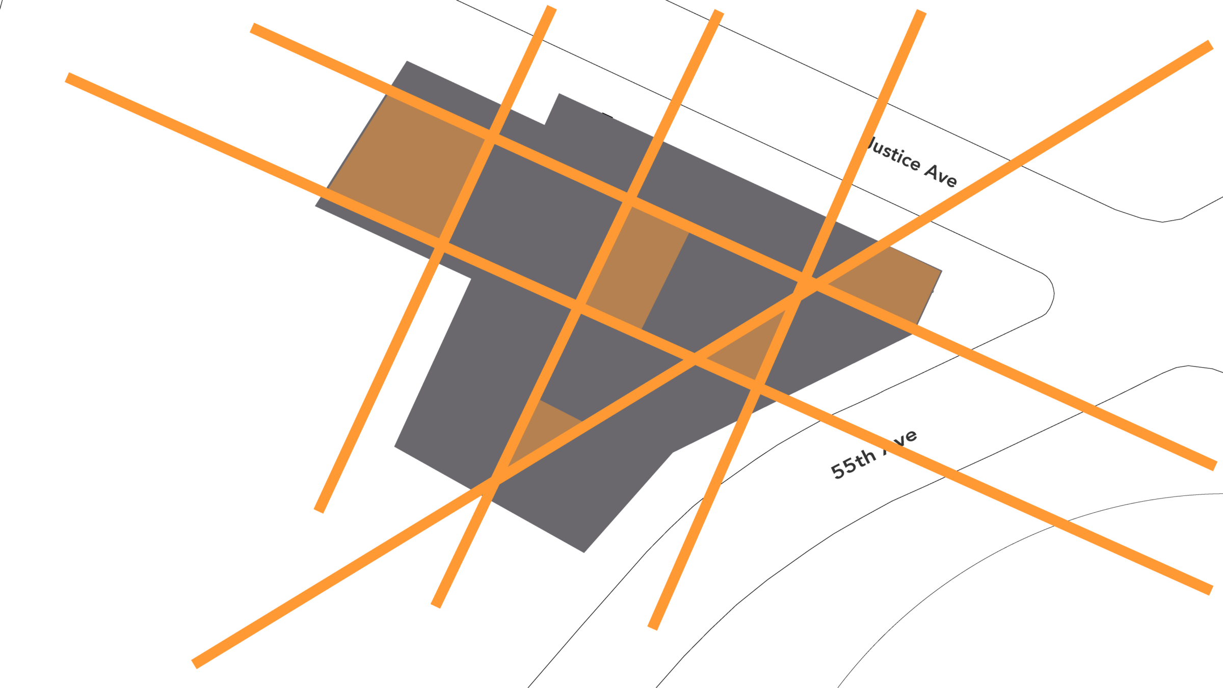
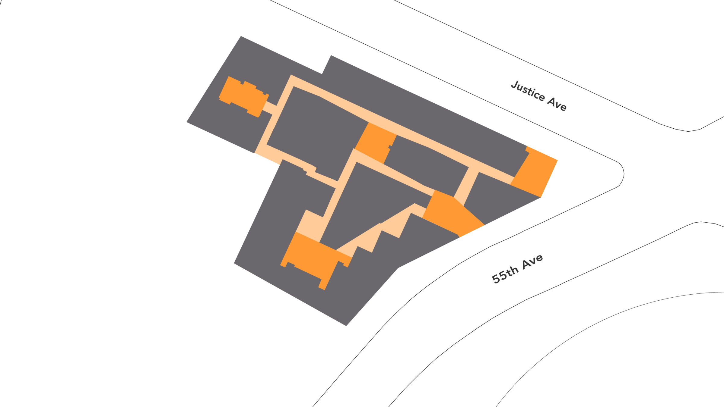
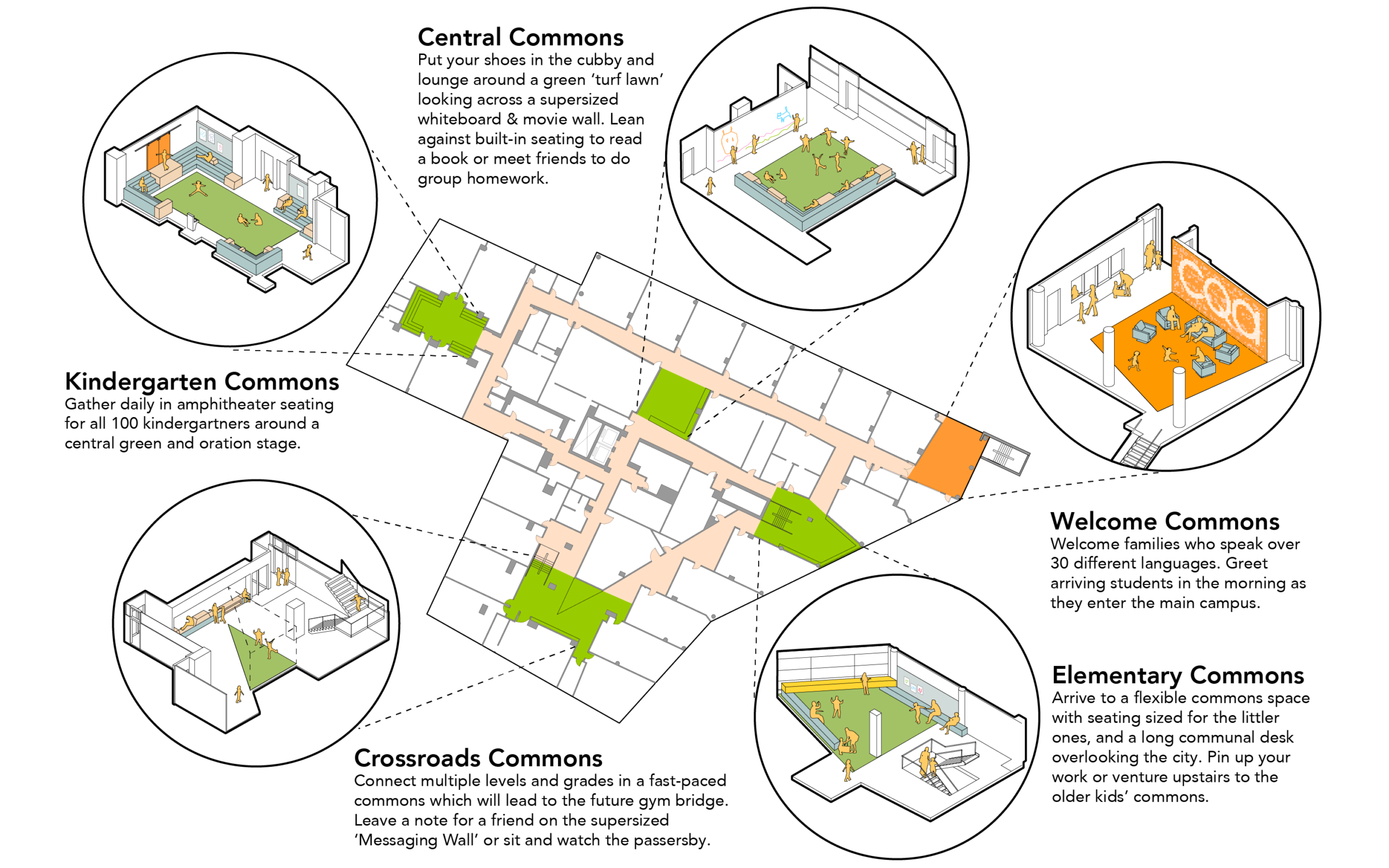
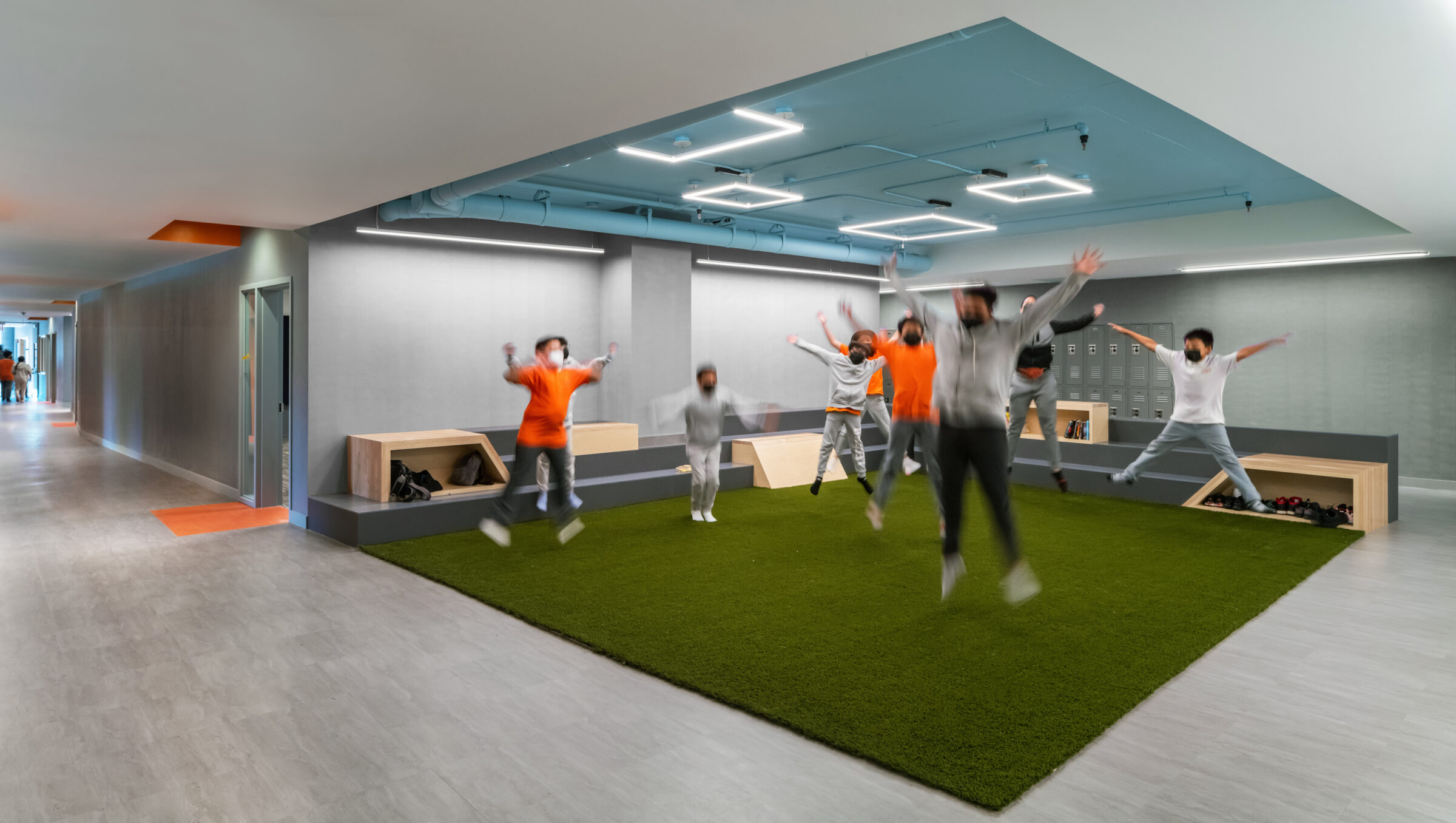
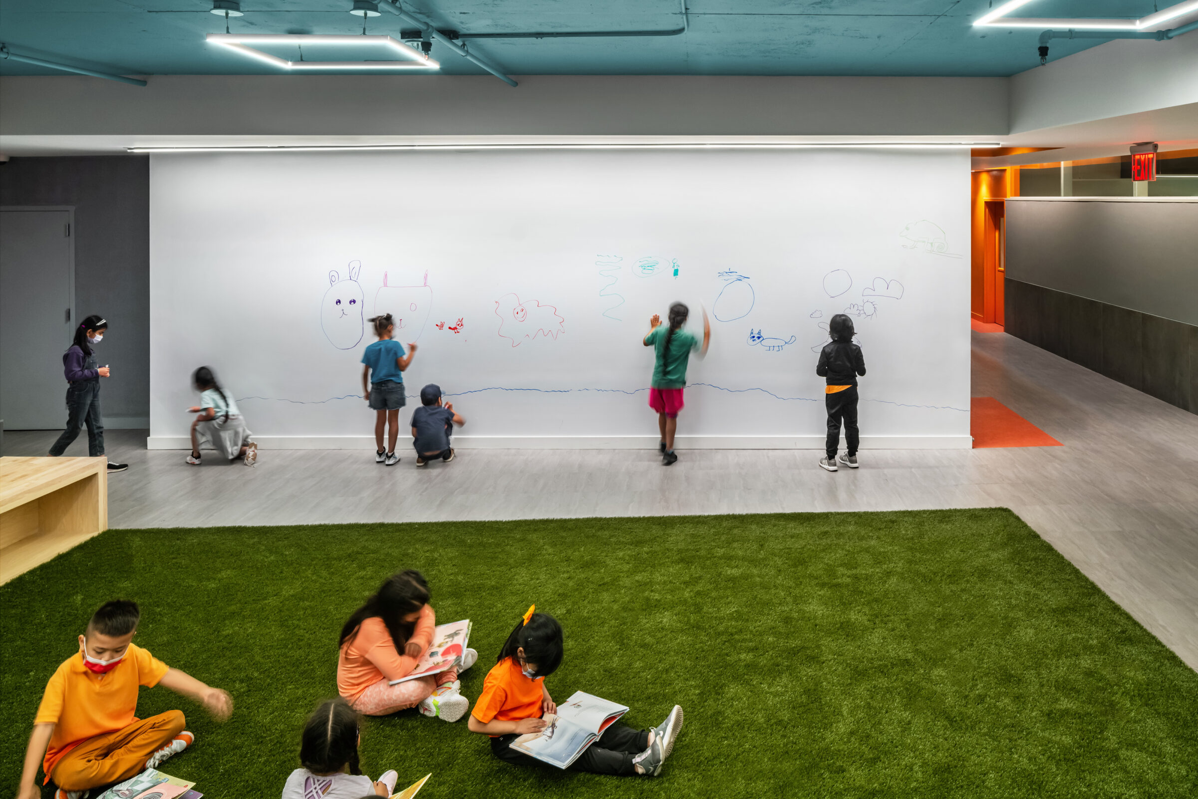
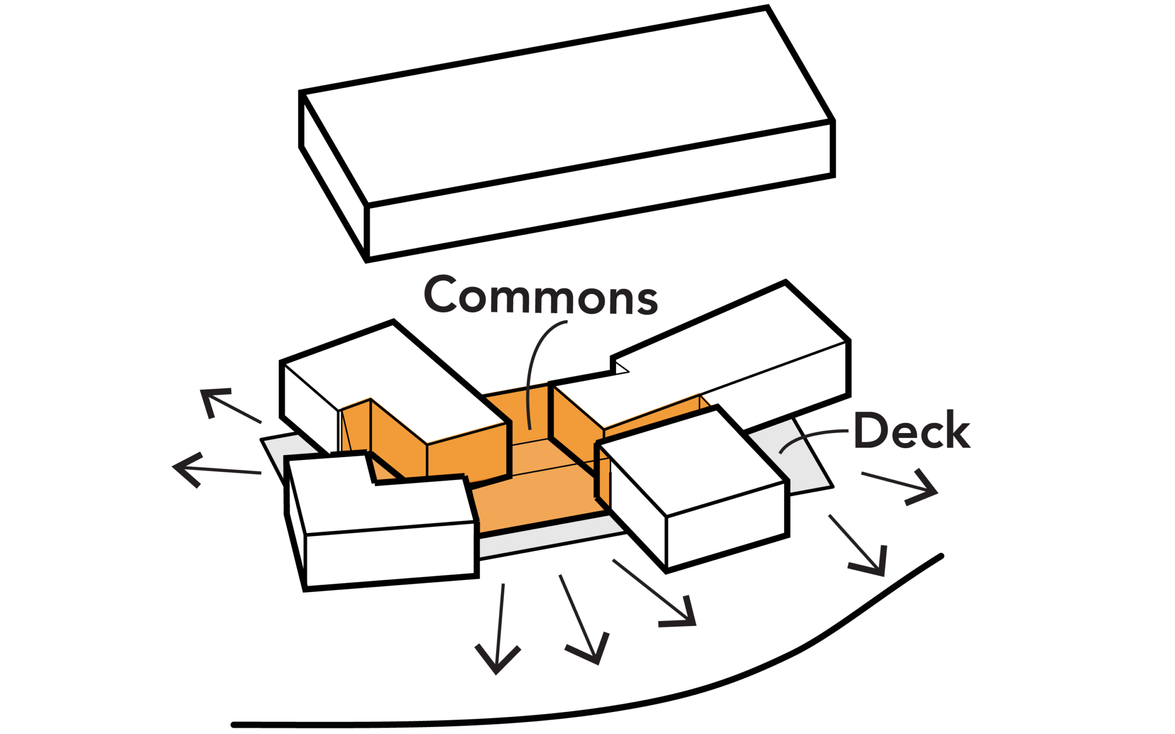
The first phase of the campus, CQA I occupies two large, 35,000-square-foot floor plates. Their sheer size, coupled with an irregular shape, increases the design’s complexity. Conceptually, the project uses the Elmhurst neighborhood grid and overlays it onto the building (the podium’s mass itself was determined by the urban grid). The resulting lines trace the geometric logic of the city onto the floor plate, delineating blocks and circulation paths. These blocks become villages, with classrooms and commons forming neighborhoods.
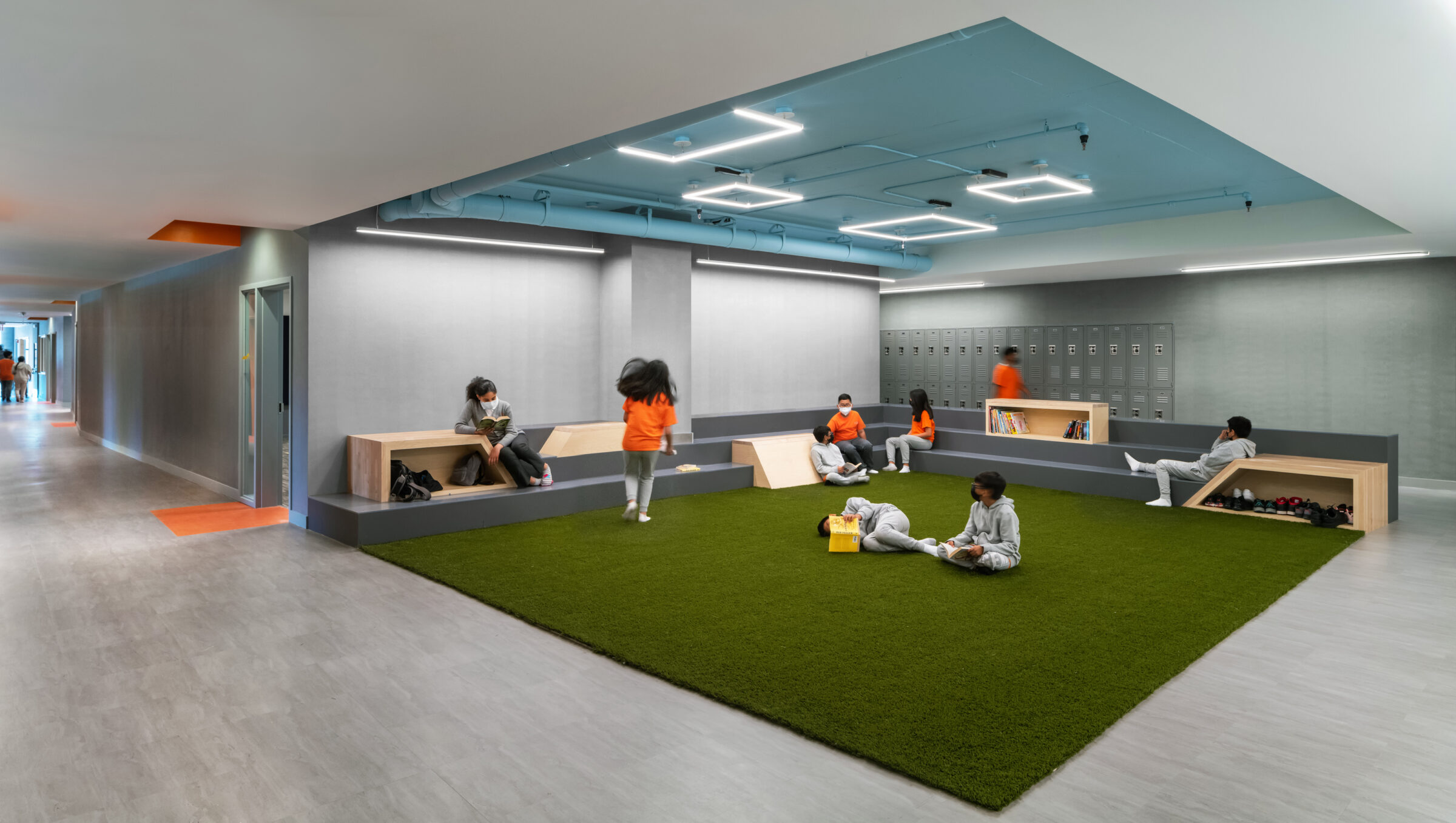
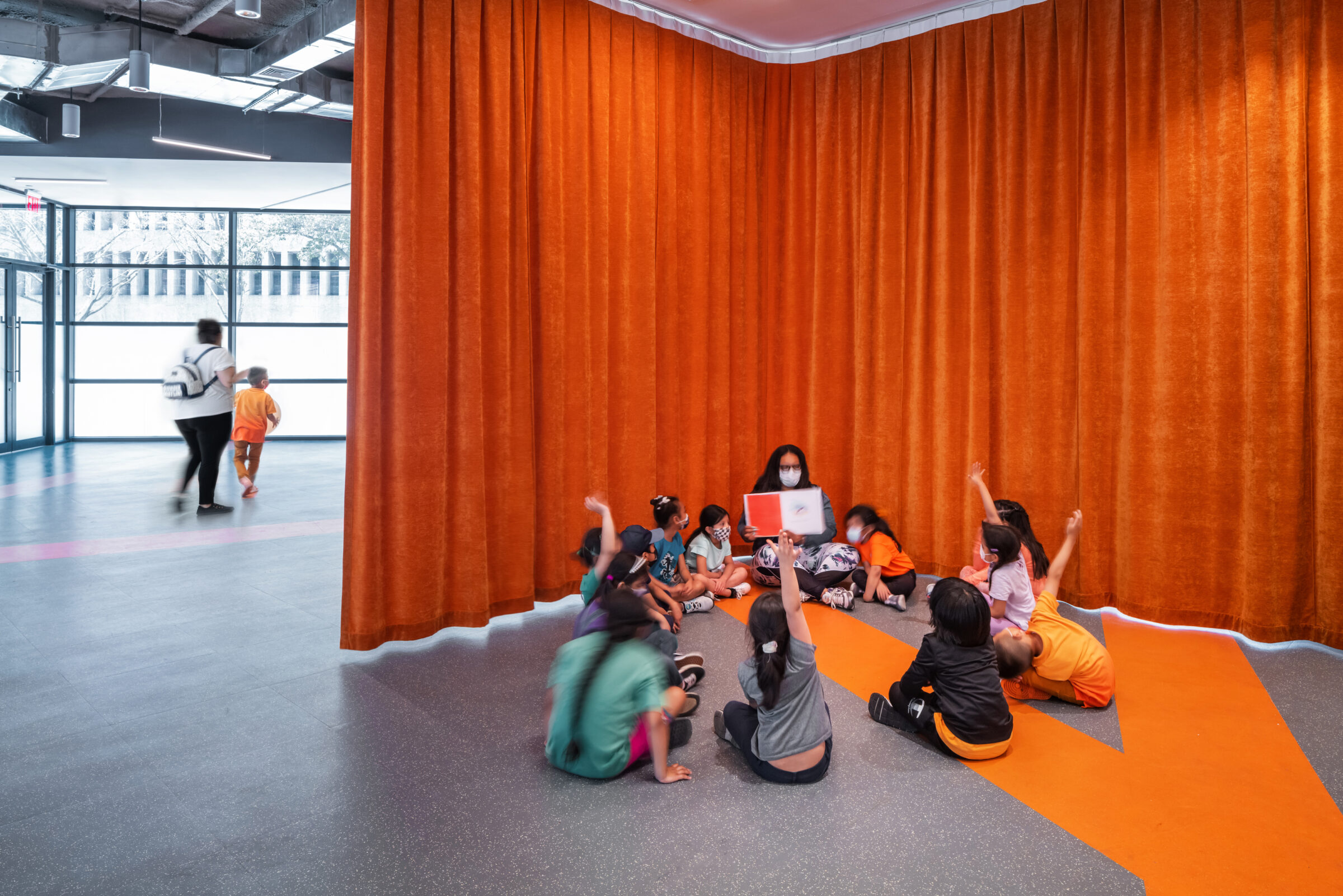
Each cluster is tied to a “Commons”, a shared space outside the classroom designed to foster creative engagement among students from up to 30 different nations, transcending the boundaries of traditional classroom learning. Each Commons has a distinct identity, featuring playful yet non-prescriptive elements: green ‘grass’ turf floors for jumping up and down; a 20-foot-long white board that doubles as a movie screen; amphitheater seating with nooks for books and shoes; and a Crossroads Commons for informal conversations with faculty and friends on the way to class.
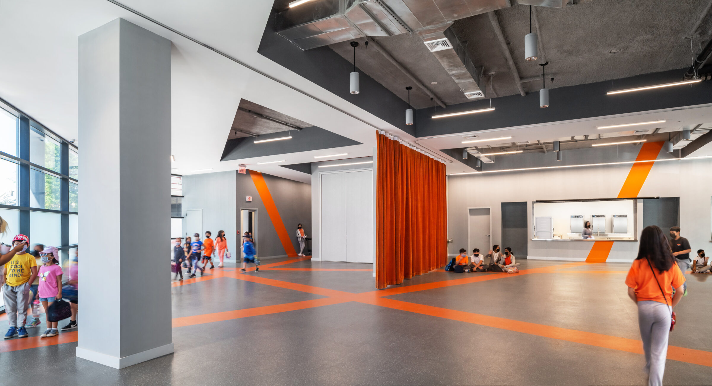
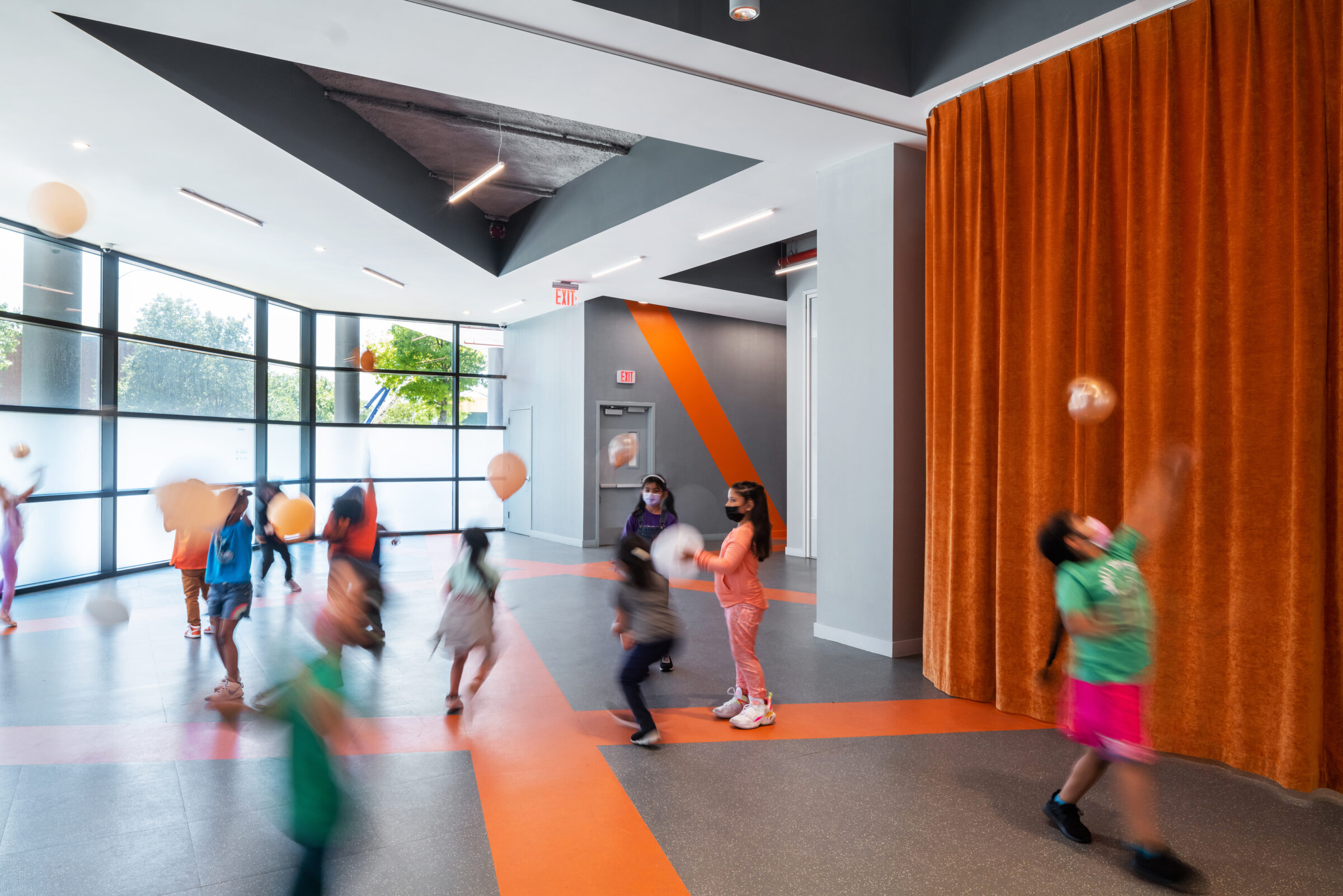
At street level, movable curtains around a multipurpose space and a flexible gym can be drawn to create smaller learning environments or fully open arrangements for all-school assembly or lunch service.
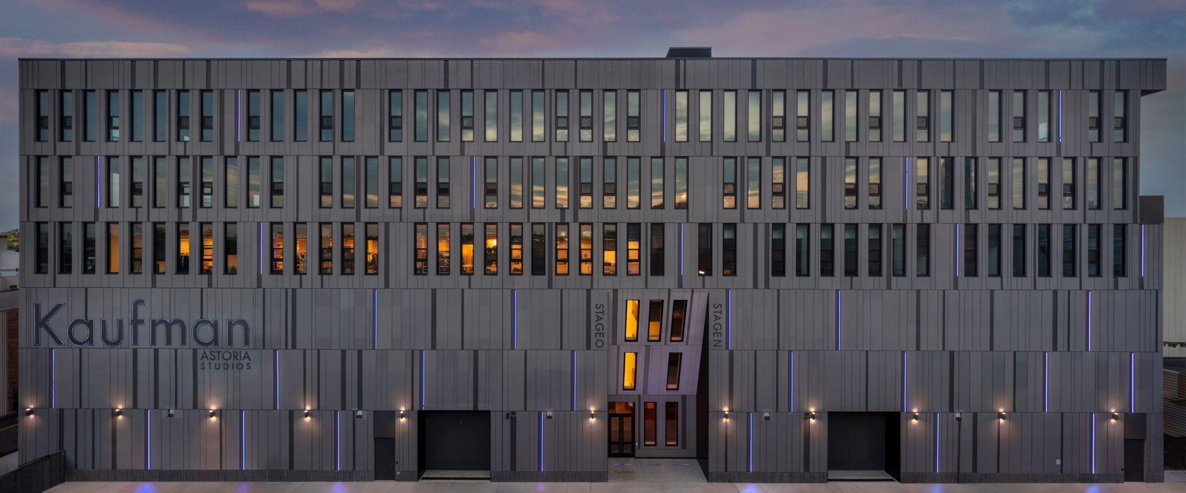
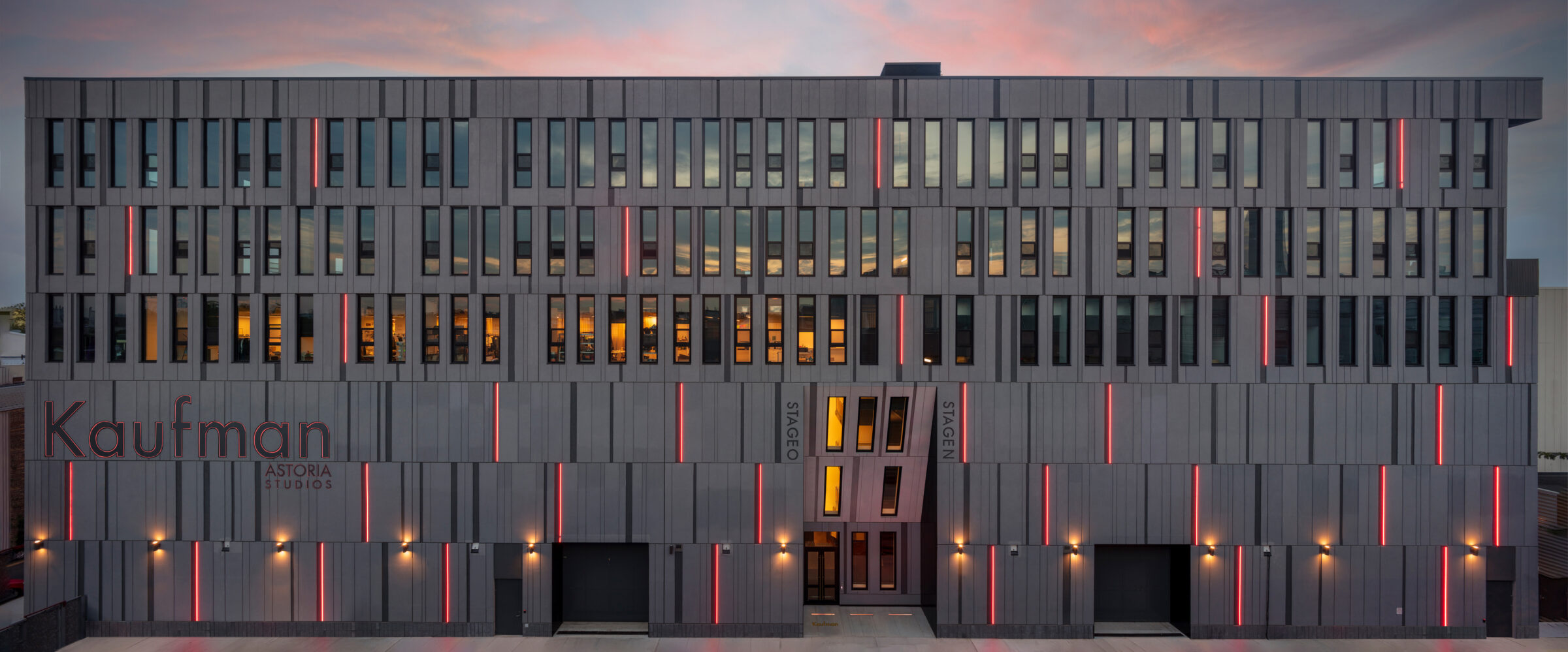
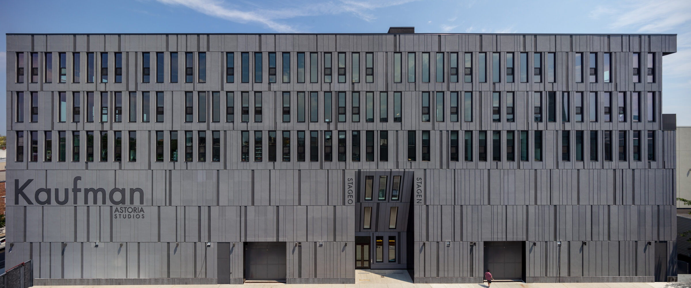
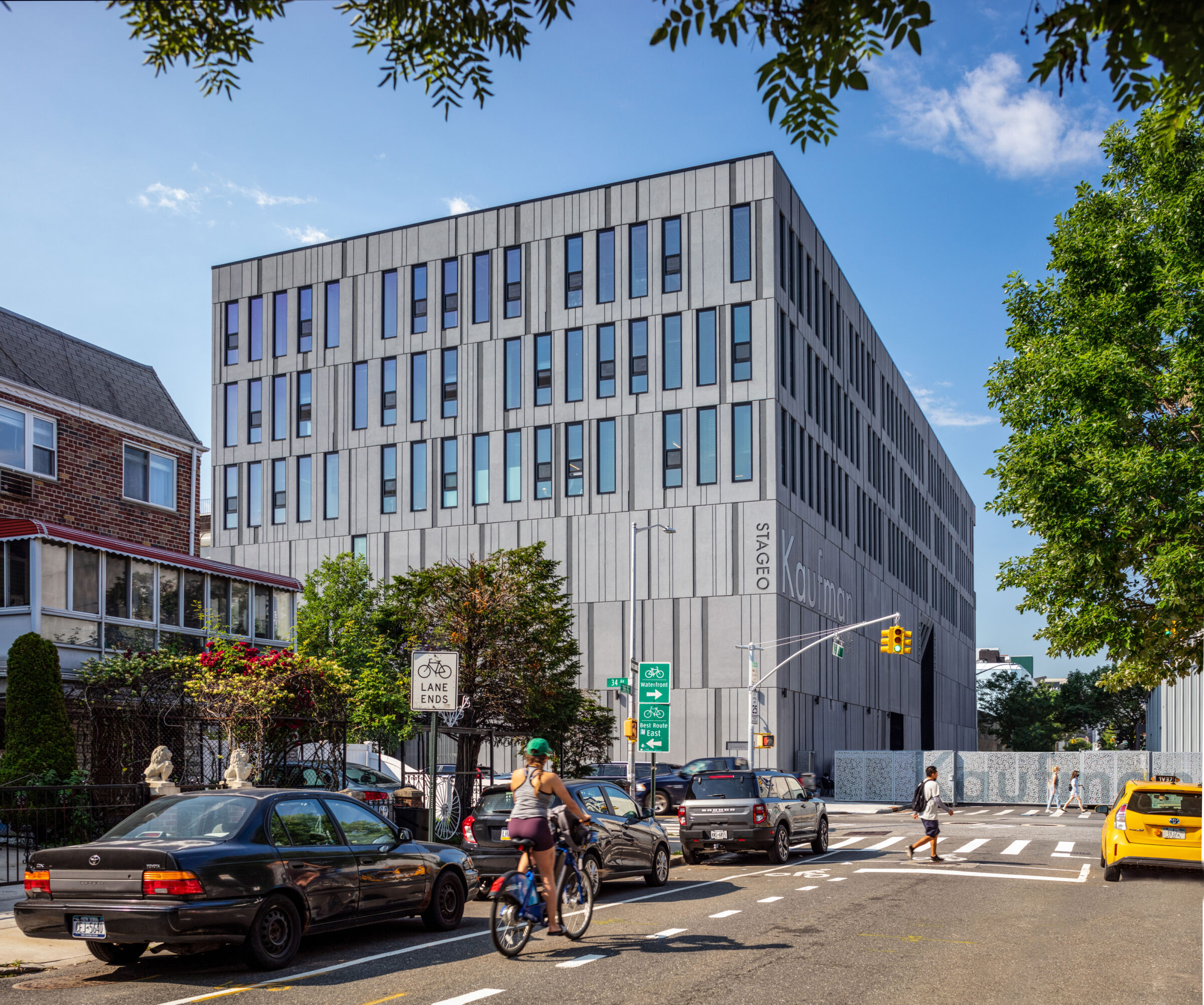
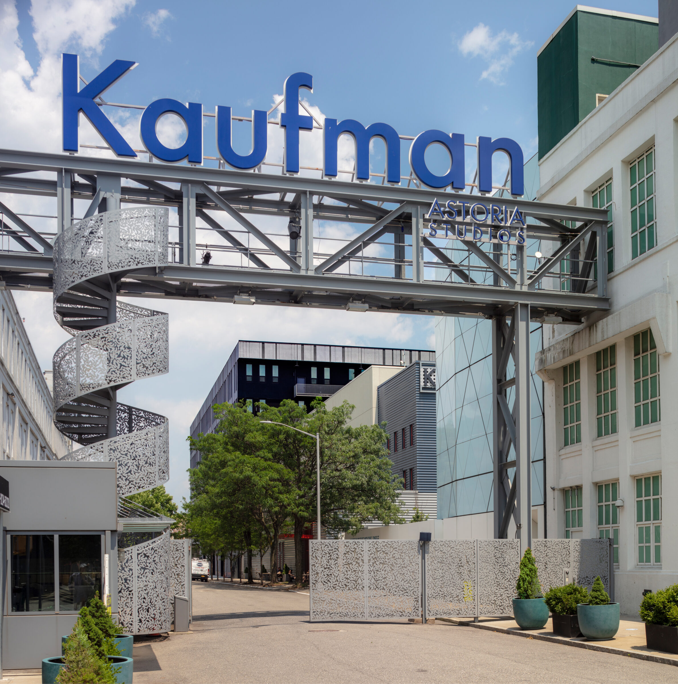
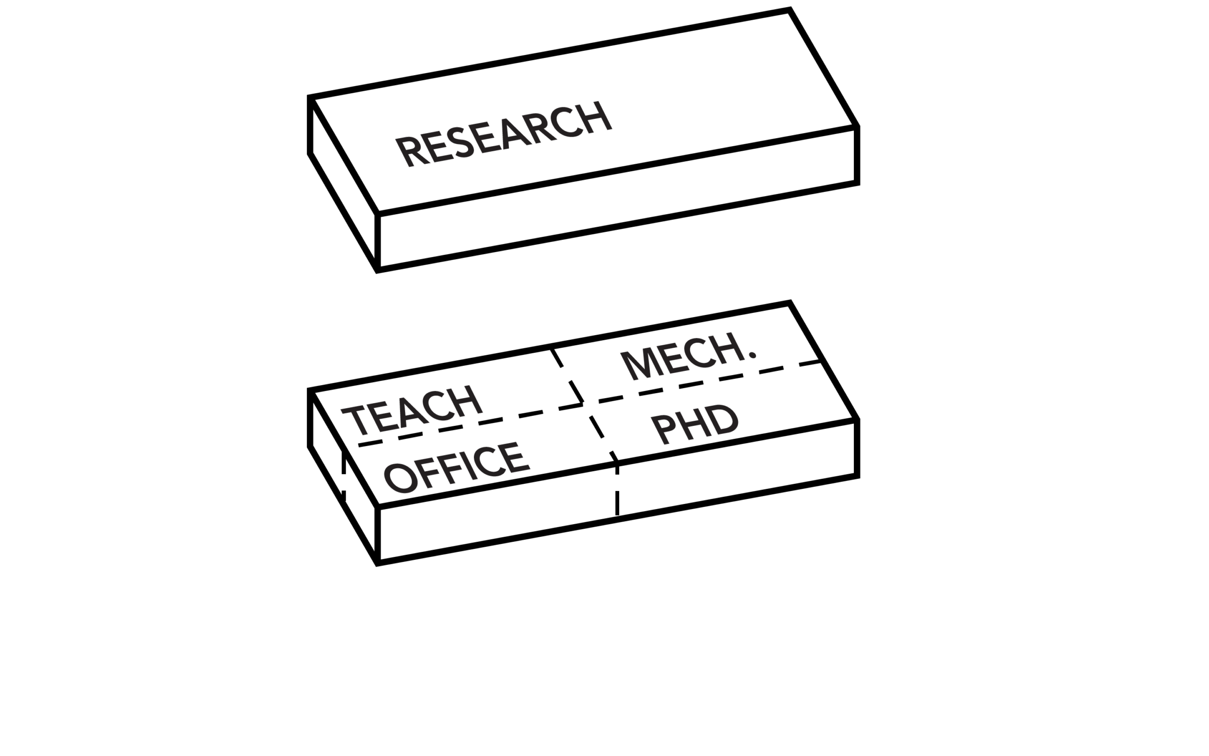
How to develop a large black box, spanning several thousand square feet, within a tight urban site in NYC? In contrast to most film studios—which have land to spread out among numerous single-story buildings—Kaufman Studios’ new home is conceived as a stacked L-shape with different yet complementary programs. A four-story building houses two soundstages at the base, production support spaces on the second floor and office spaces on the third and fourth floors, with a parking garage in the cellar that serves the entire campus.
With the program in place, how to design the building to be sensible to its immediate urban context? Astoria in Queens presents a mix of manufacturing and residential zoning districts coexisting side-by-side. Considering the pedestrian experience of users and neighbors, ONstage’s 40-foot-tall base is embroidered with a pattern of façade incisions, reminiscent of film strips, that change prominence based on the angle of the sun throughout the day. In the evening, some of these vertical tick lines light up, enhancing sidewalk safety. A playful composition of windows extends the film strip to the three floors above the stages, providing expansive city views for the support spaces and offices. At the same time, the more porous façade downscales the presence of the building, creating an inviting atmosphere for the neighborhood.
The building includes direct access and support to the backlot, allowing Kaufman Astoria Studios to work with local organizations on free, public events that benefit the larger community.
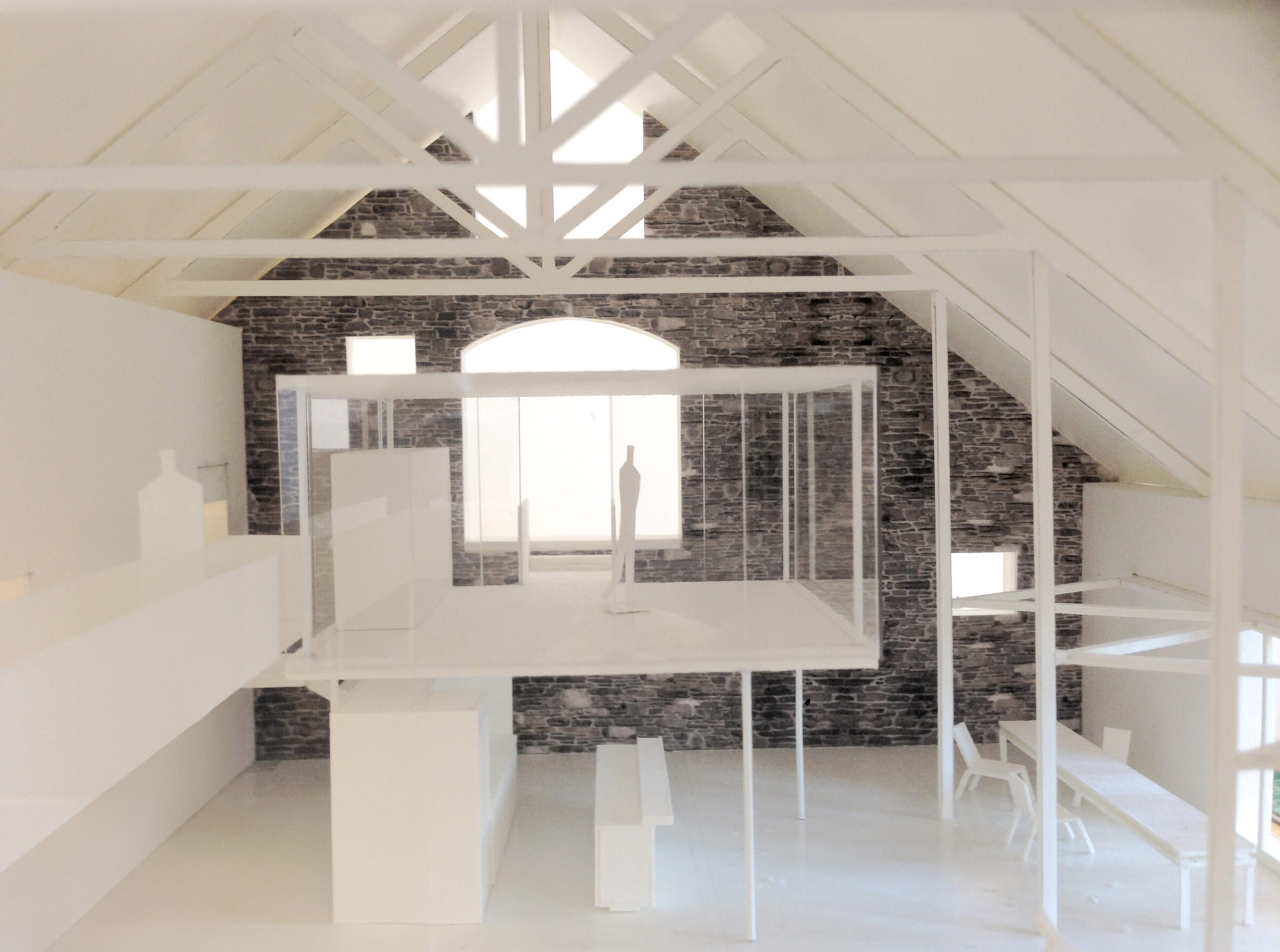
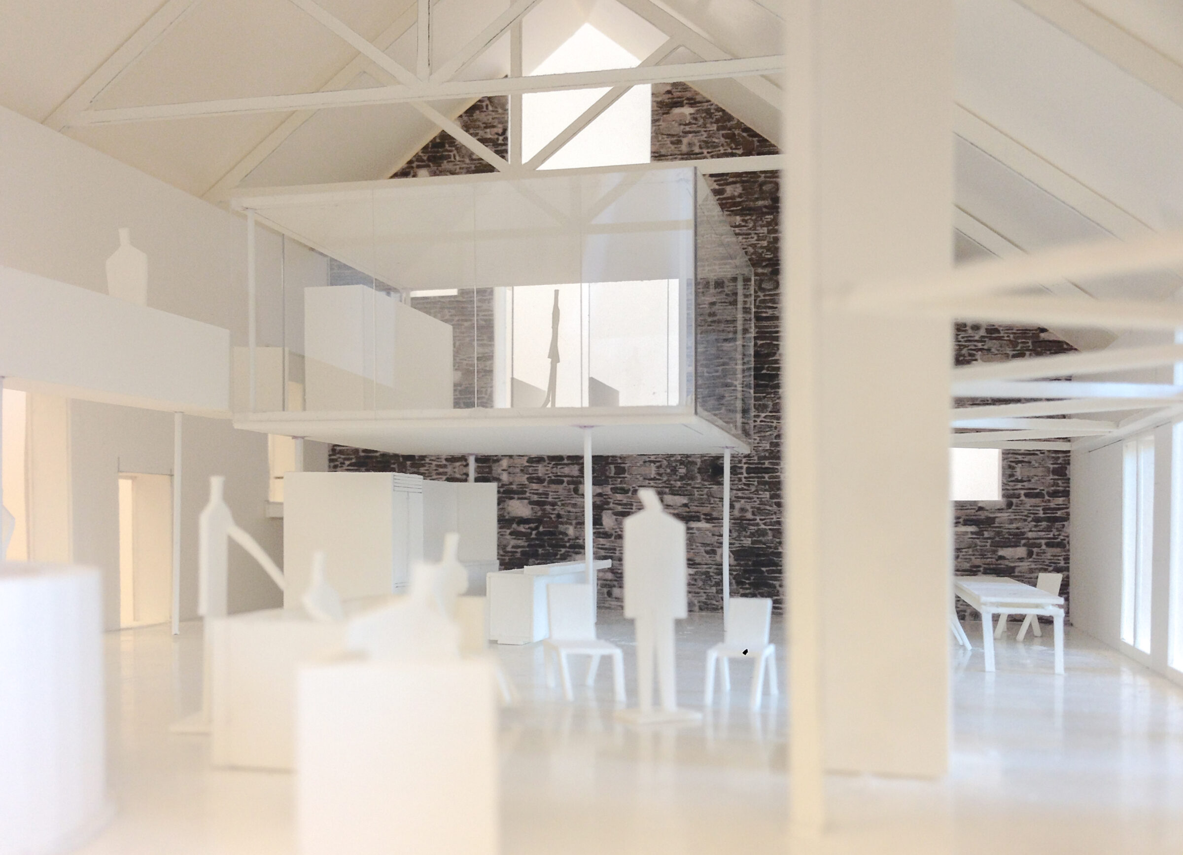
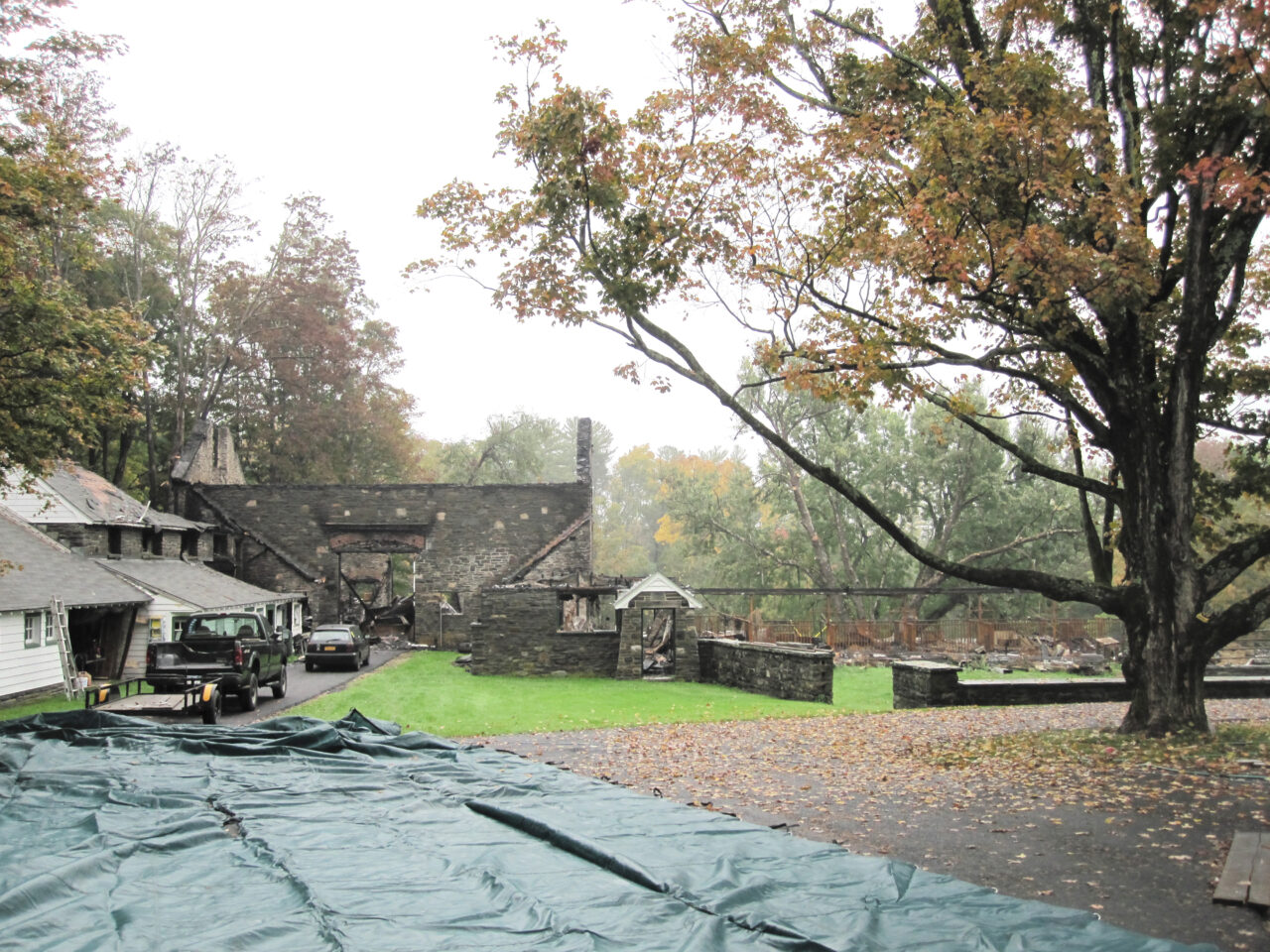
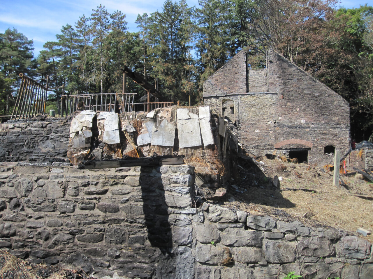
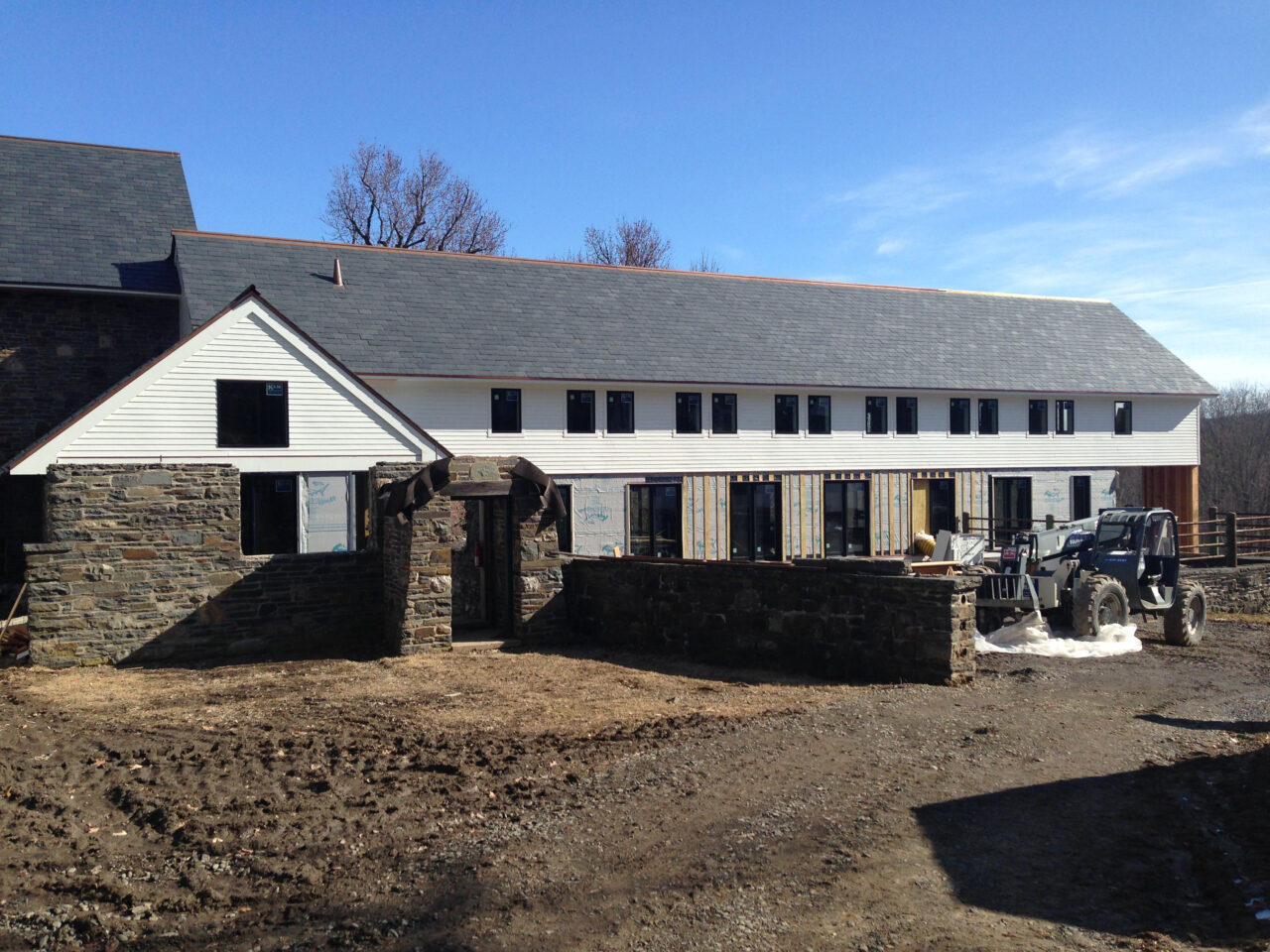
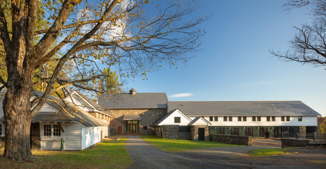
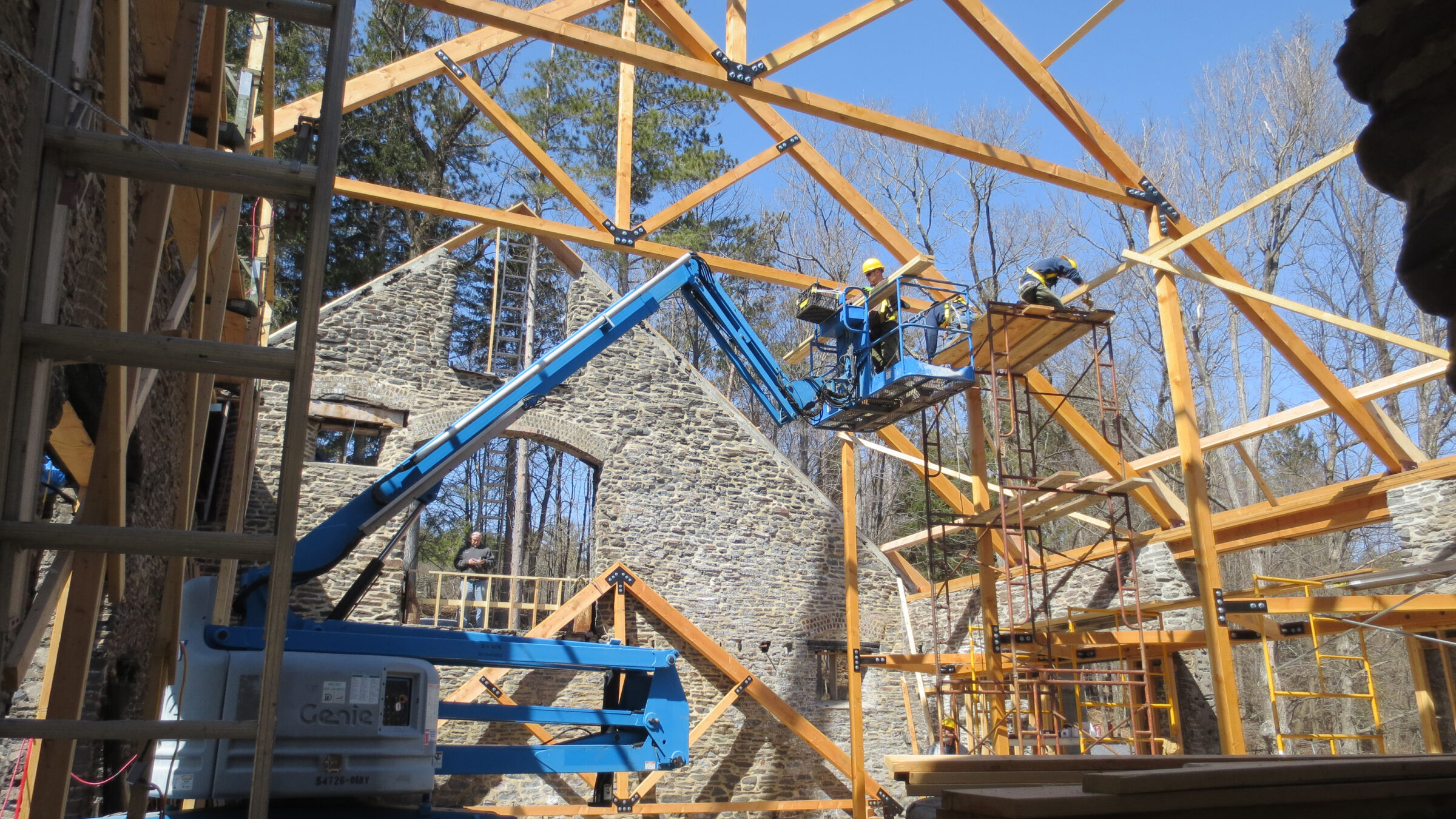
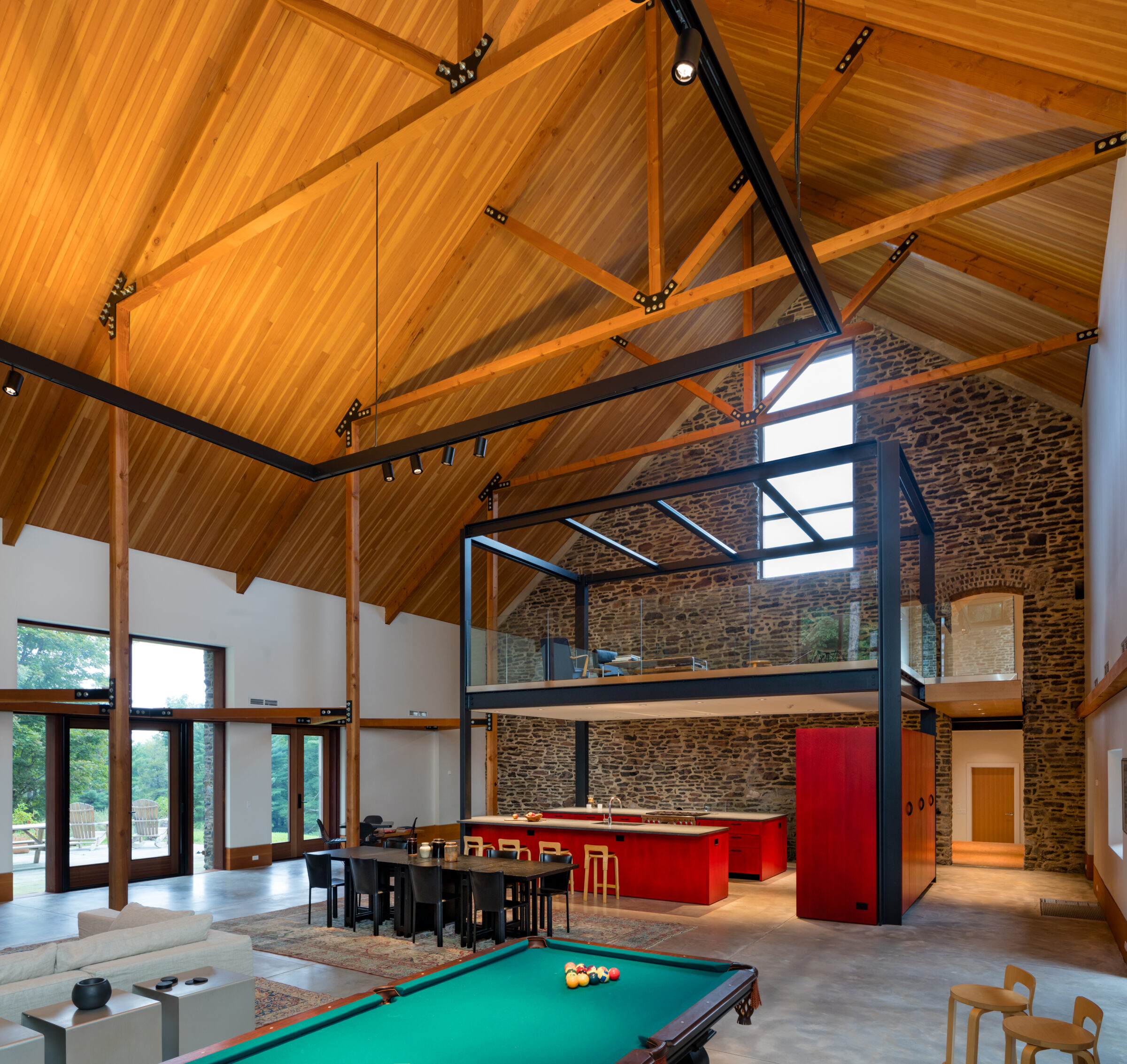
Traditional barns separated different functions into separate wings to allow for feeding, breeding and showing. In its new incarnation after the fire, Barn with Aedicule’s division of function persists but is now consistent with its new residential use.
Sleeping, living, playing; the layout of the original barn accommodates them all, ensuring privacy, ease of circulation and acoustic separation. The longest wing of the compound serves a dual purpose, with recreation spaces below and dormitories above. The main barn structure is transformed into a Great Room to host extended family gatherings.
A structural framing device that gives importance to its contents, a steel aedicule, inserted into this Great Room interior, houses a new kitchen with a library above.
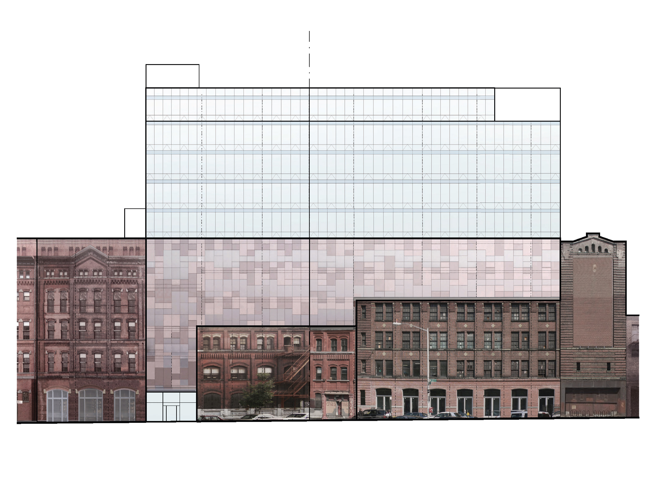
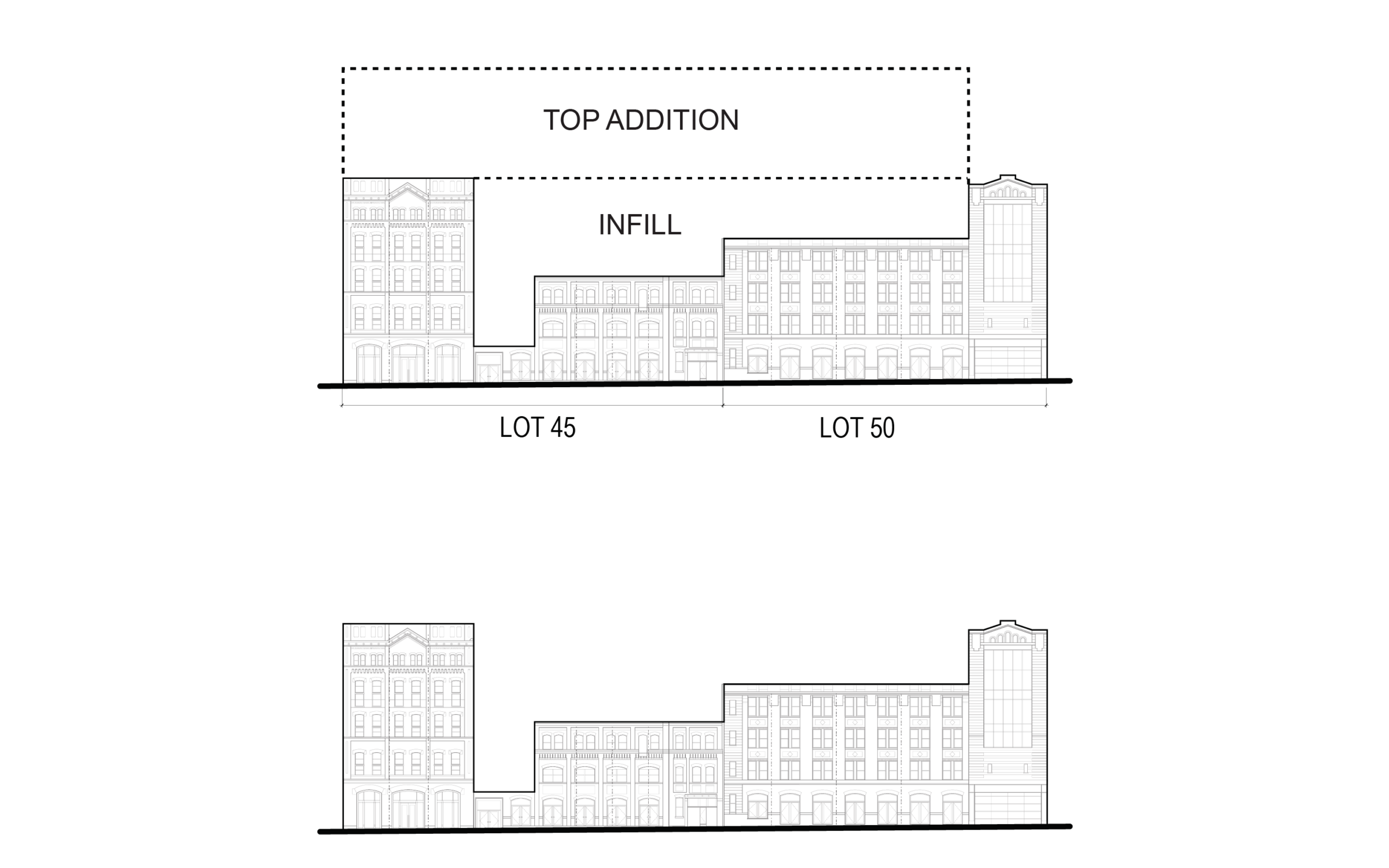
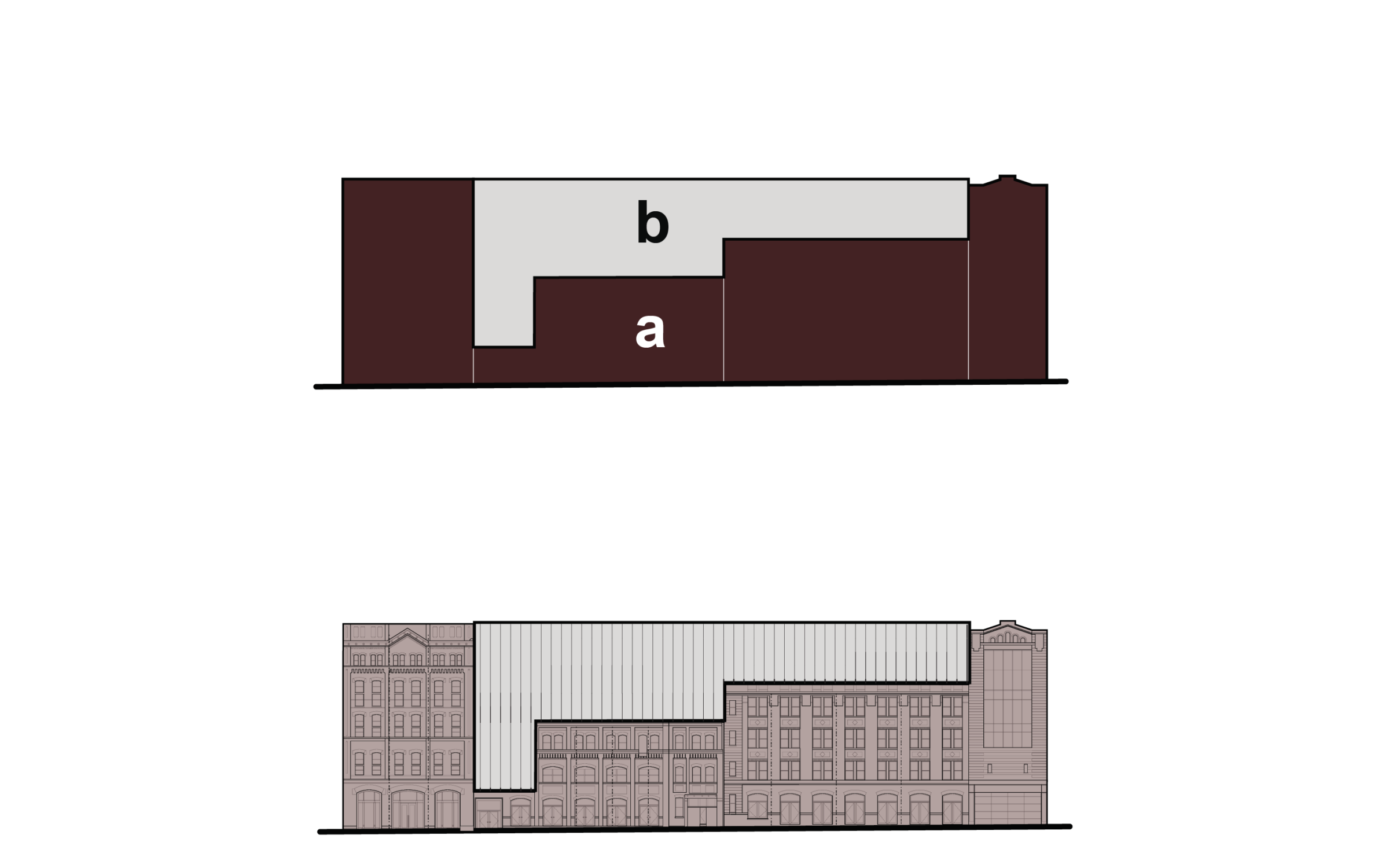
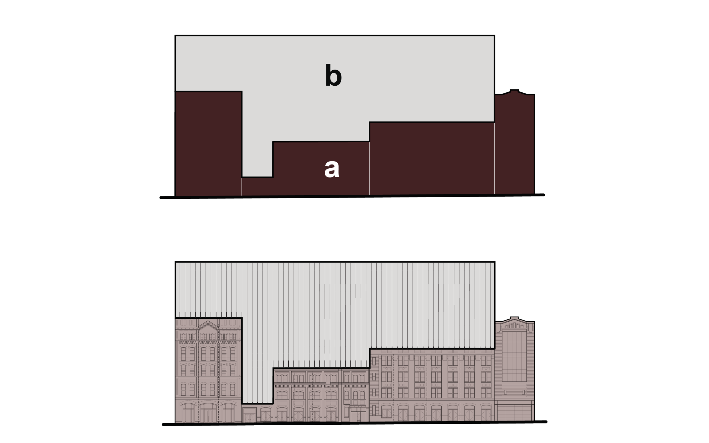
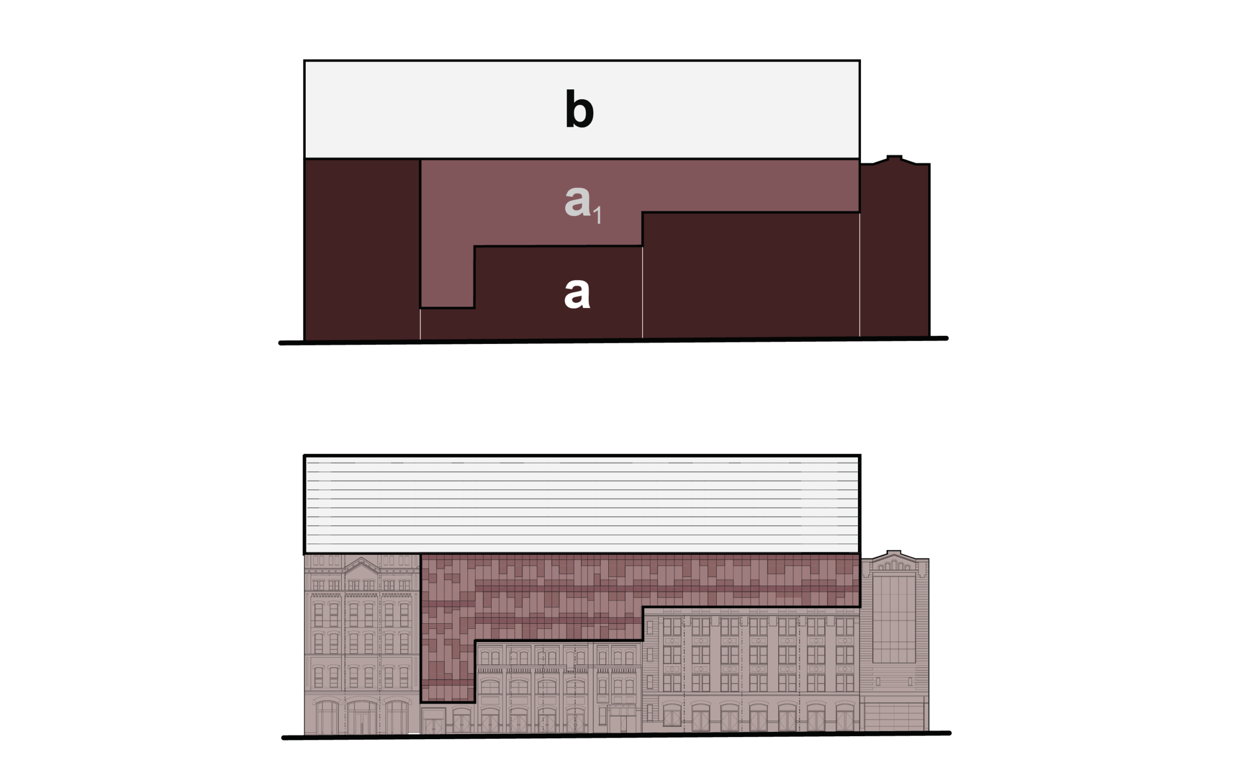
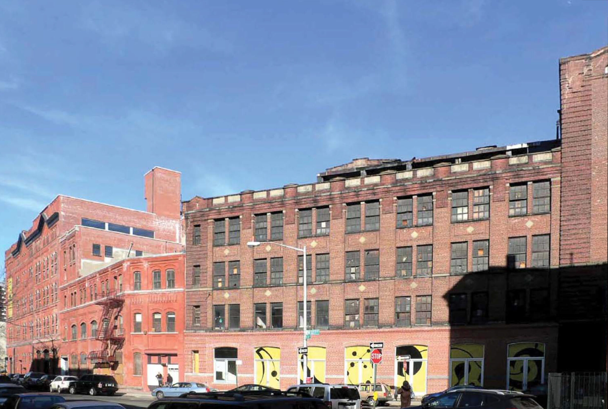
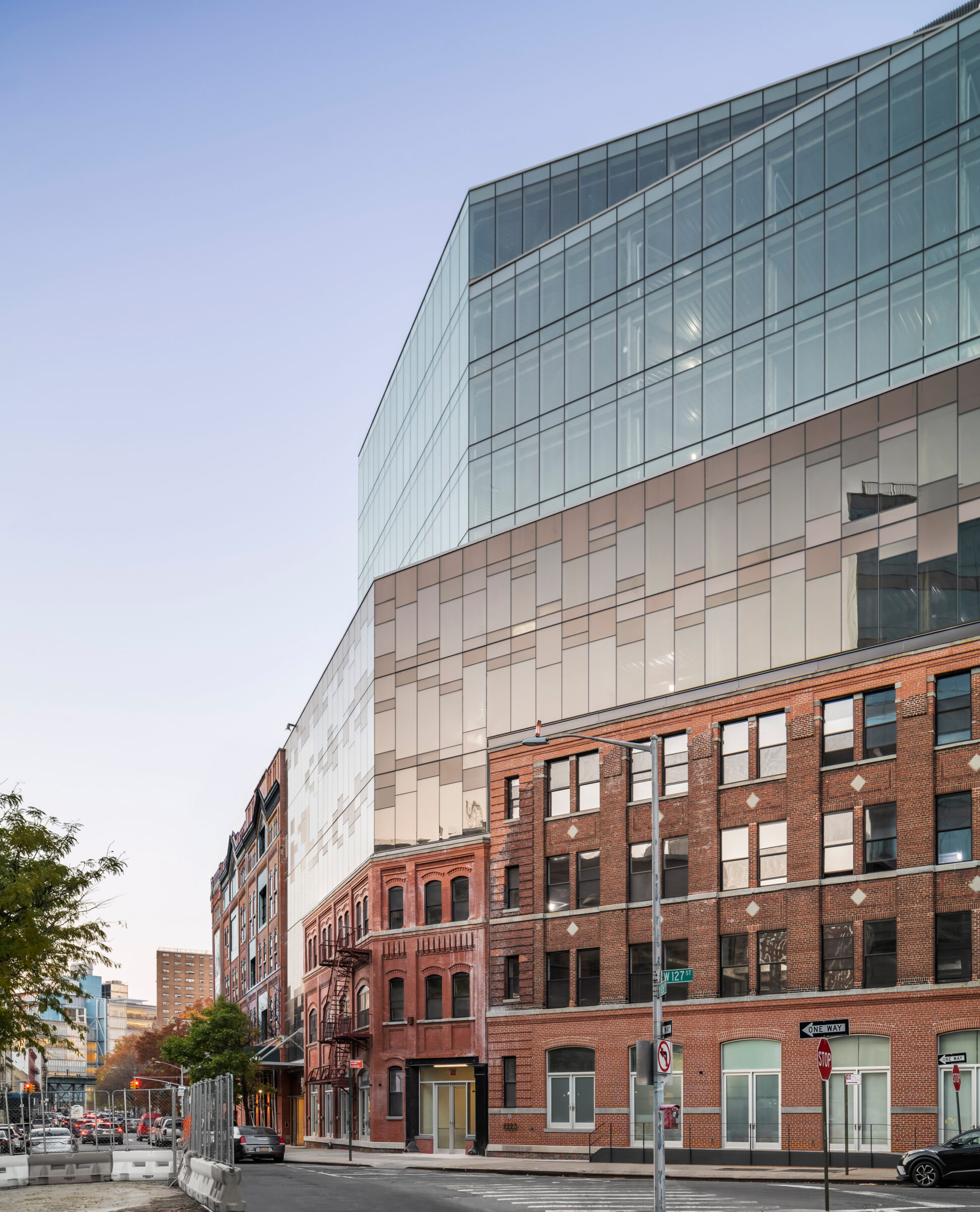
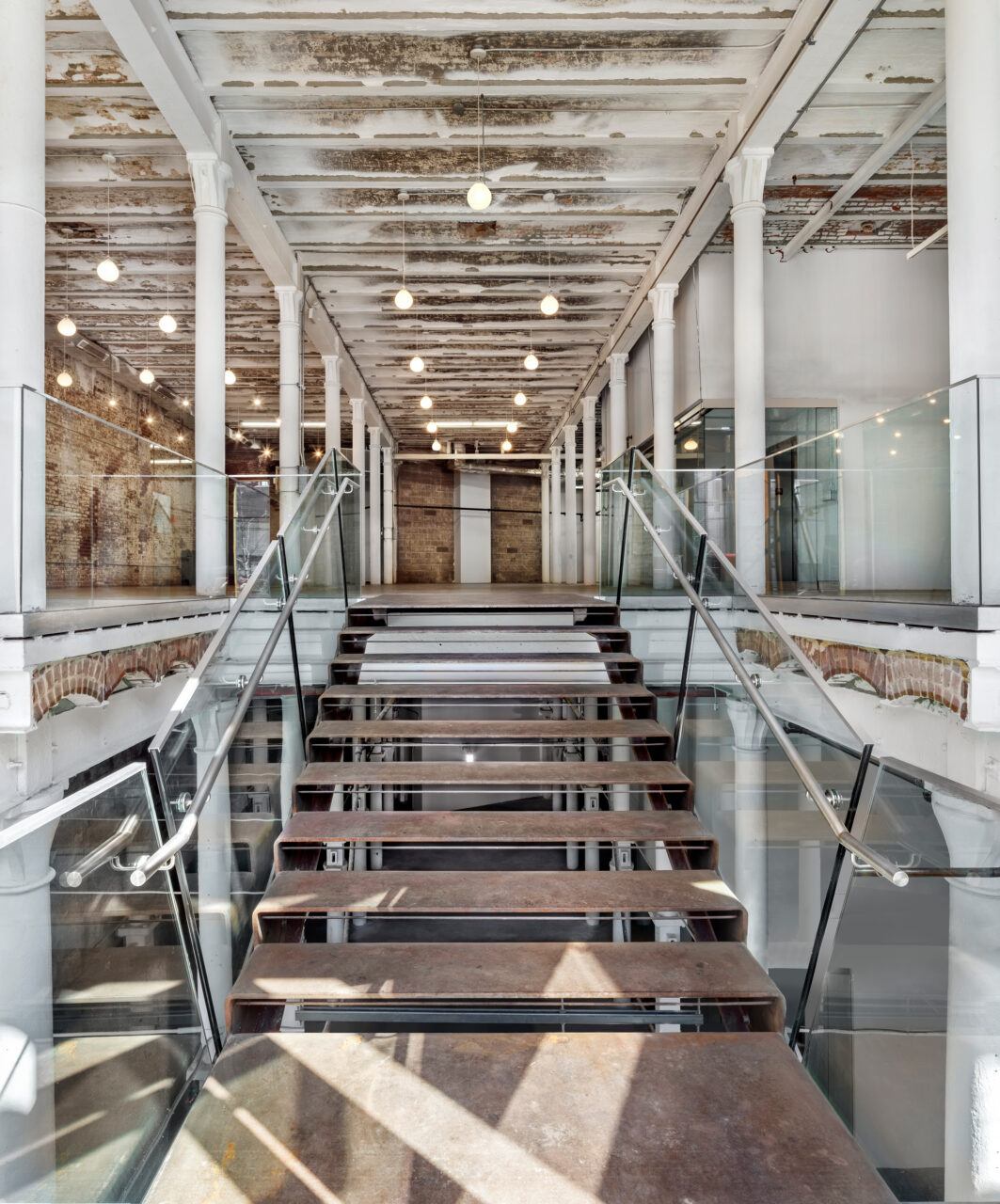
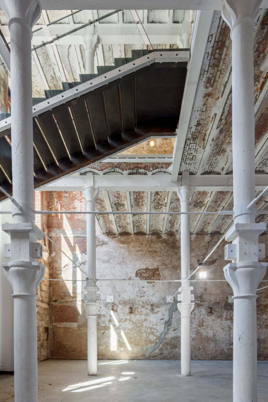
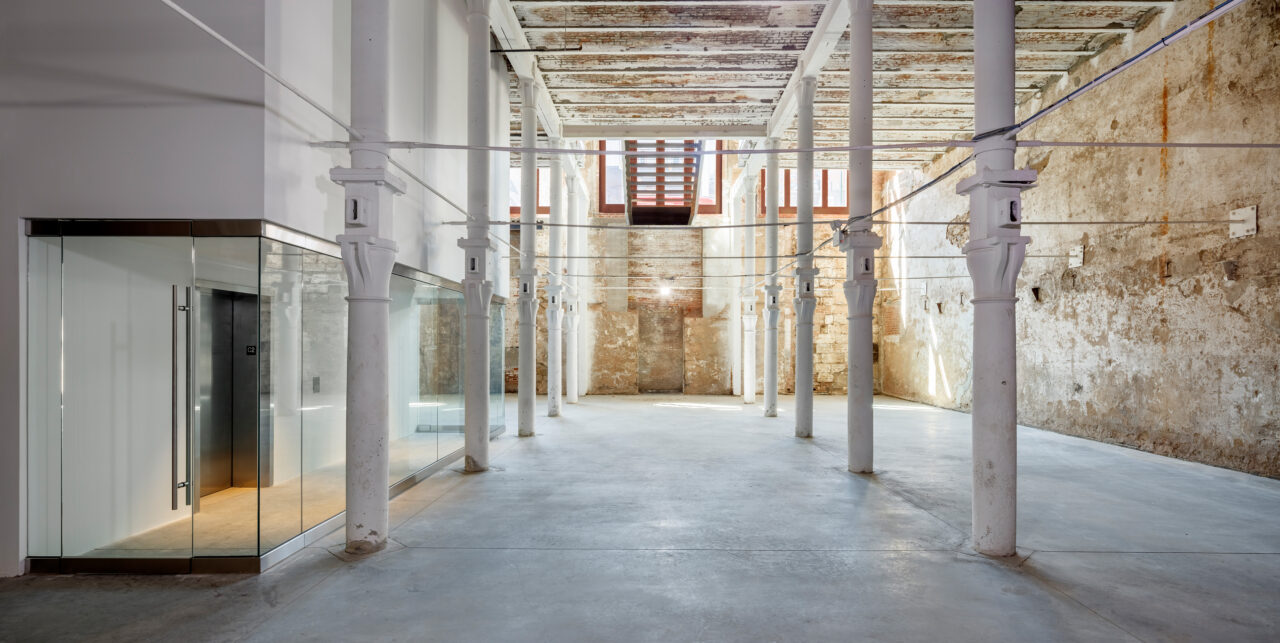
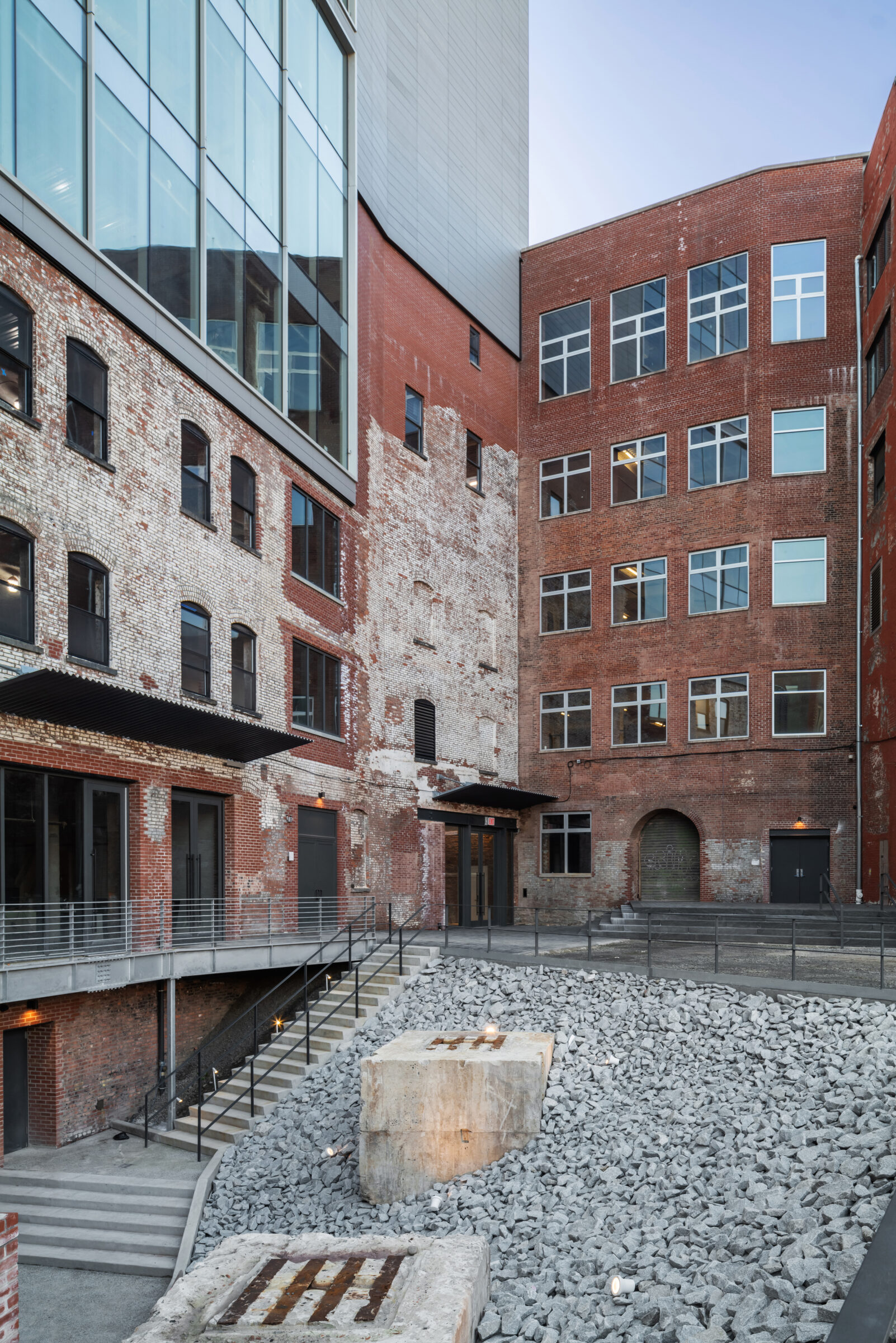
From the start, the intent for The Malt House was to restore, repair and reuse the old, while expressing the new as something different. The block, occupied by an early 20th-century brewery, was not designated by the NYC Landmarks Preservation Commission, so the main question was an architectural one: how to add and create something new while celebrating the historic nature of the old? The easiest approach would have been to demolish the existing building. But the old brick has a texture, a certain unquantifiable value—and a very quantifiable one in terms of embodied energy and carbon.
Bookended by two old structures and responding to the setback requirement, The Malt House completes the street wall, blending the existing brick with a unitized curtain wall. Matching the height of its pre-existing neighbors, the new glass façade clearly differentiates from the brick but maintains a similar tone and character with the rest of its surroundings: the rhythm of the new curtain wall acknowledges the composition of the existing façade; glass inside corners are reminiscent of brick inside corners; the use of four different tints of glass adds texture and detail while reducing the scale of the building’s base.
Inside, the old is left as raw as possible—the existing state of the building treated as a historic witness—while the new pieces are distinct and clearly delineated.
At the back, the contextual strategy was to blend old and new by creating a patchwork of pieces that embraces the original hodge podge. In a sentence: The Malt House reflects its context.
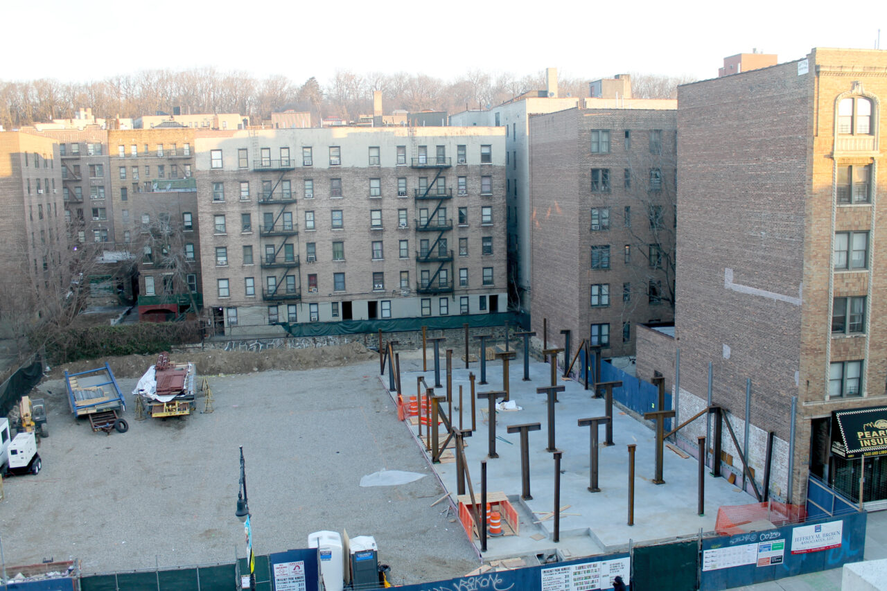
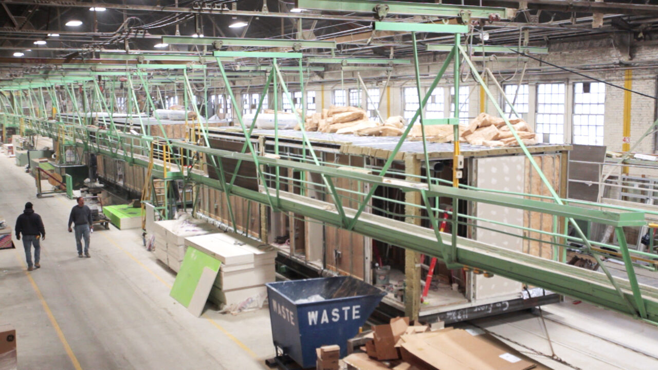
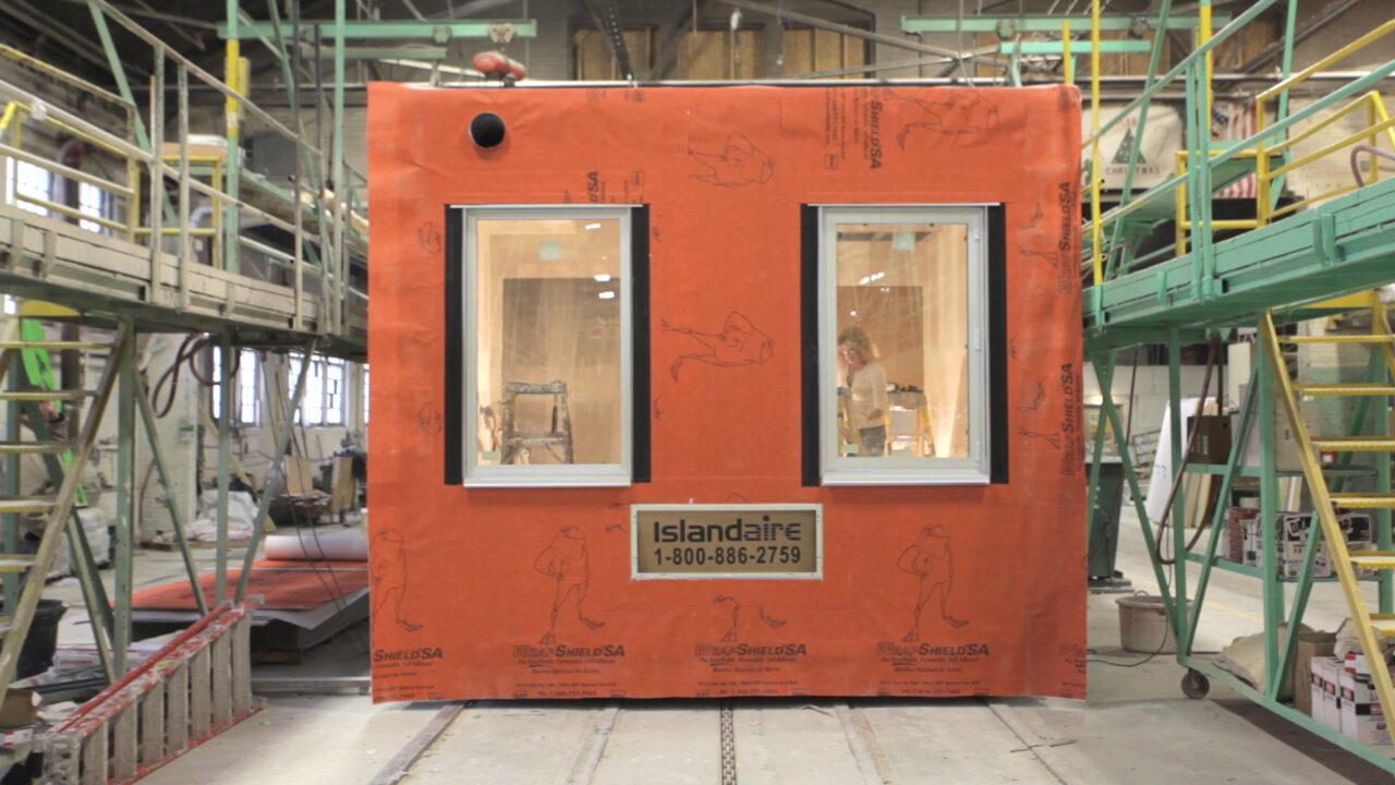
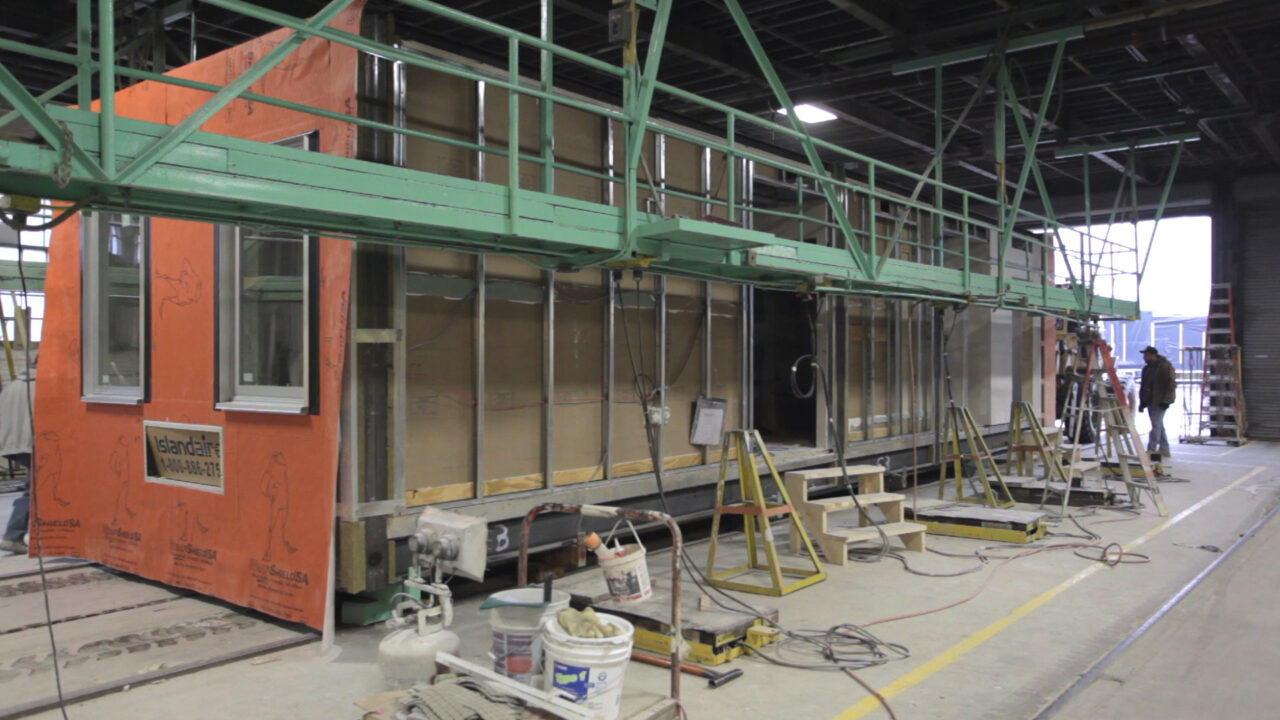
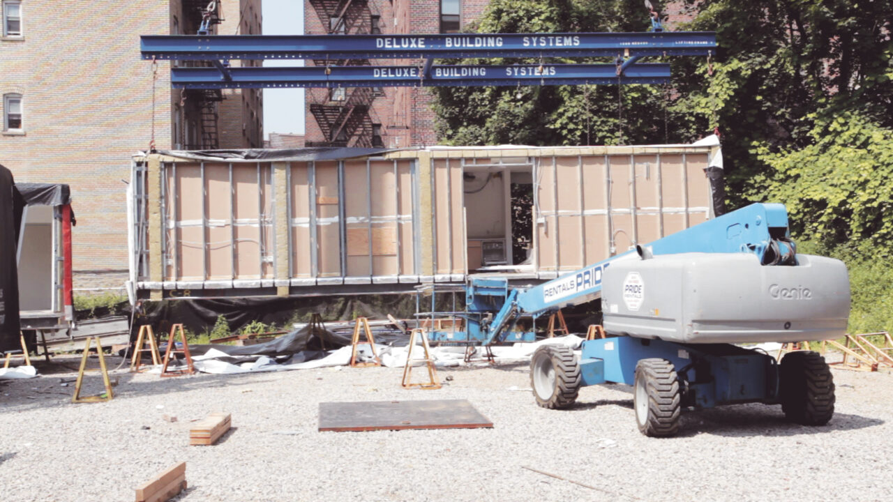
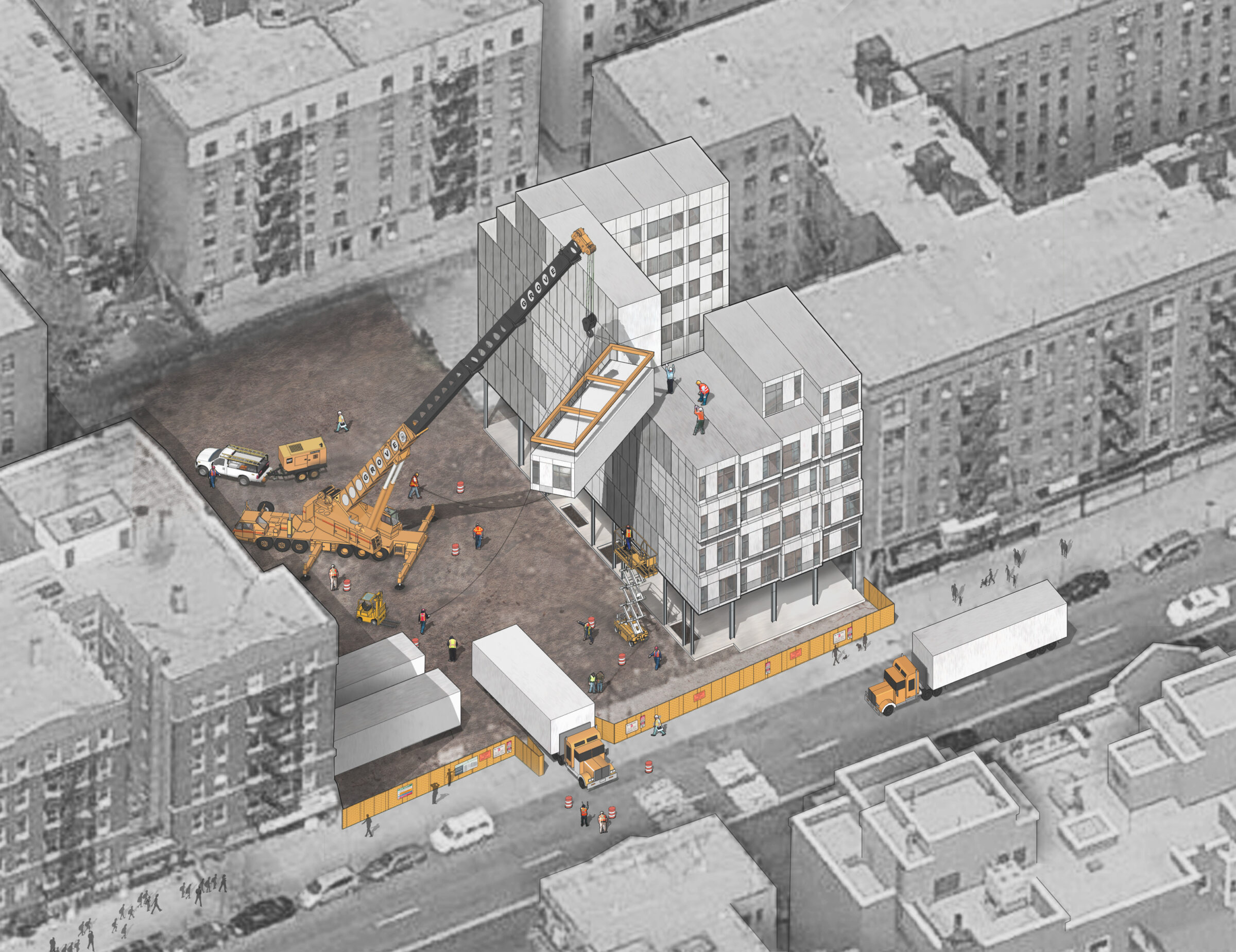
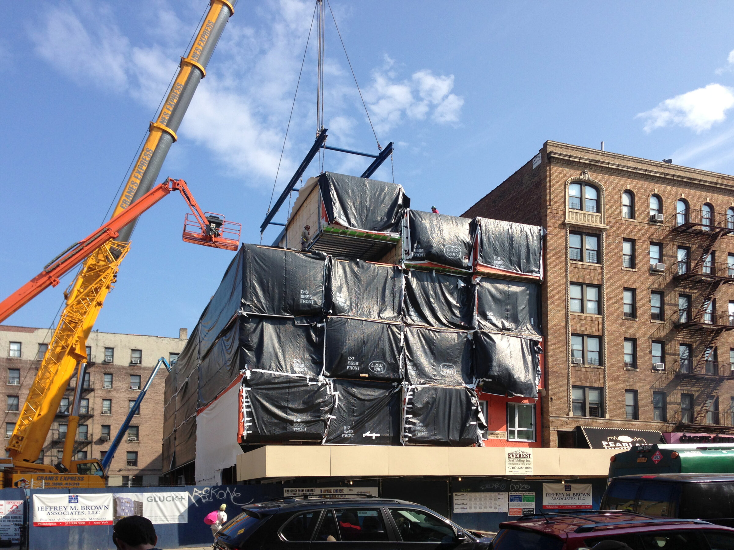
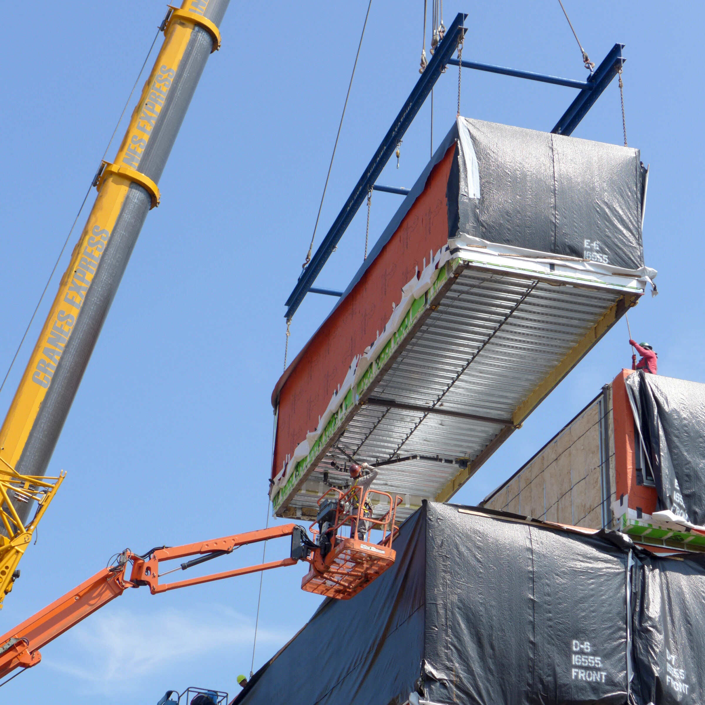
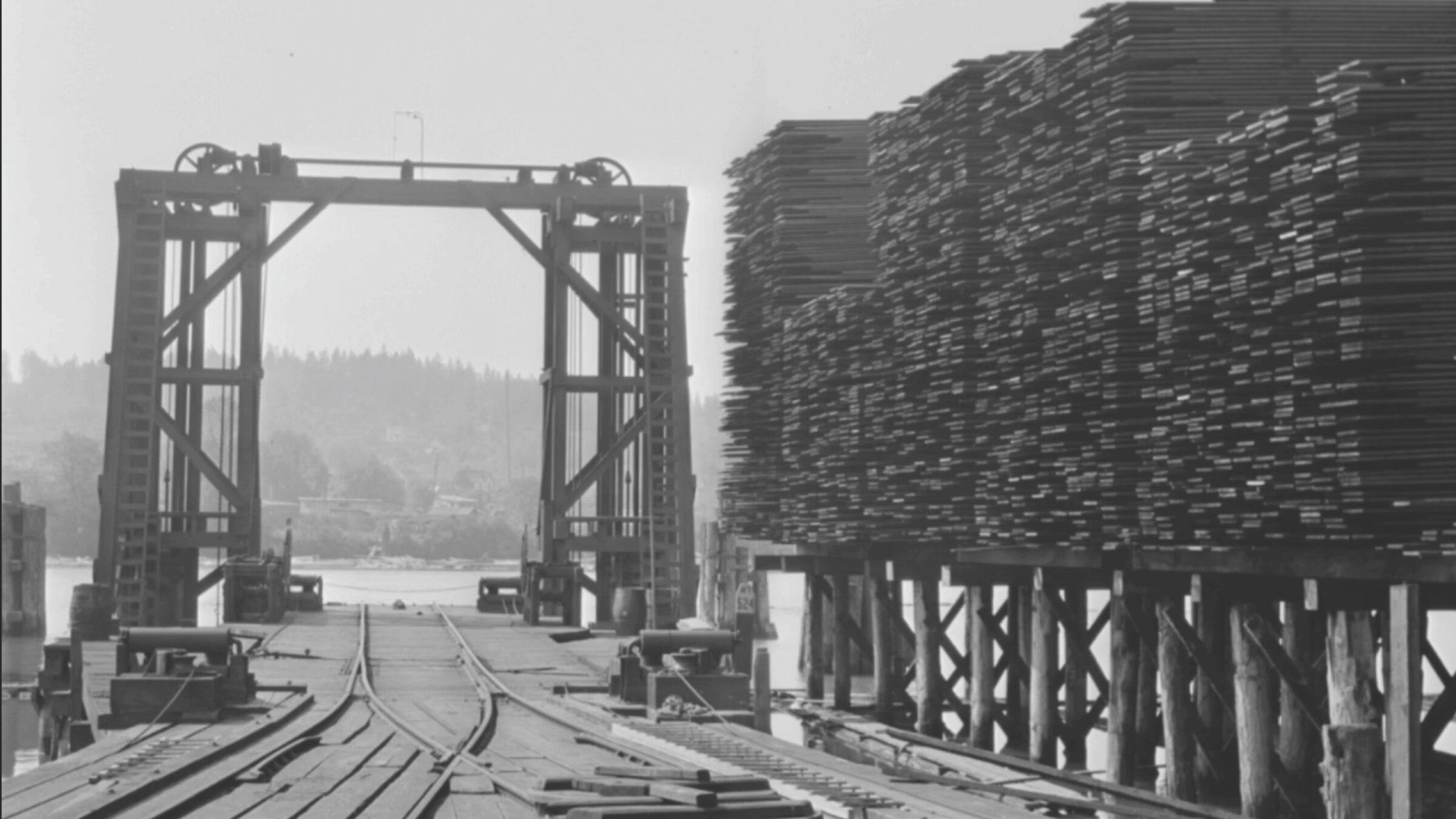
In cities like New York, where real estate is scarce and housing demand high, offsite construction offers a unique solution. By utilizing infill sites—small, vacant parcels of land that are typically difficult and costly to develop—this approach can creatively address the housing shortage.
As we were building 5,000 square feet of infrastructure and foundations on site, a 28,000-square-foot, six-story building was being completed in the factory, where construction workers worked in dry, warm, optimal conditions. The two components, on-site and off-site construction, came together in a four-week installation period. This approach reduced time and site supervision, significantly lowering the overall project cost and enabling the building to generate income sooner.
Another bonus of offsite construction is that it greatly reduces the period of disruption to the neighborhood. Street closures, parking impacts, sidewalk re-routing, scaffolding and street bridge erection—all are minimized to the benefit of everyone who lives and works in the vicinity. Offsite construction is also more sustainable, as it makes waste management and recycling easier.
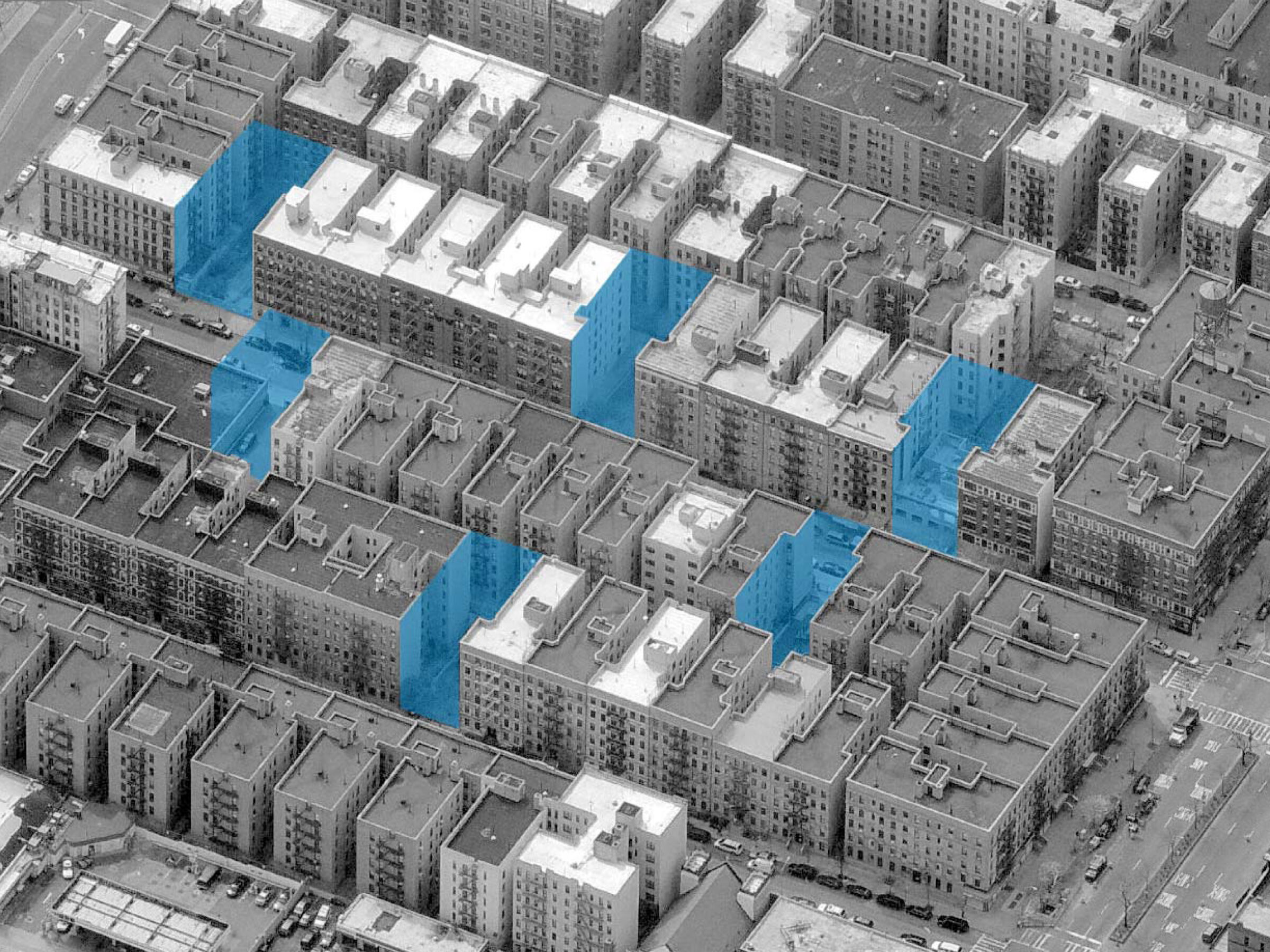
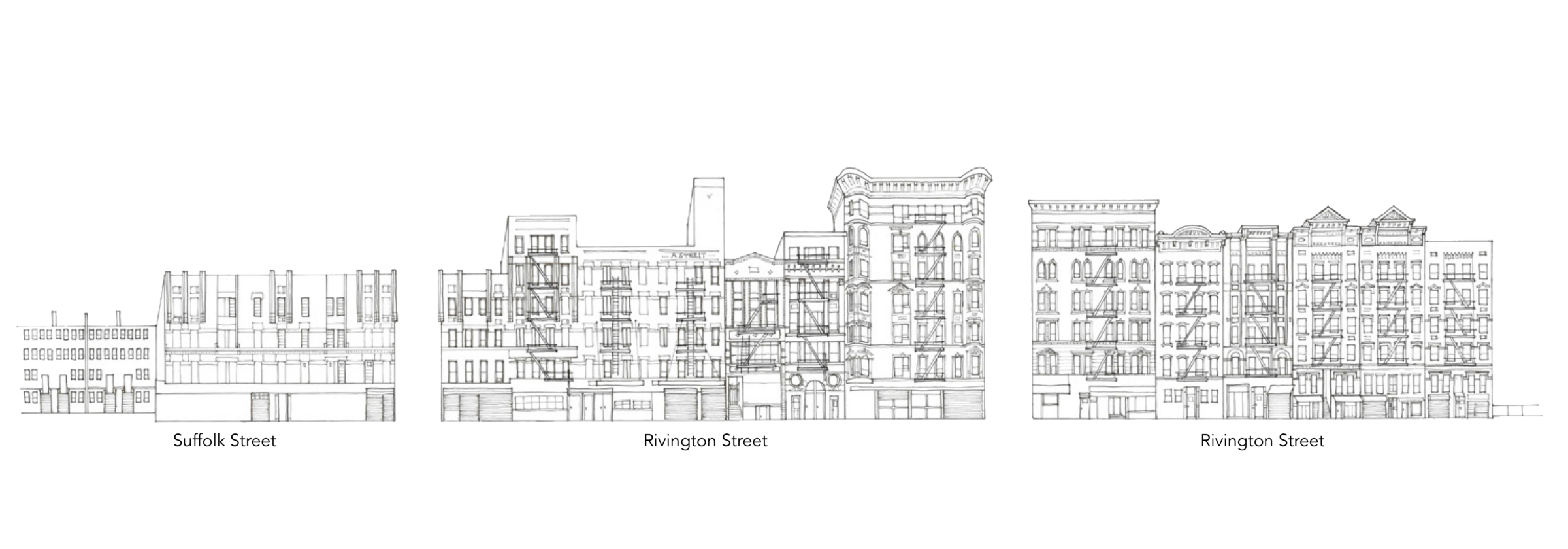
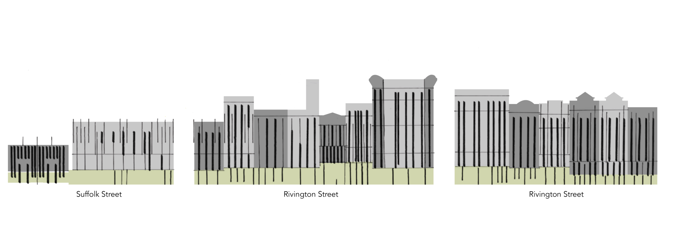
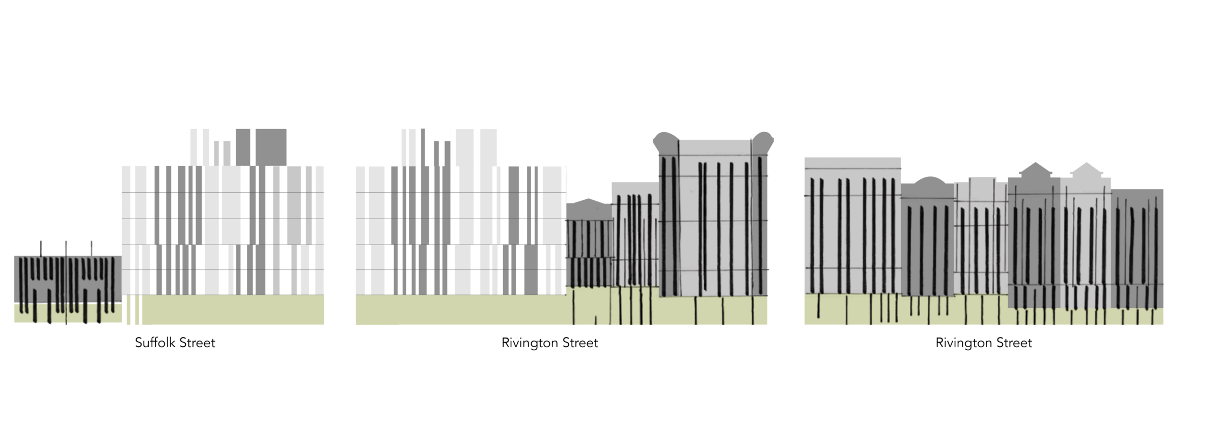
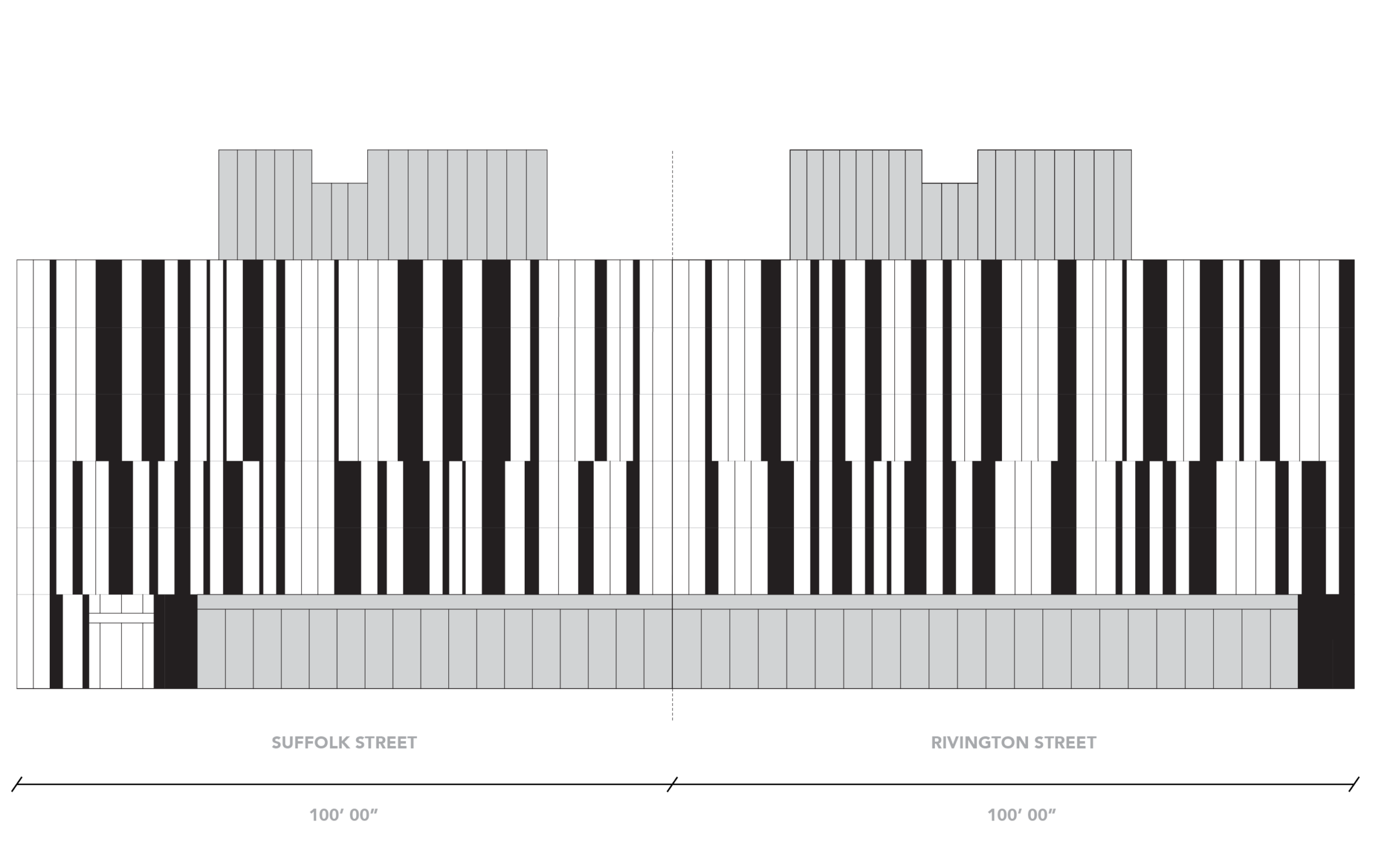
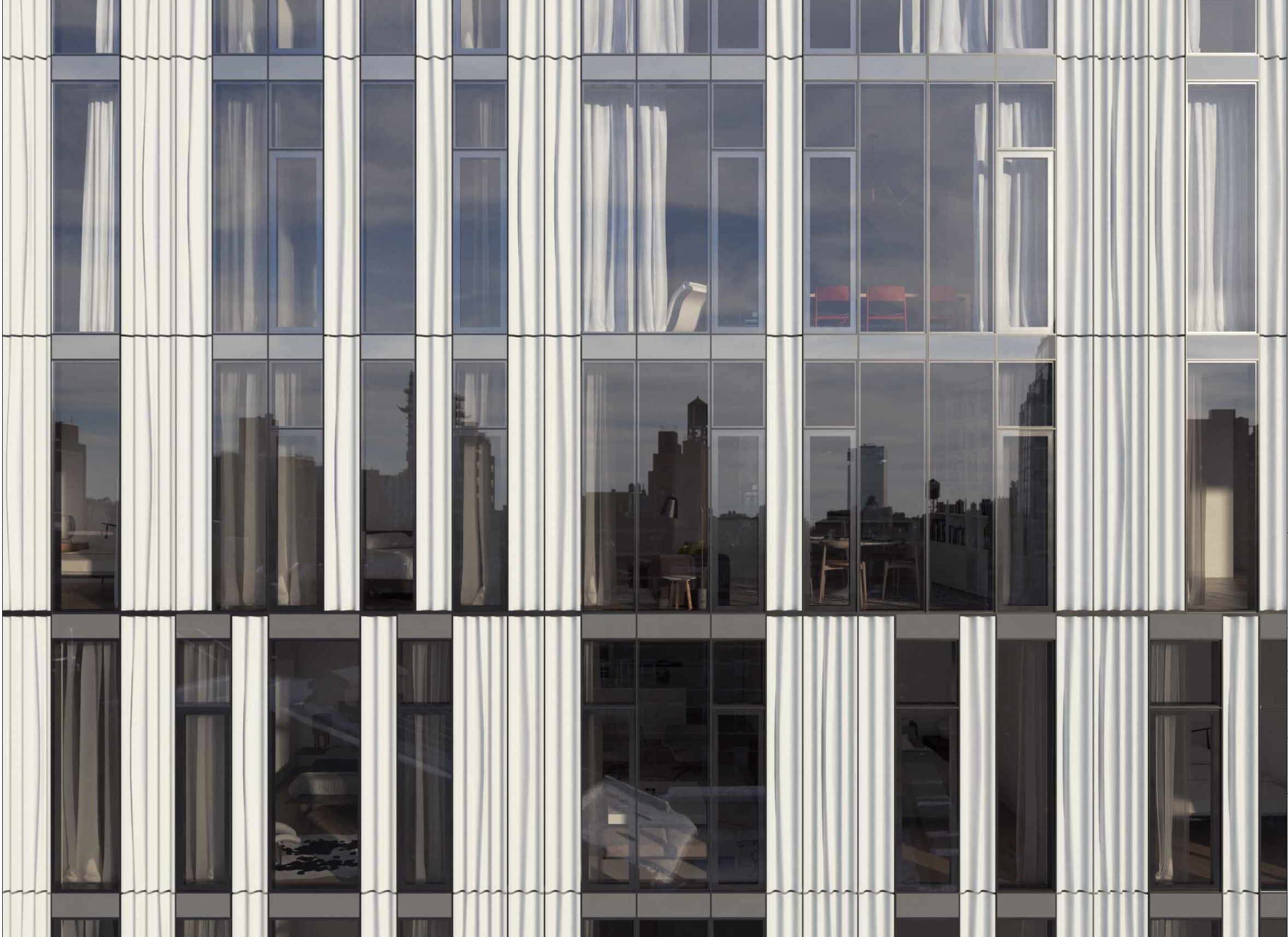
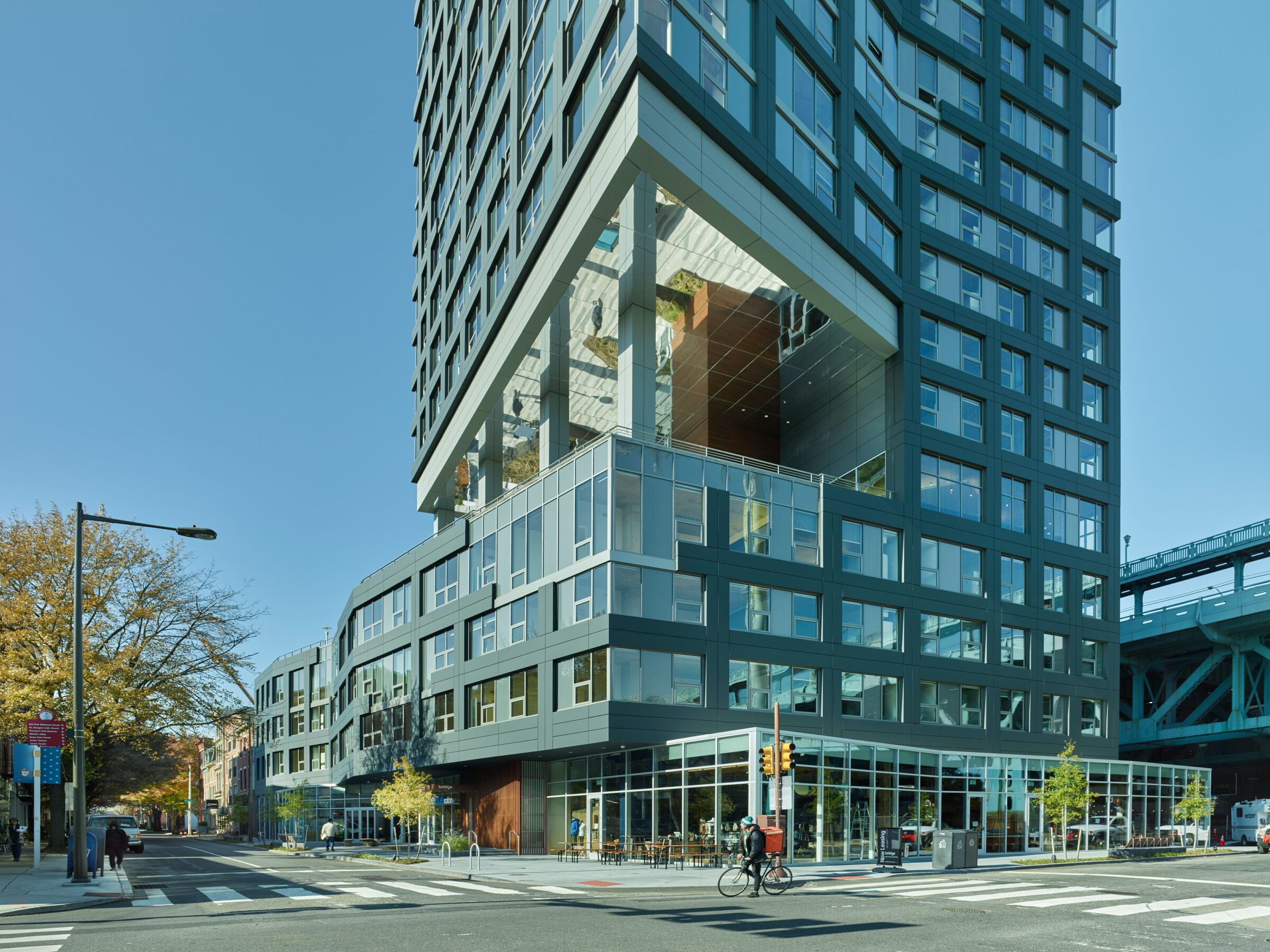
Some neighborhoods in New York City, brownstone neighborhoods, for instance, are likely to maintain a certain uniformity, they tend to be more or less the same. But in the Lower East Side, buildings go up and down, in and out. They are designed in diverse styles and serve diverse uses—the eclectic nature of the Lower East Side’s building stock cannot be ignored. 150 Rivington embraces these conditions and finds a language to express the vitality of its context.
Mediating the desire for openness and views and the domestic need for enclosure and protection, the team explored patterns of open and closed sections, akin to keys on a piano. Apartments in the building do not always align from floor to floor, so when programmatic elements were mapped onto the façade, unexpected patterns began to appear, breaking down the vertical sections and helping to scale down an otherwise monolithic facade.
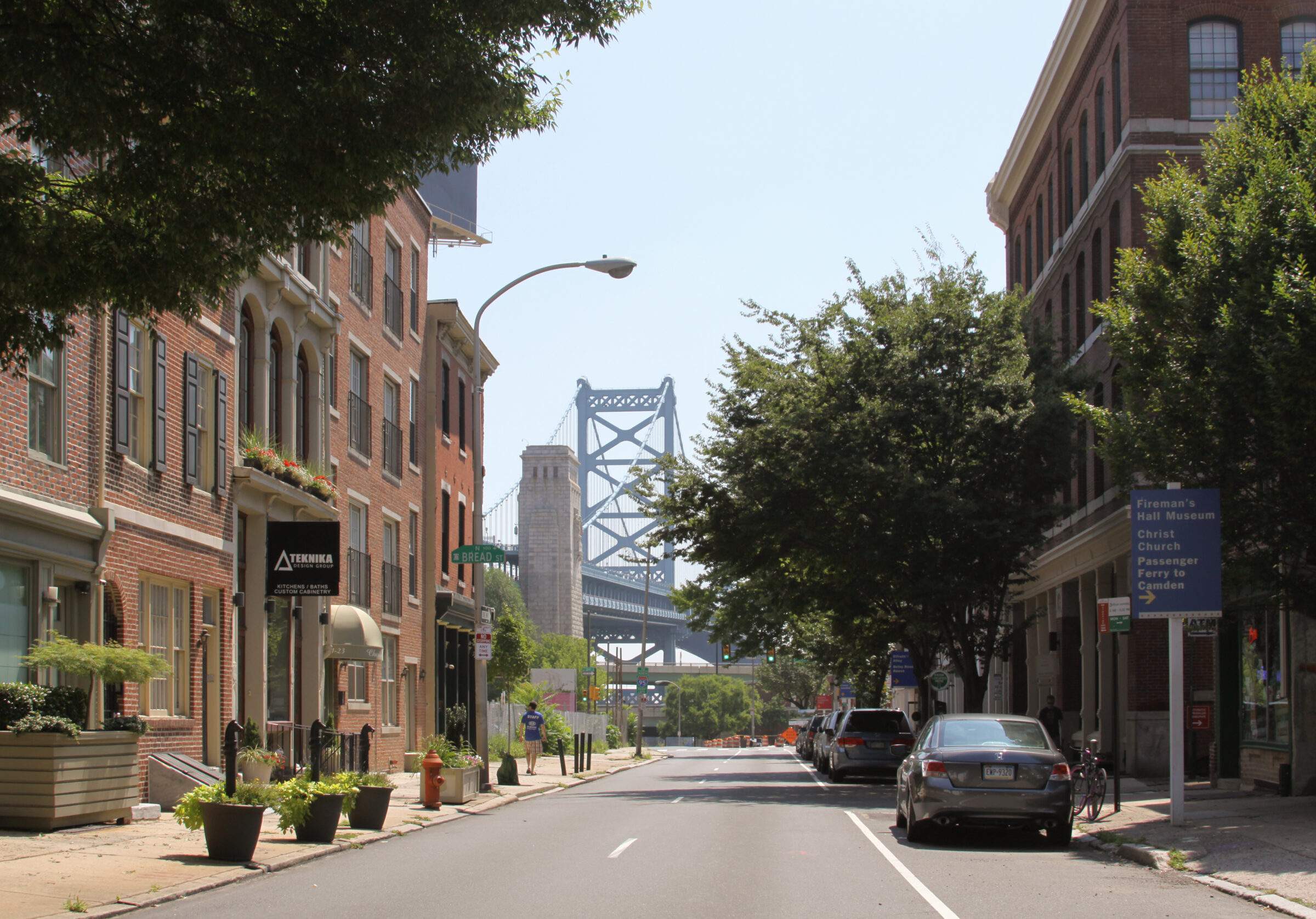
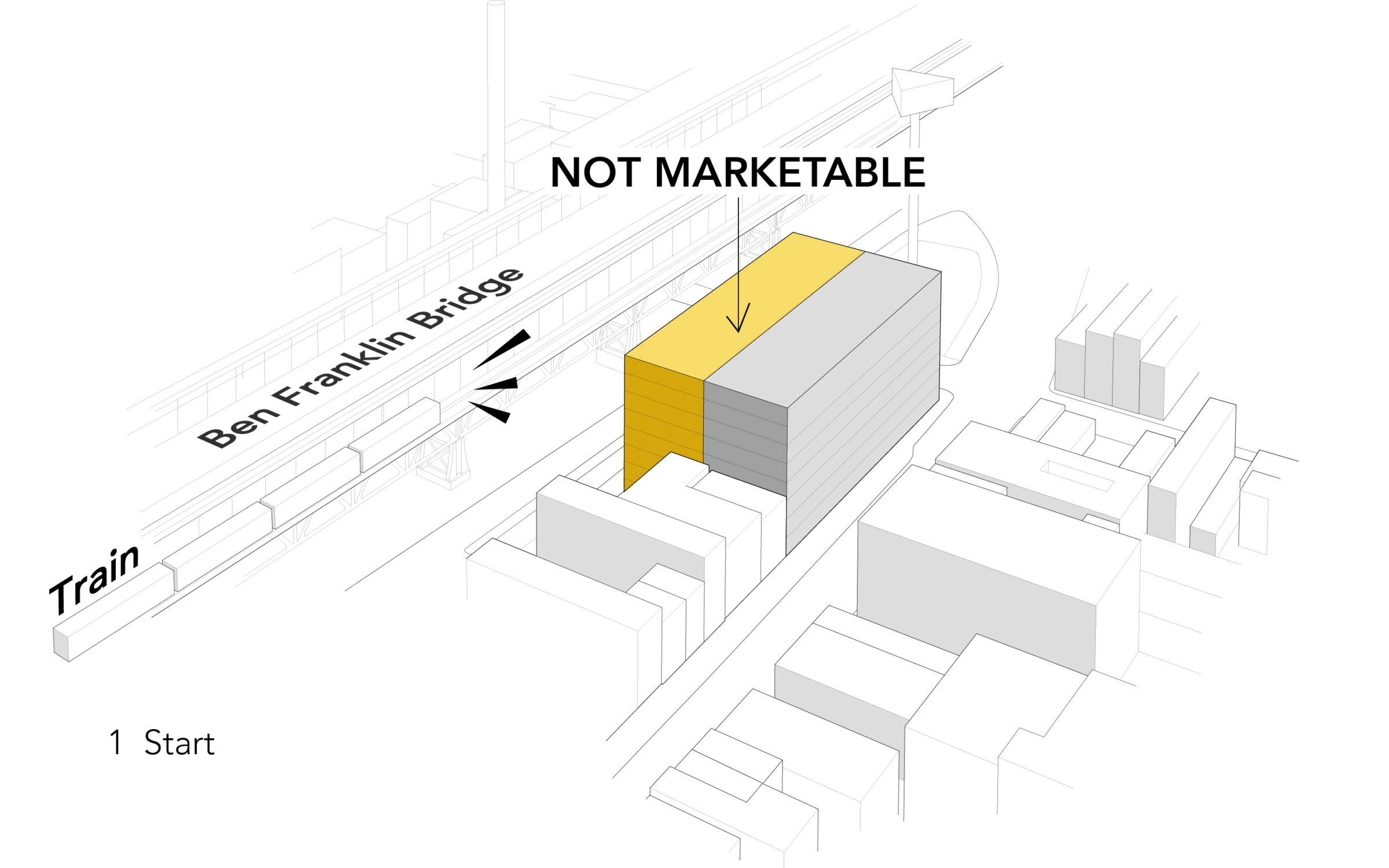
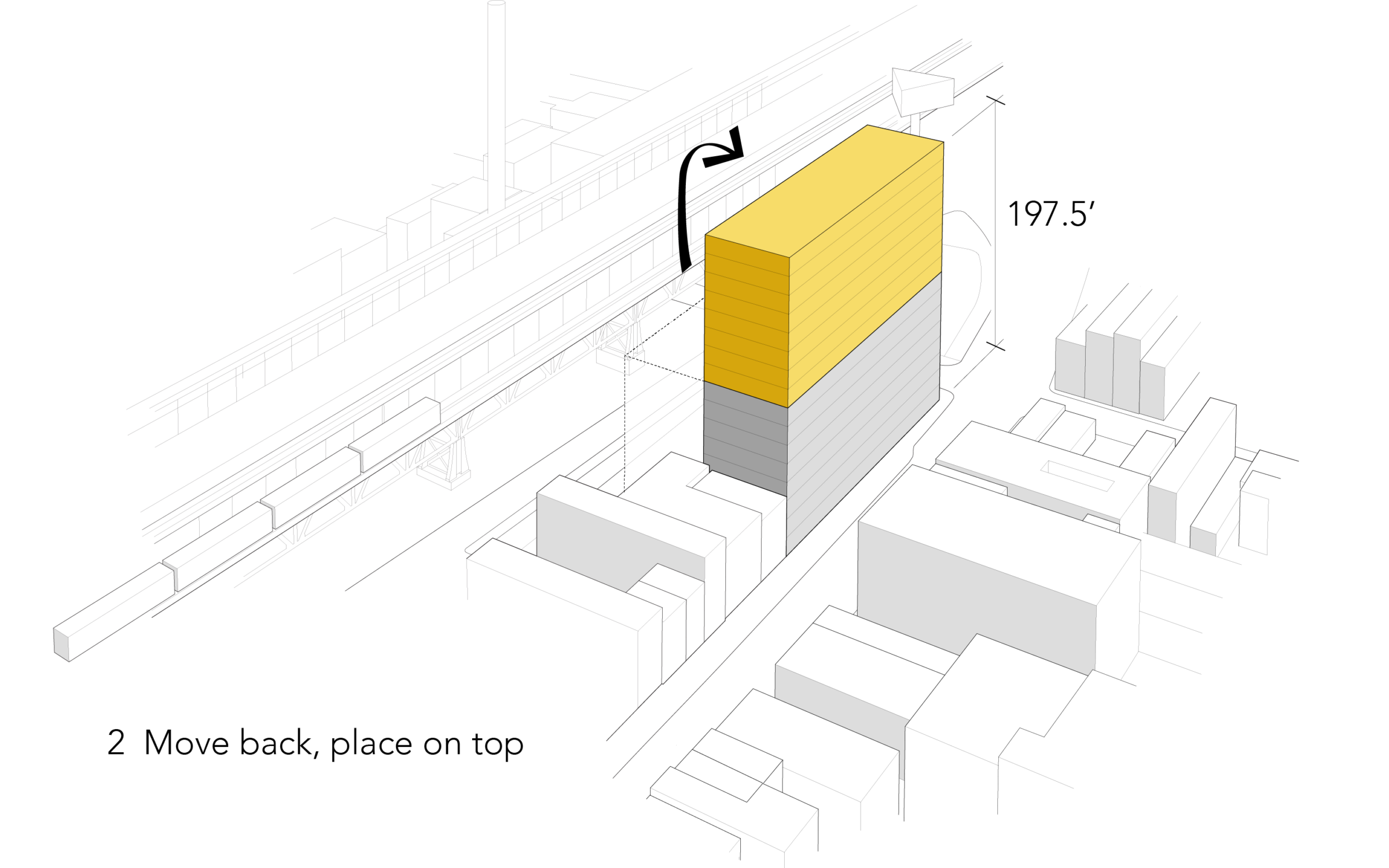
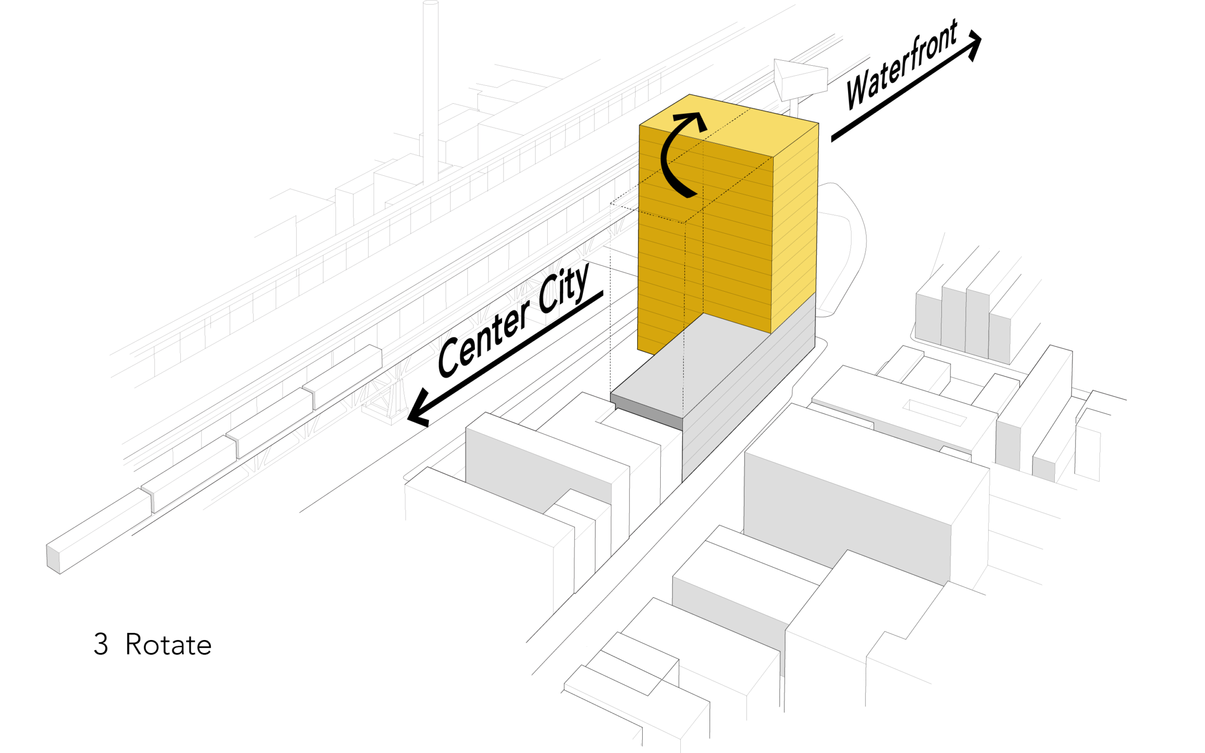
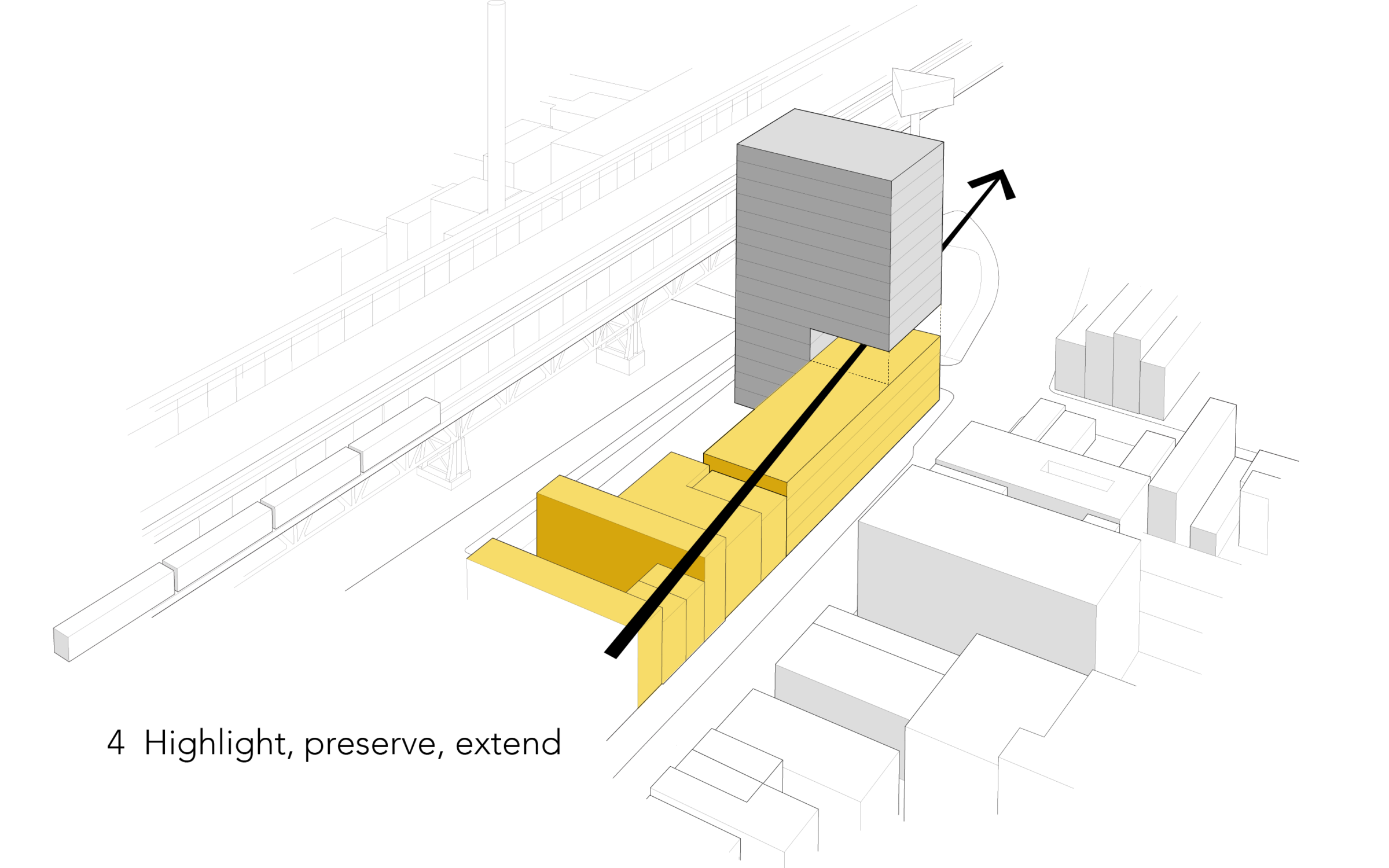
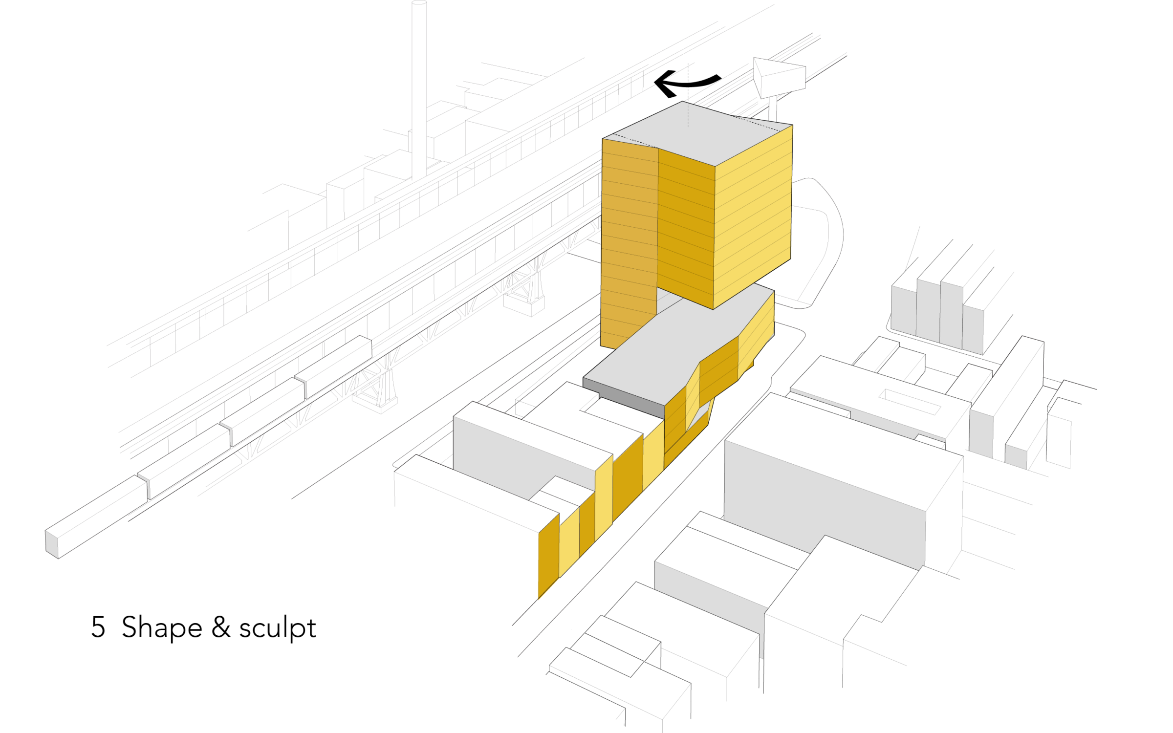
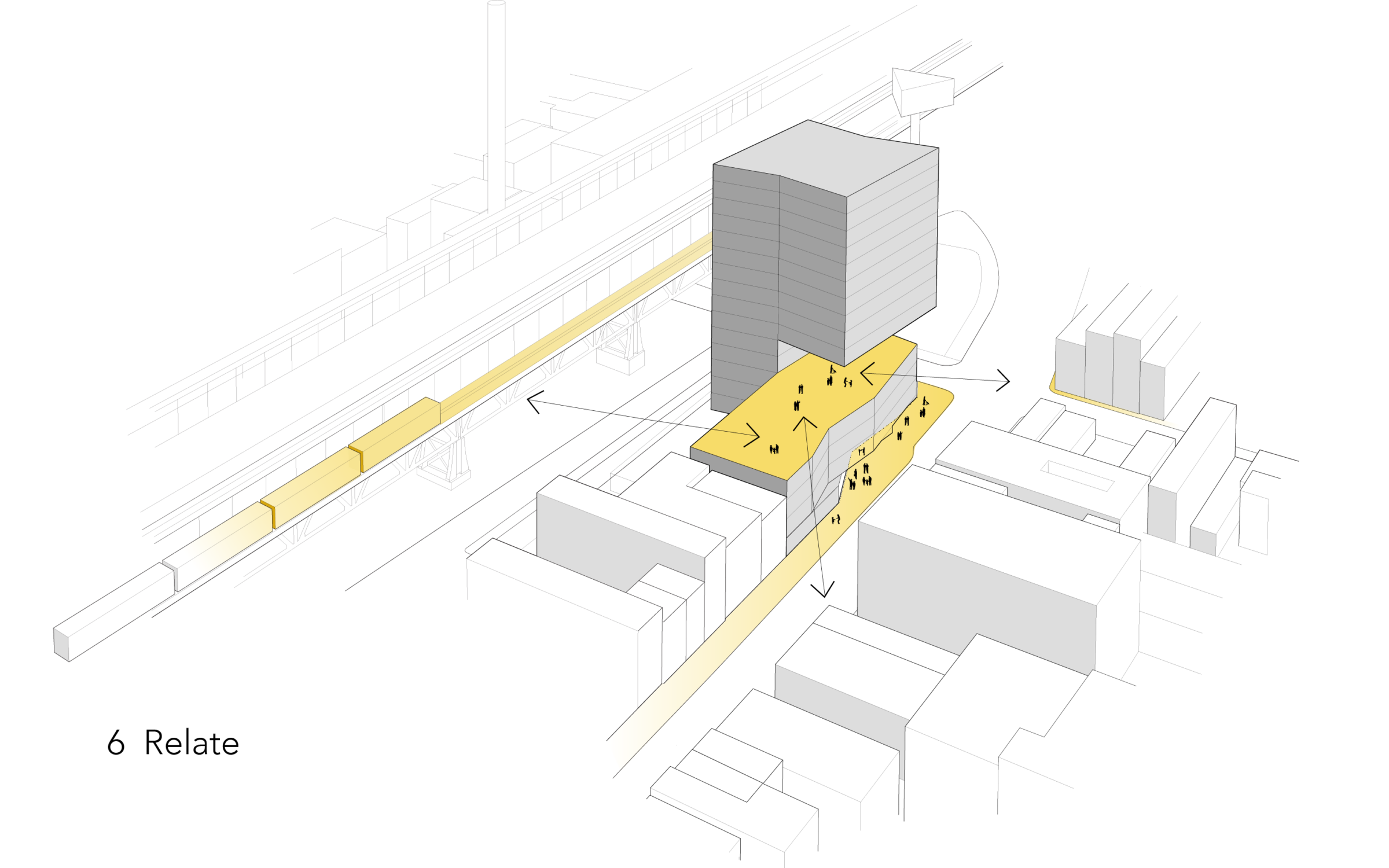
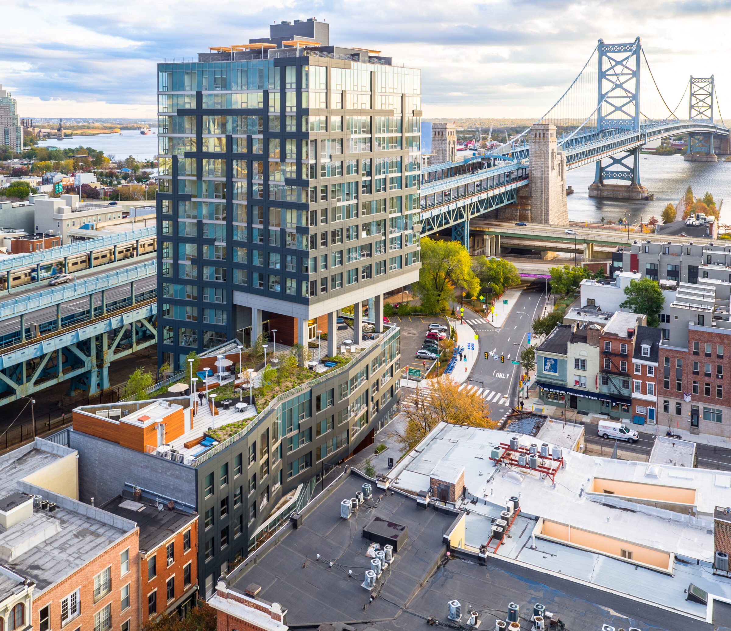
Bridge – 205 Race addresses a critical issue faced by most cities in the United States. Located on the edge of Philadelphia’s Old City, where some of the country’s oldest urban fabric stands side by side with the Ben Franklin Bridge (an epitome of 20th-century industrial infrastructure), the project sits at a unique crossroads. As productive and recreational activities make a comeback to Philly’s waterfront and Center City, new development and changing demographics demand housing and commercial accommodations, reviving a preference for living downtown.
Although zoning allows for a building close to the bridge, it is not marketable for housing. The design stacks that portion of the building on top, away from the bridge. When rotated, it optimizes views of the city and the waterfront. A notch in the tower extends the street wall and preserves the view of the bridge. By reinterpreting and extending the façade rhythm and proportion of historic adjacent rowhouses, the four-story podium integrates with the neighborhood. The sculpted tower negotiates height, density, speed, and views of the Delaware River, becoming an architectural expression of its time, relating to the historic fabric of the street and the bridge.
The entire 5th floor is dedicated to residential amenity spaces, including an expansive 8,000-square-foot outdoor terrace with visual connections to the pedestrian promenade of the Ben Franklin Bridge and downtown Philly. From the street-level retail below, a mirrored soffit reflects views of the activity on the common roof terrace, inviting the city into the building.
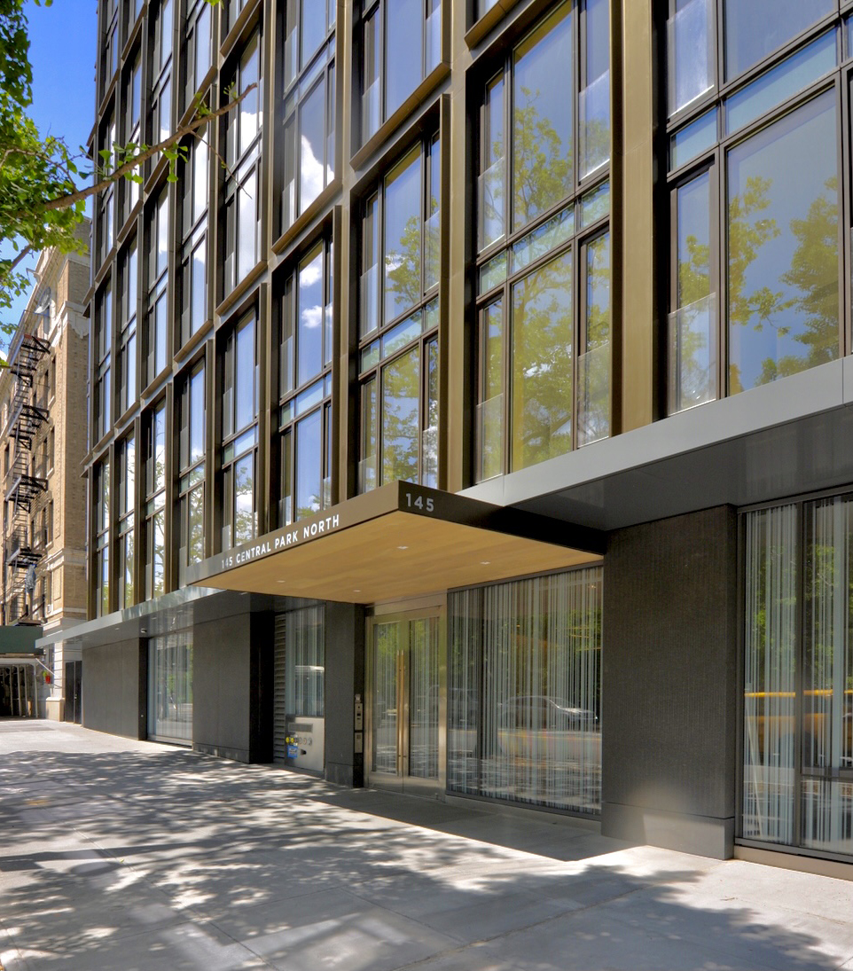
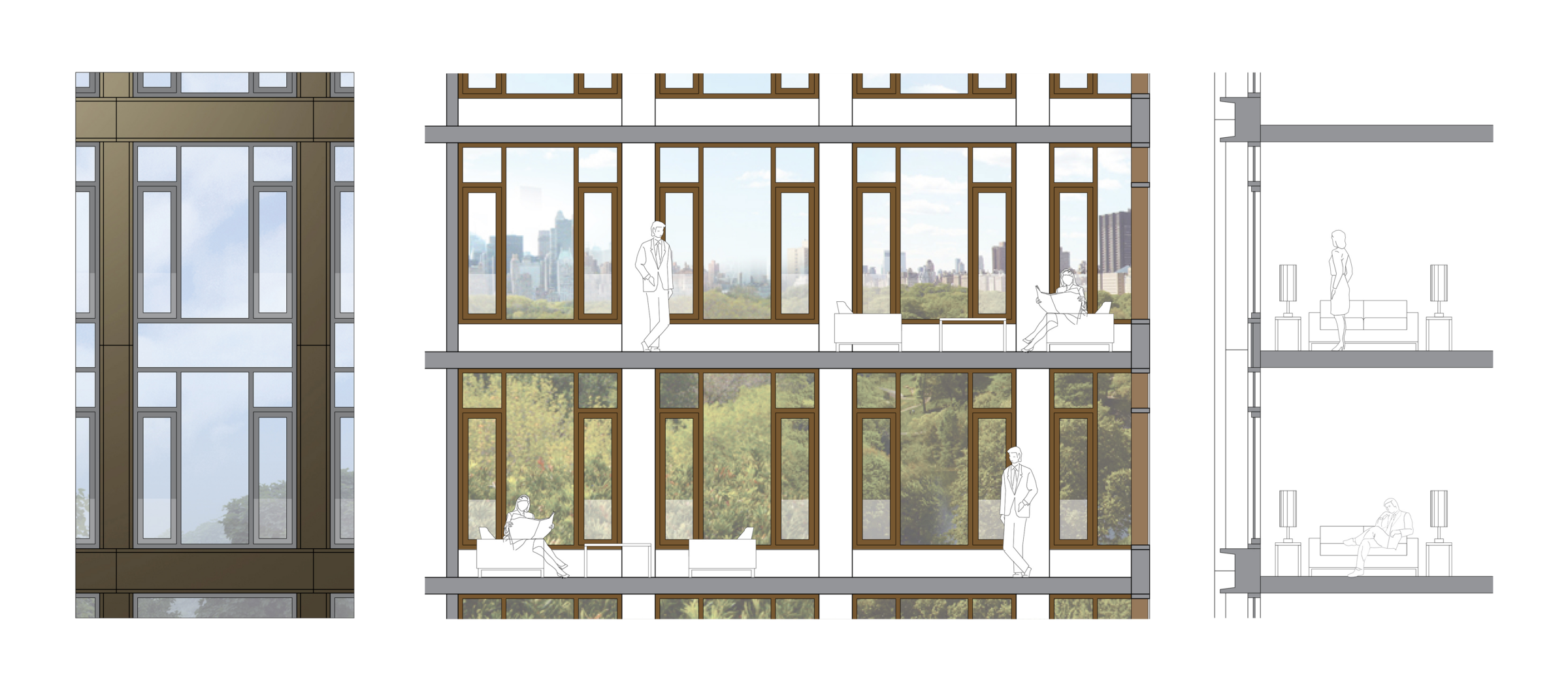
Location is the most important aspect driving the design of 145 CPN. The building is on Central Park North, one of its four defining facades. The goal of the project was to complete the parkwall while maintaining the scale and character of the neighborhood. To do so, it was important to articulate the three portions of the building—its base, middle, and top.
The base relates to the rusticated historic buildings by segmenting the ground floor façade into stone and glass panels. The rhythm of these elements and the height of the floating canopy further articulate the experience of passing by pedestrians.
Above the canopy and up to the eighth floor, which coincides with the first zoning setback, the middle portion of the building incorporates deep bronze profiles, each covering two floors: instead of eight stories, this section of the façade expresses only four horizontal divisions towards the street—an implied cornise line, directly relating with the scale of the neighboring buildings. Finally, the top, taller than the adjacent structures, becomes abstract and reflective, almost disappearing as it recedes in height.
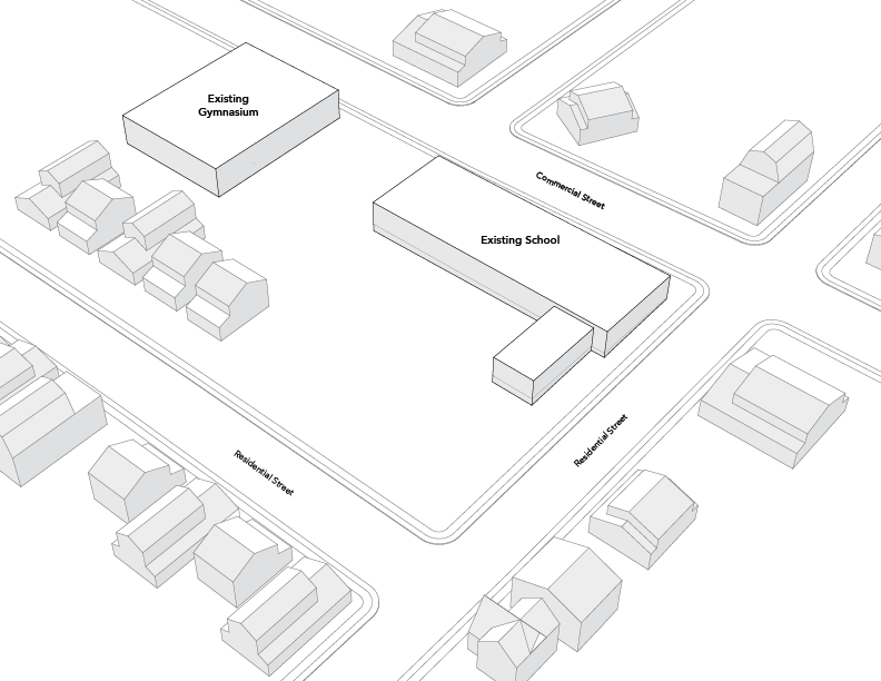
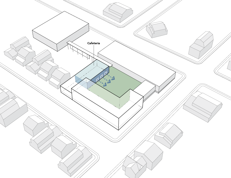
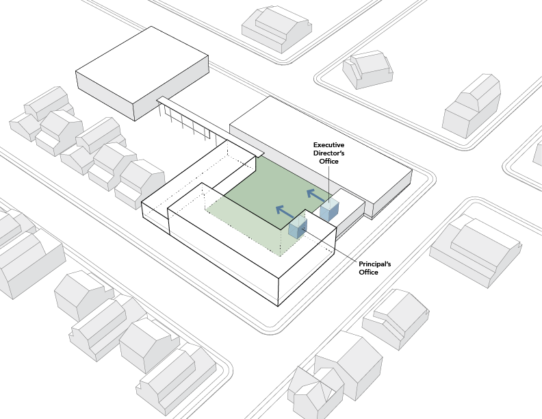
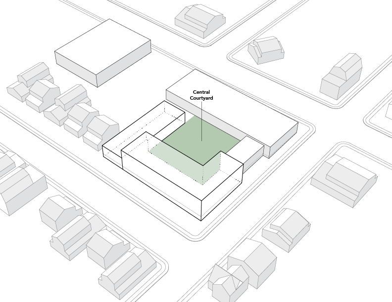
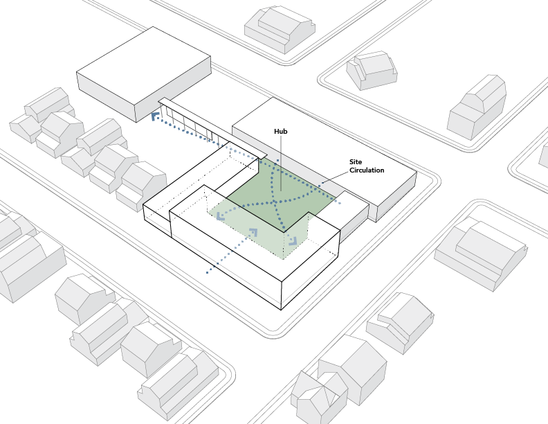
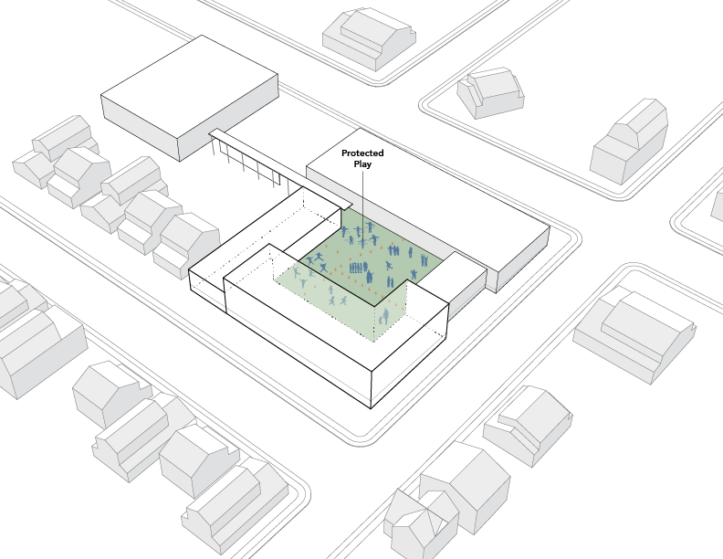
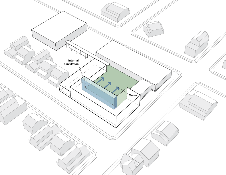
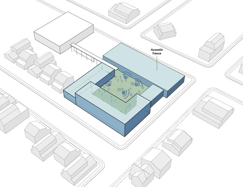
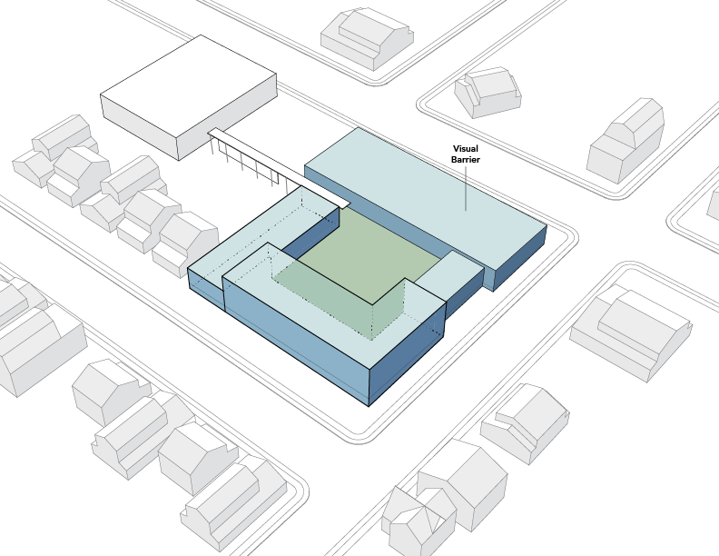
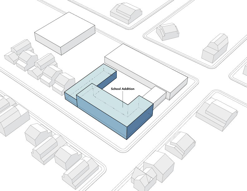
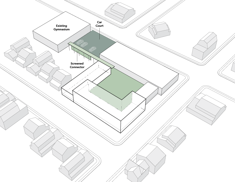
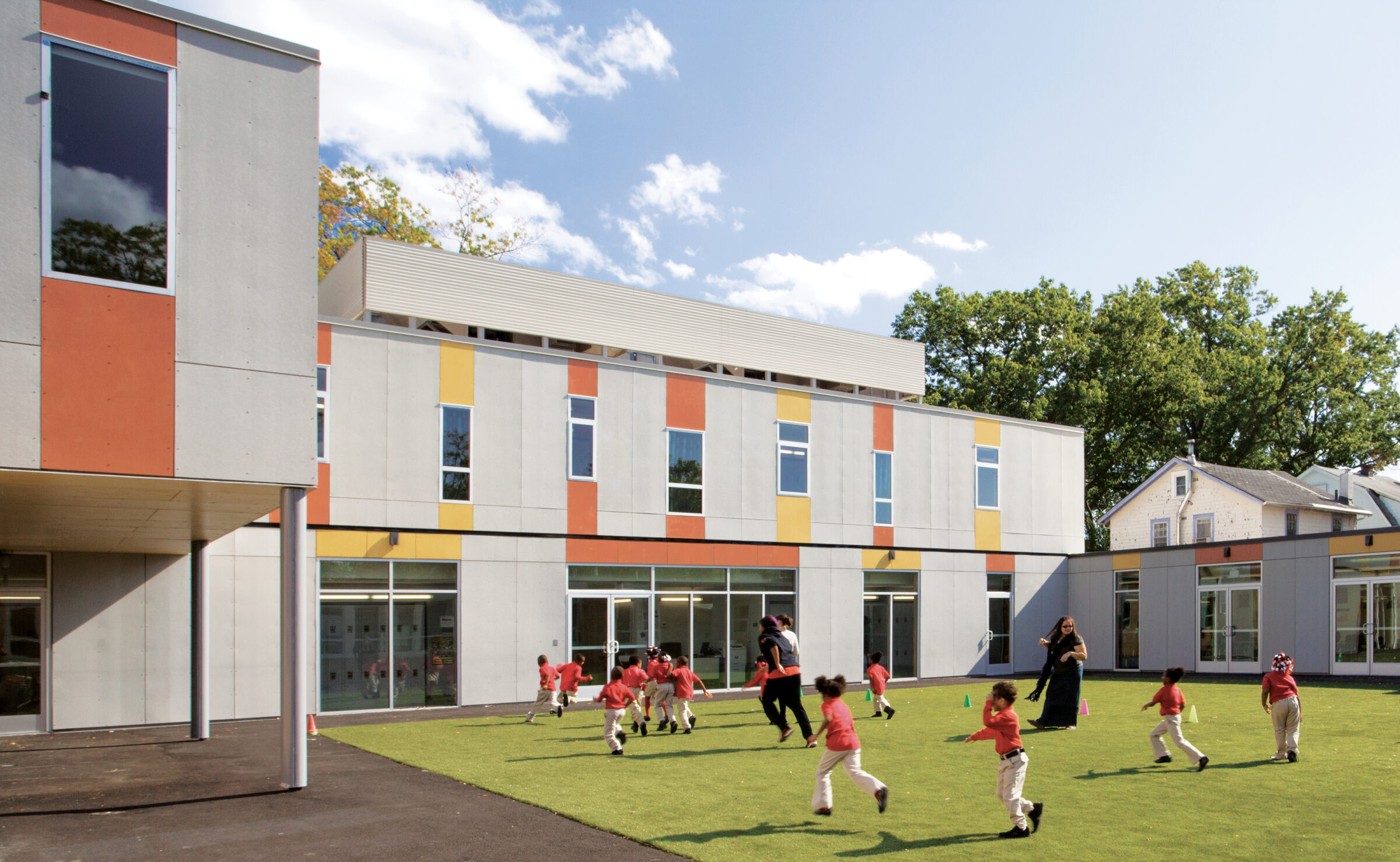
Located between a busy commercial street and a residential suburban neighborhood, the existing buildings —including an underused 1950s Ukrainian church school— accommodate Lady Liberty’s lower grade classrooms and a separate gym. To house the middle school, we designed a new, three-sided volume that wraps round the existing structures. This move created a central courtyard around which the whole community could organize, creating many opportunities, solving many school-specific issues and giving the place its unique identity.
The building itself becomes a protective fence for kids at play, and simultaneously shields the residential neighbors from playground noise. The courtyard becomes an easily monitored outdoor recess space and provides an overall ‘campus’ feel from where students and faculty alike participate in the school’s vibrant life.
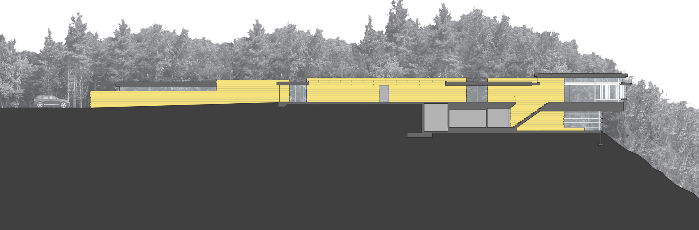
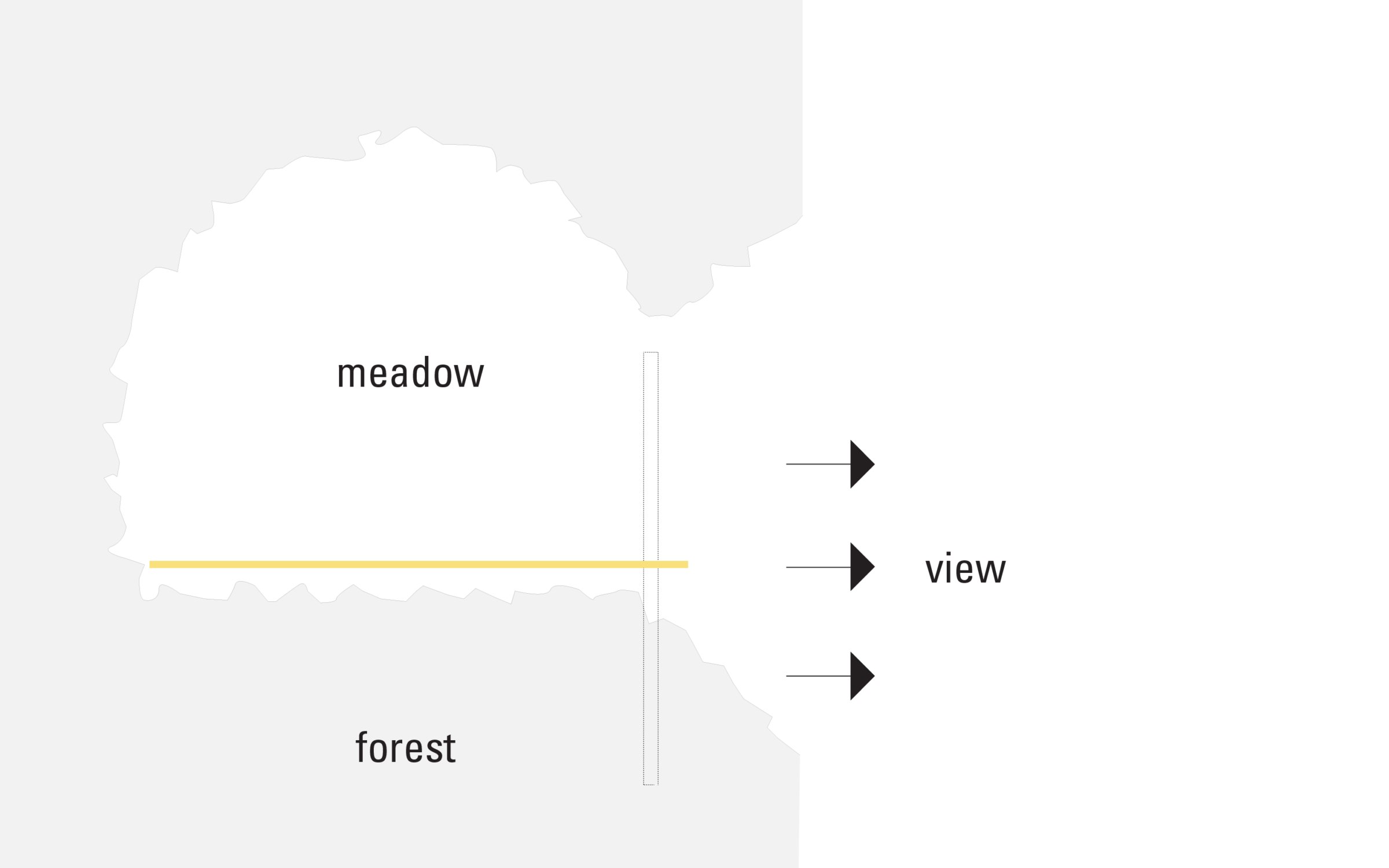
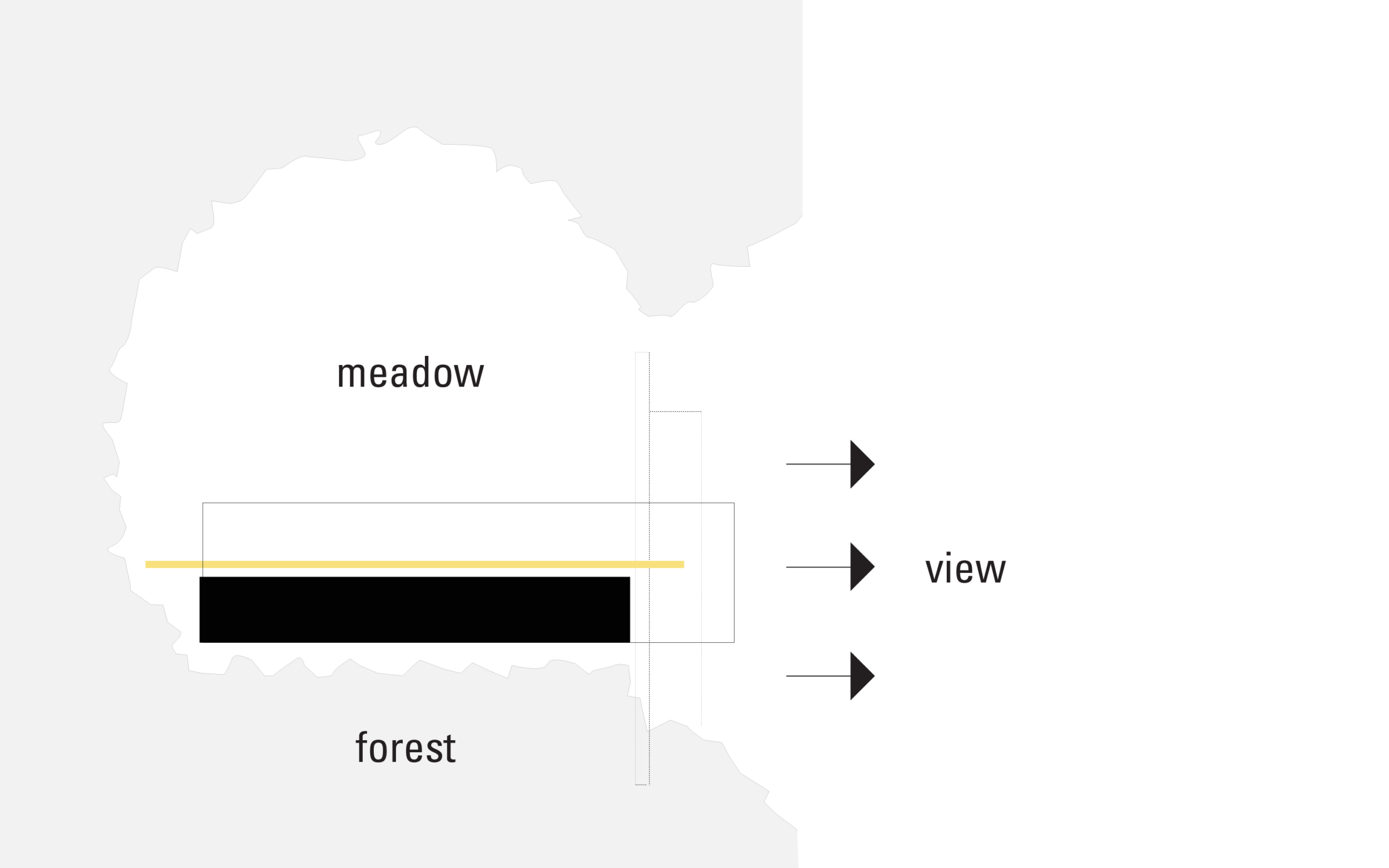
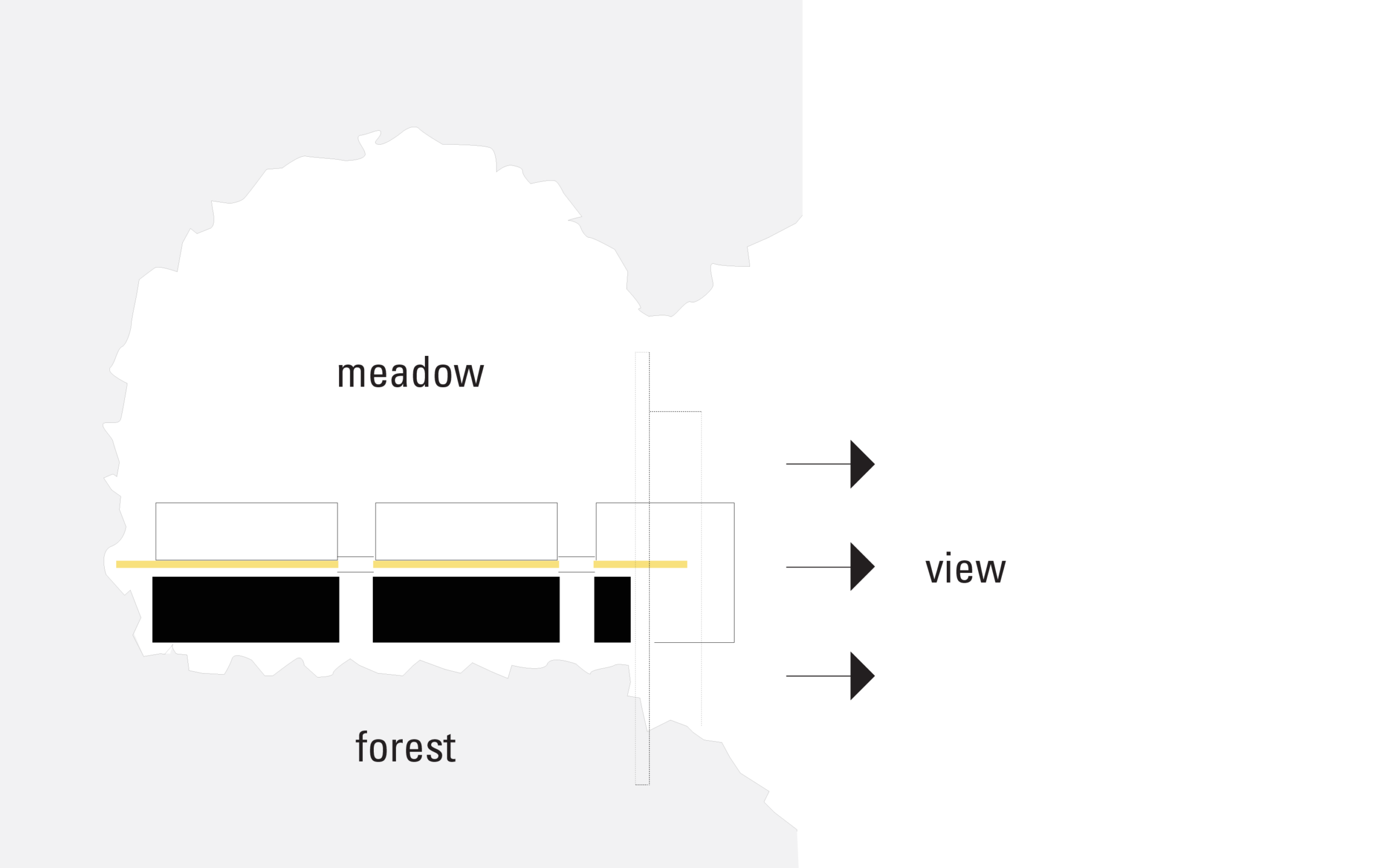
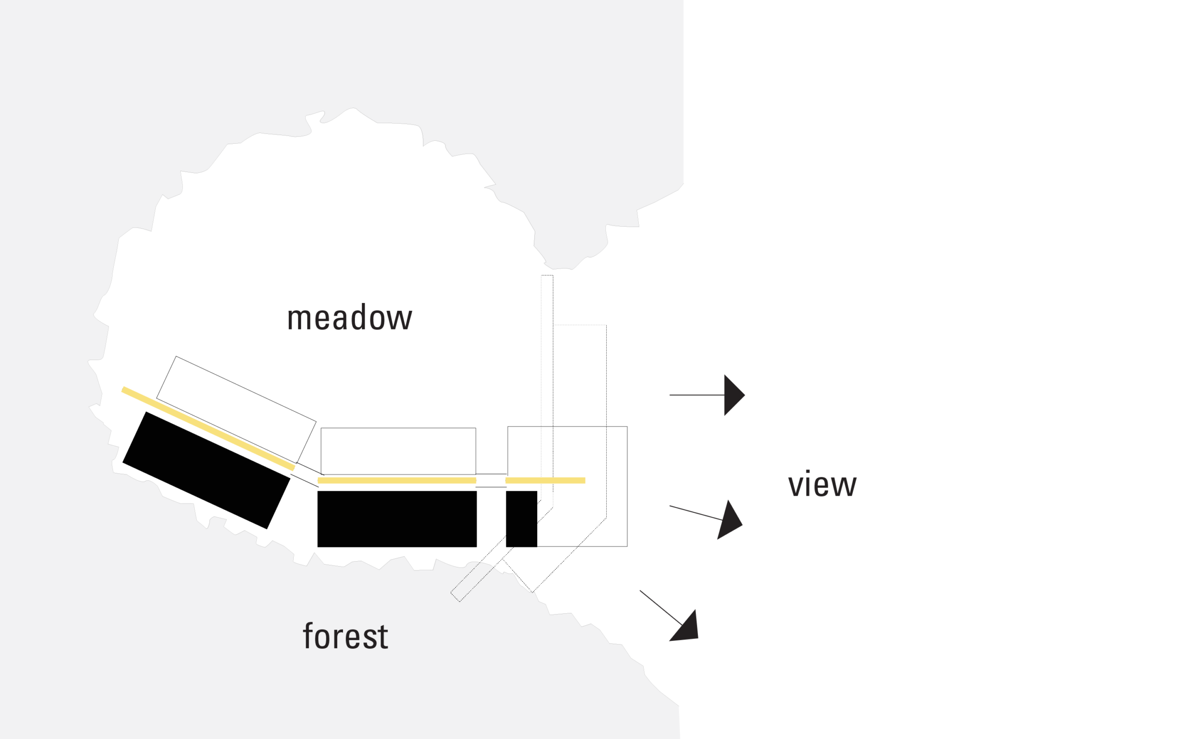
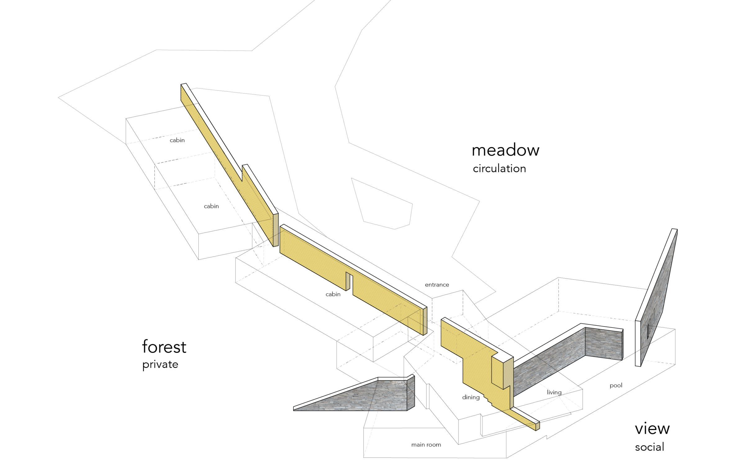
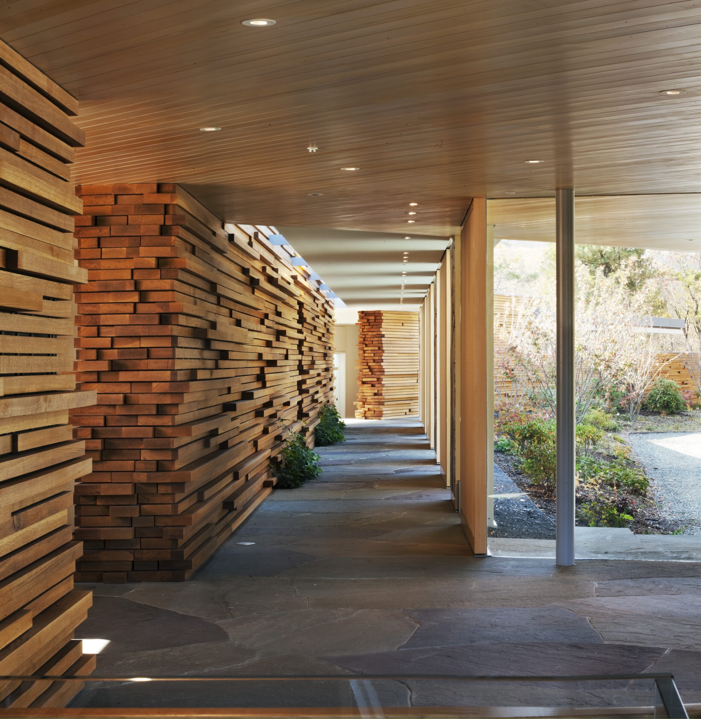
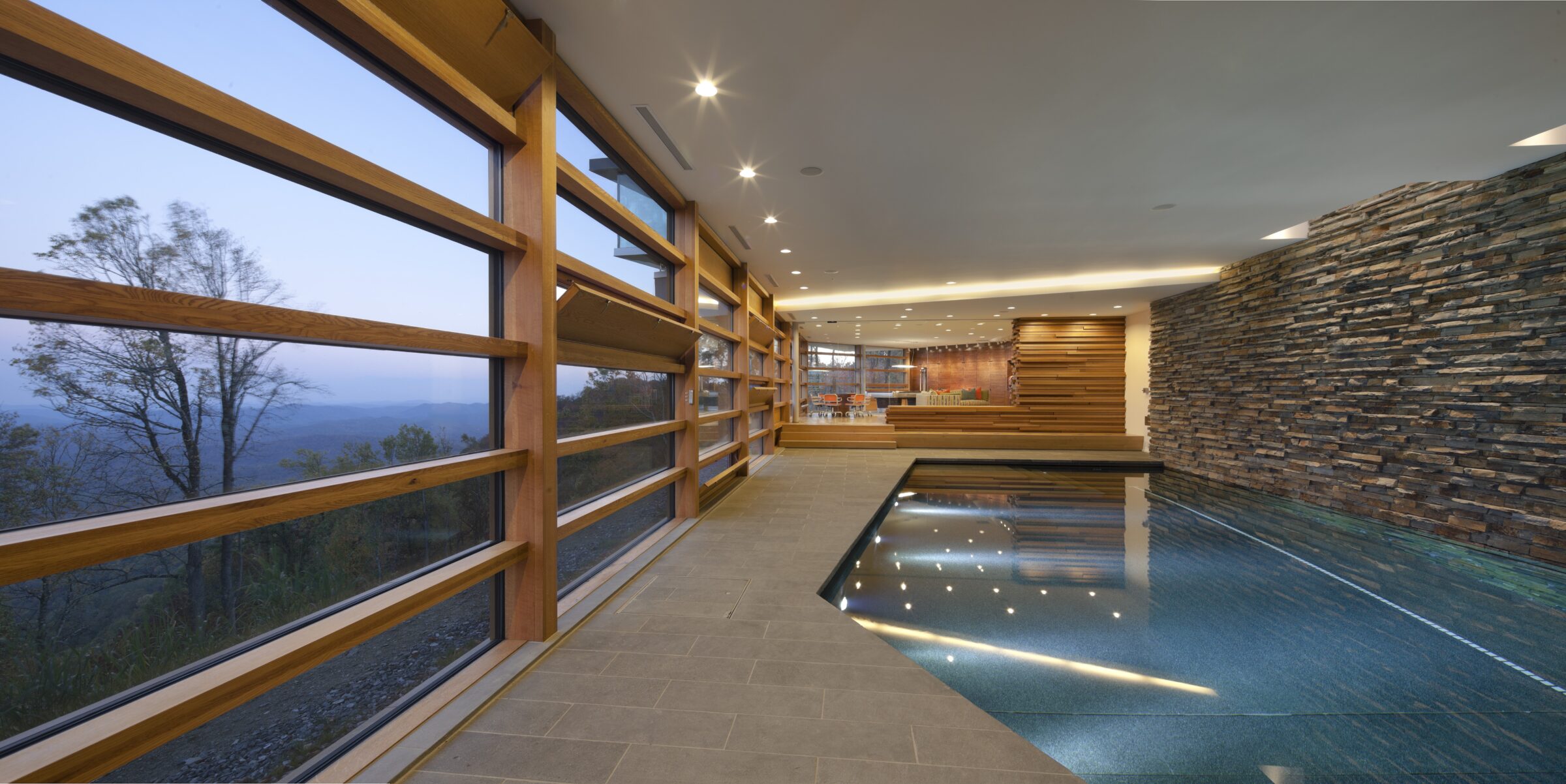
A meadow, a forest, and a view: the three milieus at Blue Ridge House are weaved, both conceptually and spatially, by a traditionally crafted wood wall. The private rooms are in the forest, the circulation in the meadow, and the public spaces dominate the view.
Upon arrival, the wood wall guides the experience, running the entire length of the house, leading into the Great Room and its 100-mile-long view across the valley. The wall serves as backbone for the circulation and cabins, which adjust to an expanding number of guests while maintaining an intimate scale for the house. The Great Room features open-plan gathering areas for living, kitchen, and dining activities. Excavated below, a stone wall frames the main suite and various recreation spaces.
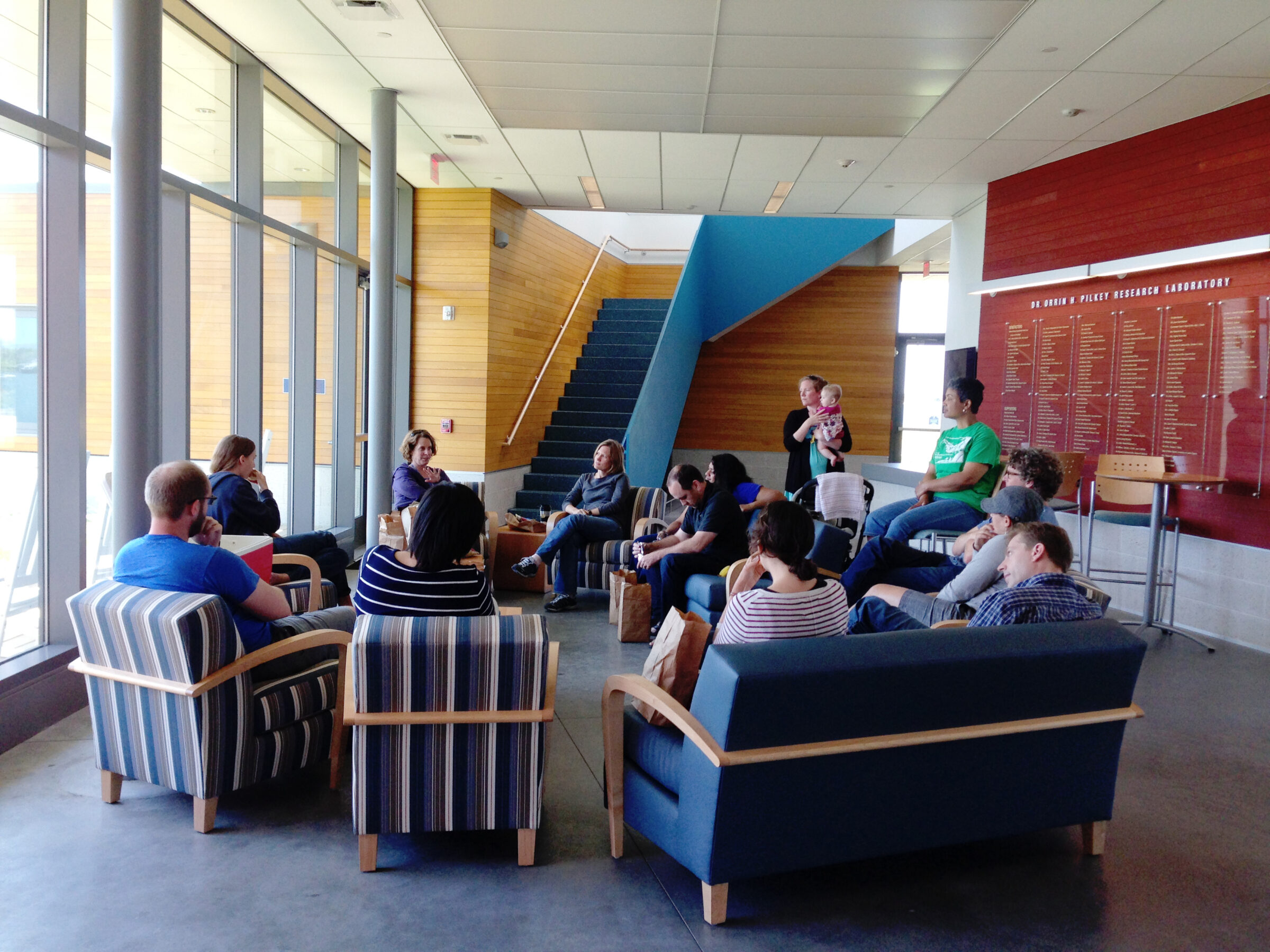
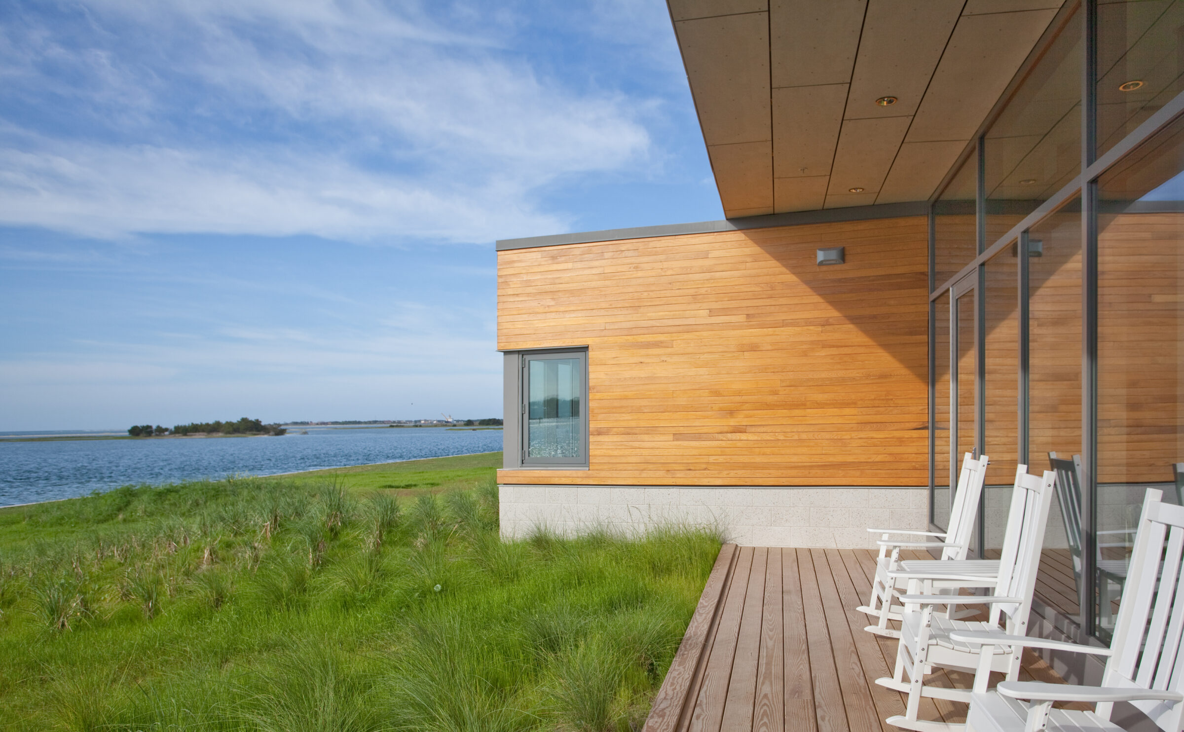
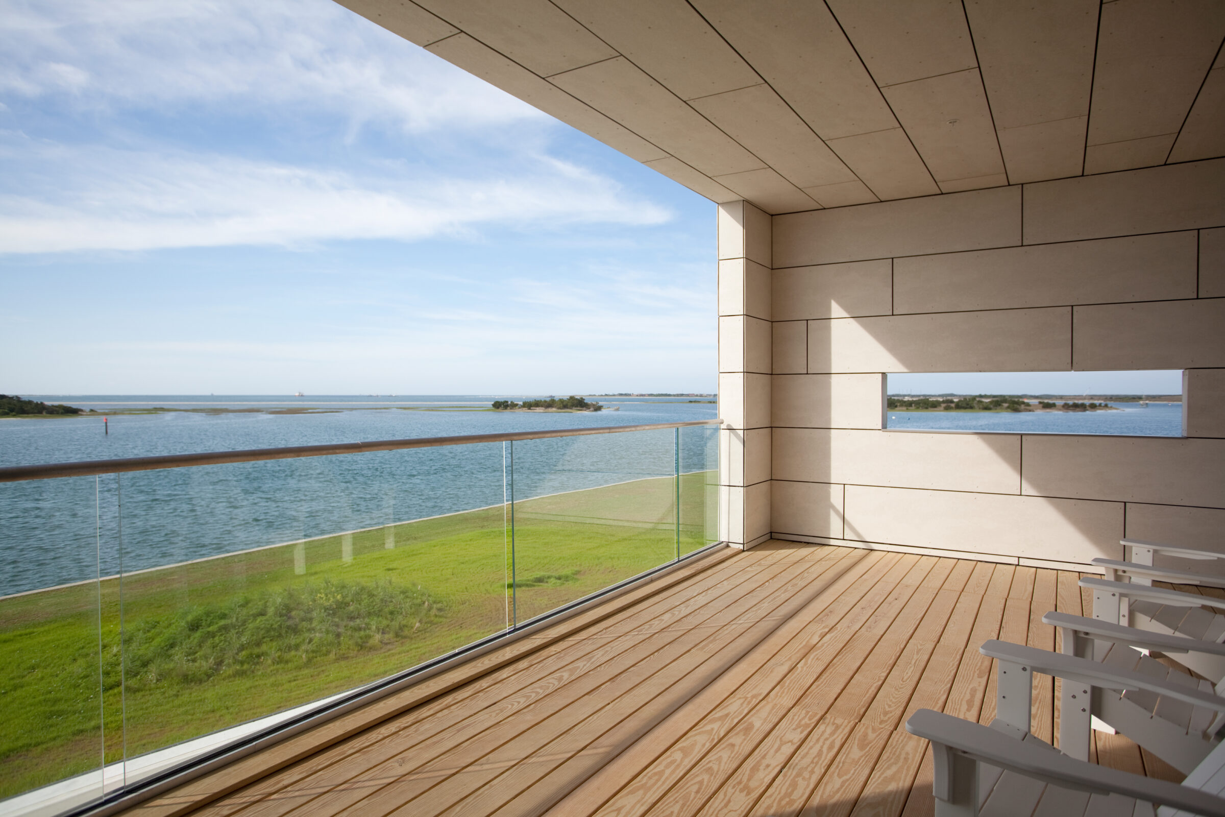
Duke’s programmatic and human oriented goals for the building were clear: take advantage of the location’s natural beauty; recognize that research is performed inside and outside the lab through debate and discussion; avoid an institutional feel; and embody the rustic sensibility of the original 1930s campus.
The architectural response to all these desires concentrates on social spaces. The “Collisional Commons”, coined by the then Marine Lab Director, Cindy L. Van Dover, is a spatial node where ideas from the entire marine lab community collide informally, where debate and discussion happens outside of the lab. Visually and spatially porous, the Collisional Commons opens to outdoor porches protected from seasonally shifting winds all times of day. All this while capturing amazing views of the water and the surrounding barrier islands.
The Pilkey Lab, as it is affectionally known among colleagues, is designed to have people engage with each other and with their surrounding environment.
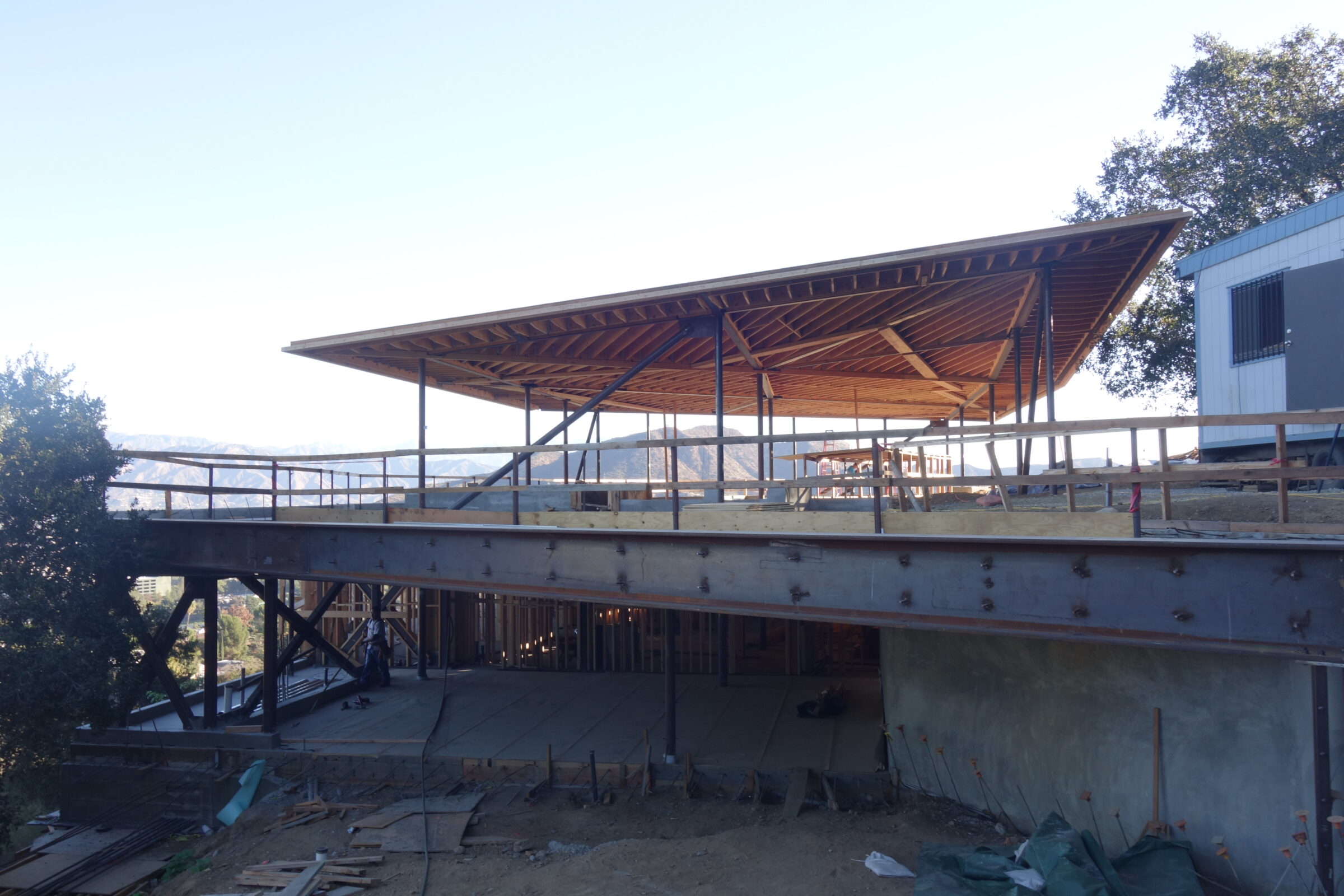
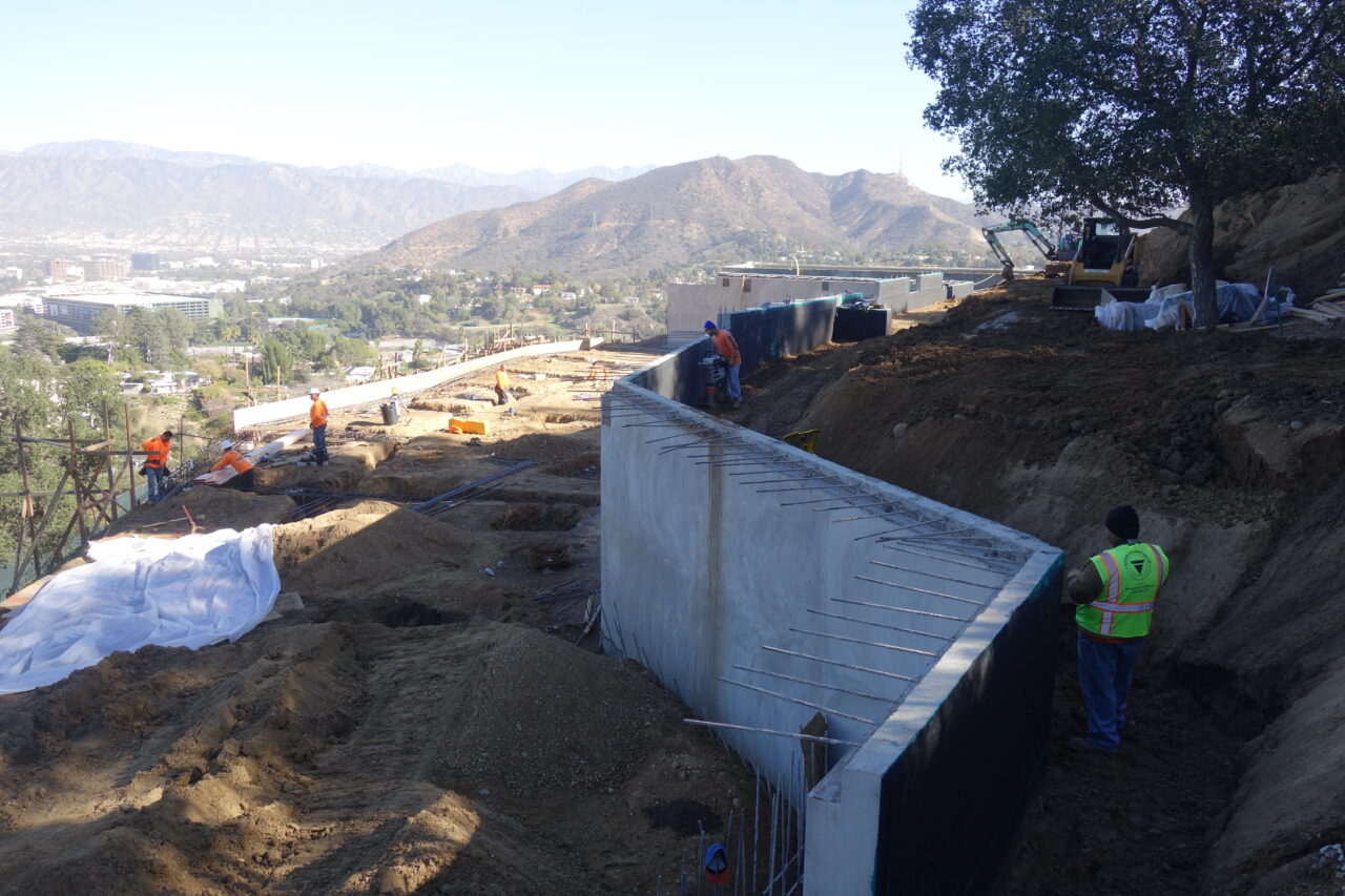
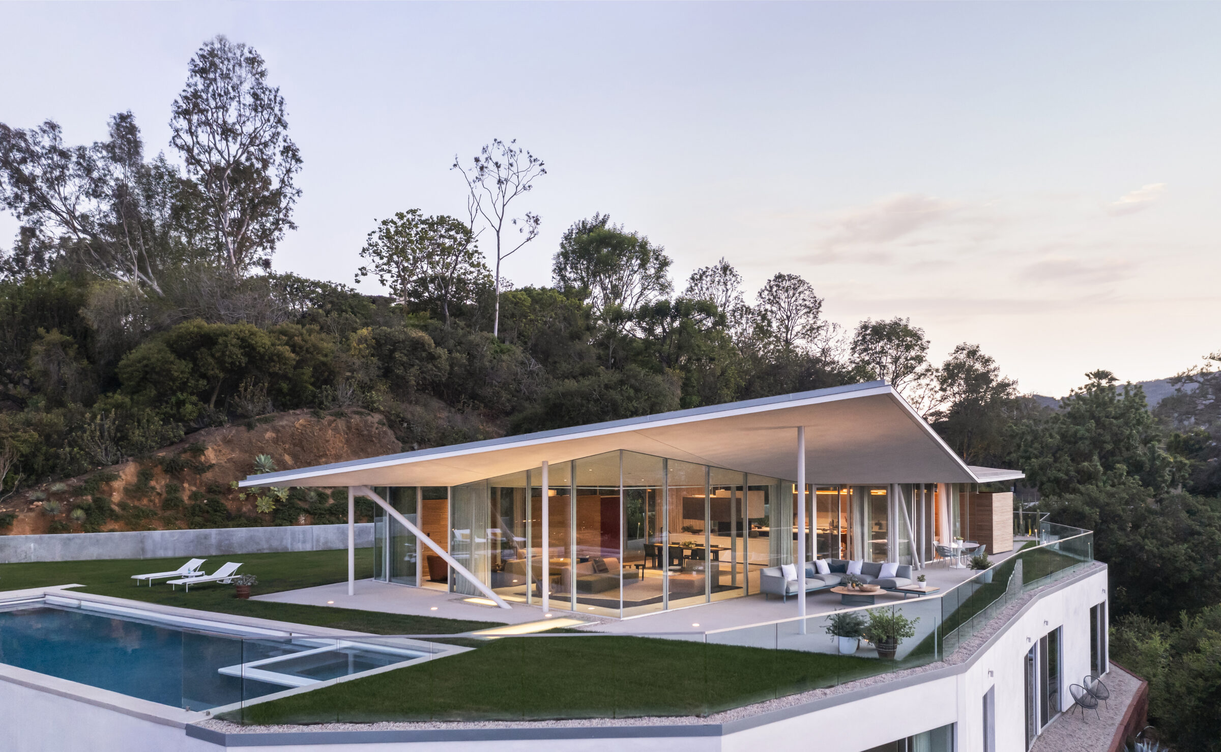
California House is inspired by the utilitarian simplicity of the Case Study Houses, experiments in affordable, innovative design developed in Los Angeles between 1945 and 1966. By establishing a direct relationship with the hillside and accounting for the region’s seismic conditions, California House expands on mid-century architectural principles, reducing its impact on the landscape and increasing the energy efficiency of its architecture.
Carved into the hill, the lower floor, with its expanse of green roof, creates a strong ground-plane, or bench, in the steeply sloping land. Private family spaces are arrayed along the hillside, meant to be essentially invisible.
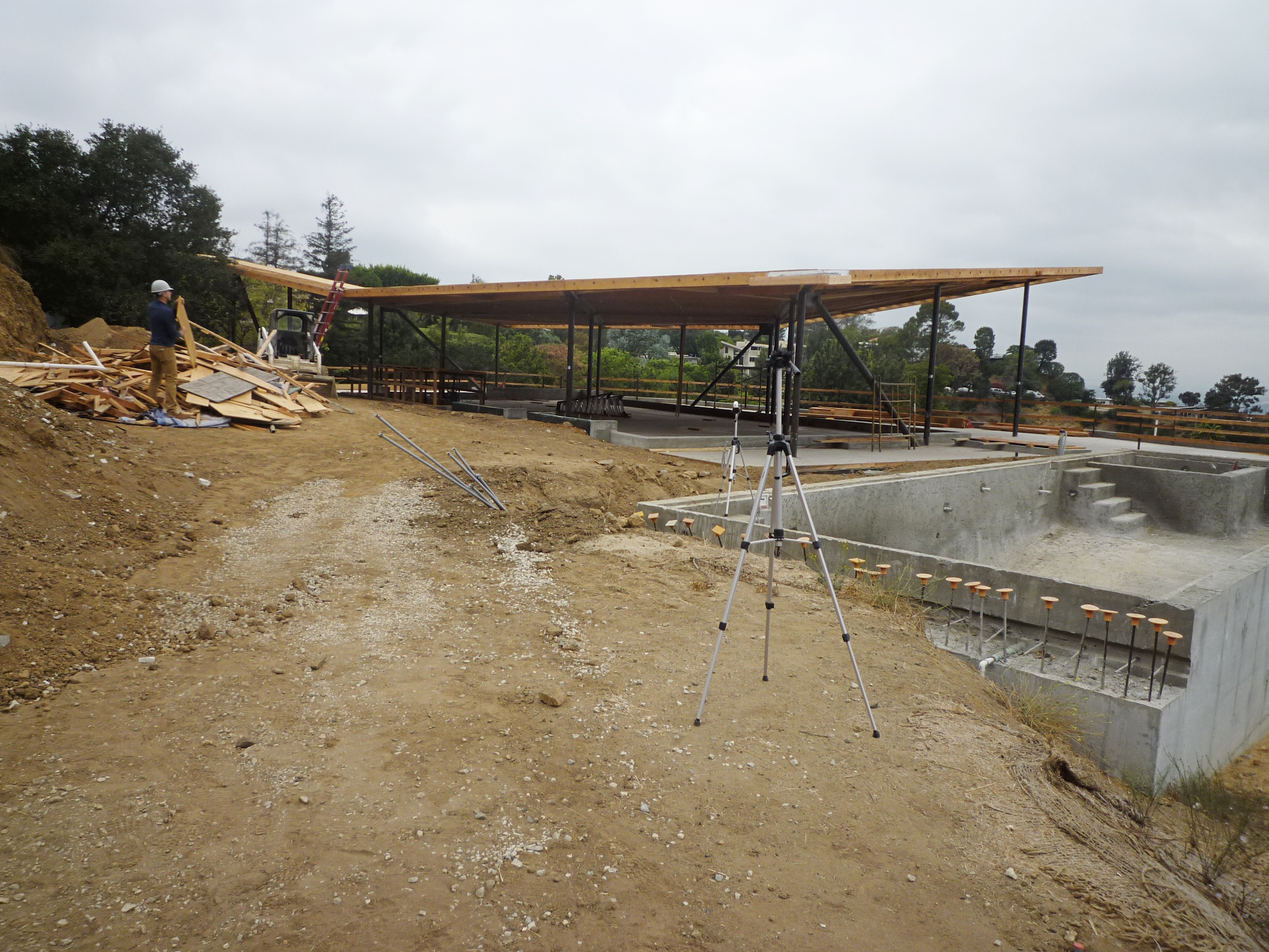
This invisibility contrasts with the strong sculptural form above. A glass-sided pavilion creates a loft-like space for the communal activities of living, cooking, dining, and entertaining. Everything is configured to maintain the simplicity and openness of the space. Kitchen and spatial divisions never touch the ceiling so that it seems to float above on independent steel supports. Three solid wood-faced “boxes” contain “messy” program elements, maintaining the integrity of the large space.
Like a vast parasol, the roof of the house is a rectangle with upturned edges that extend well beyond the footprint of the pavilion. By twisting its position in relation to the glass rectangle, at all times of day or season, at one corner or another, there is always either shade or sunlight to be found.
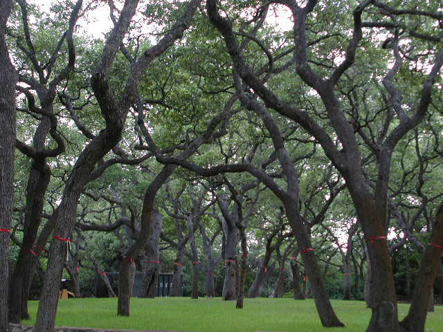
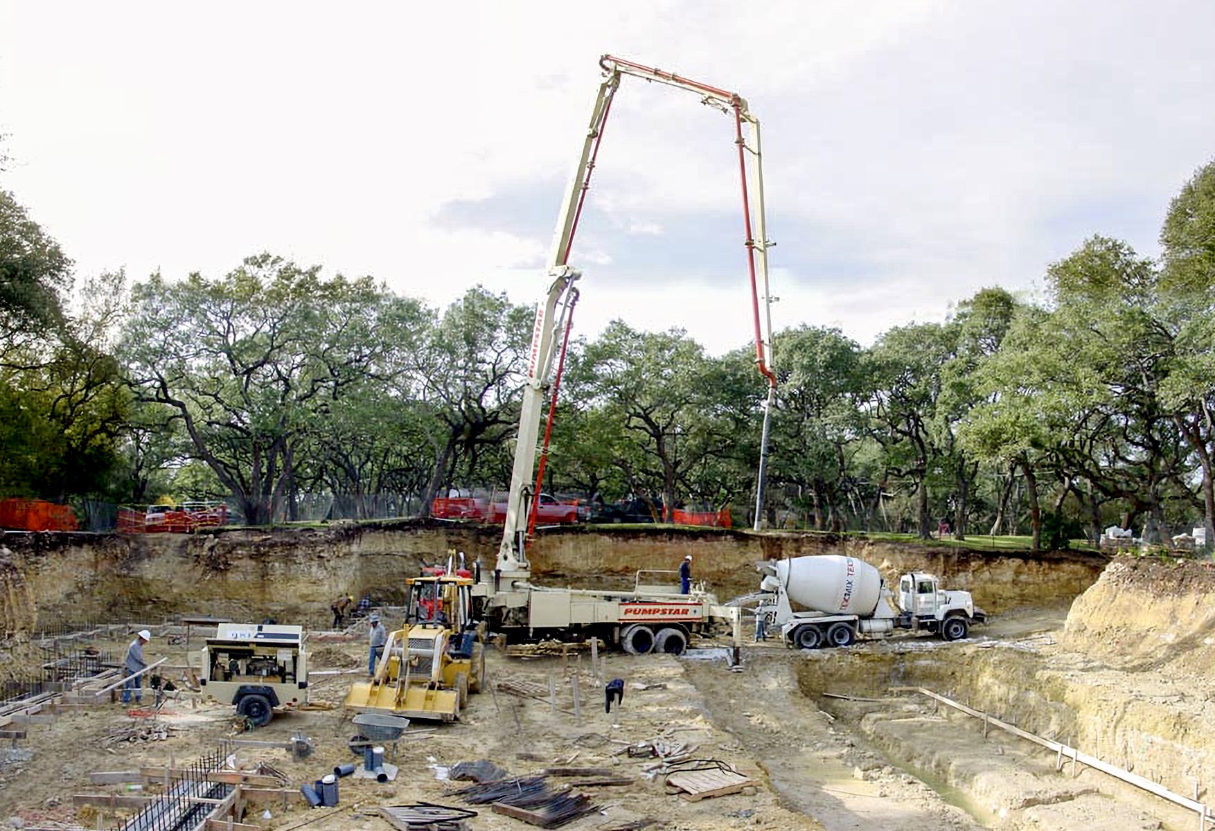
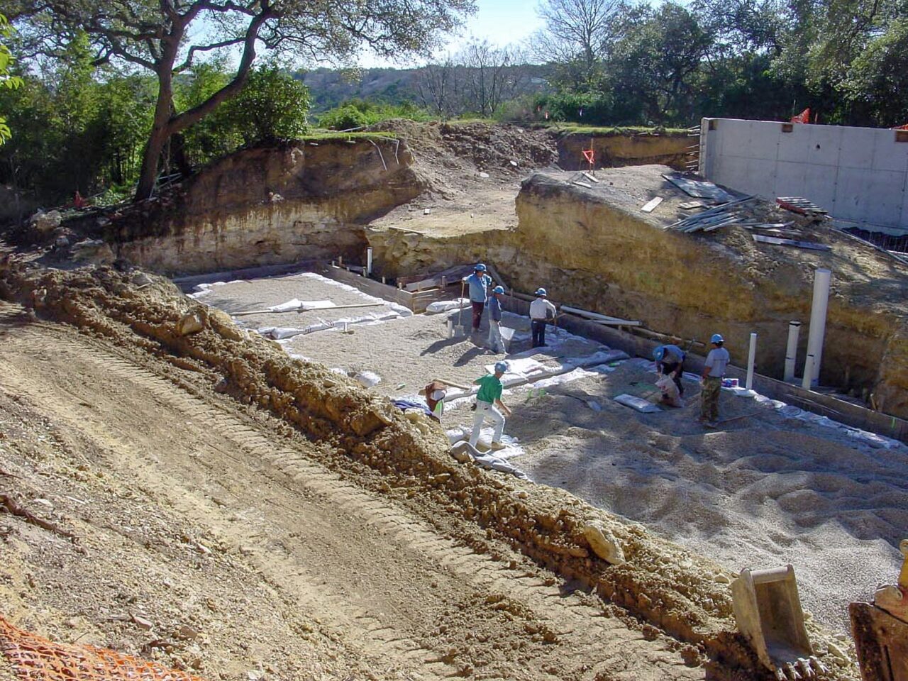
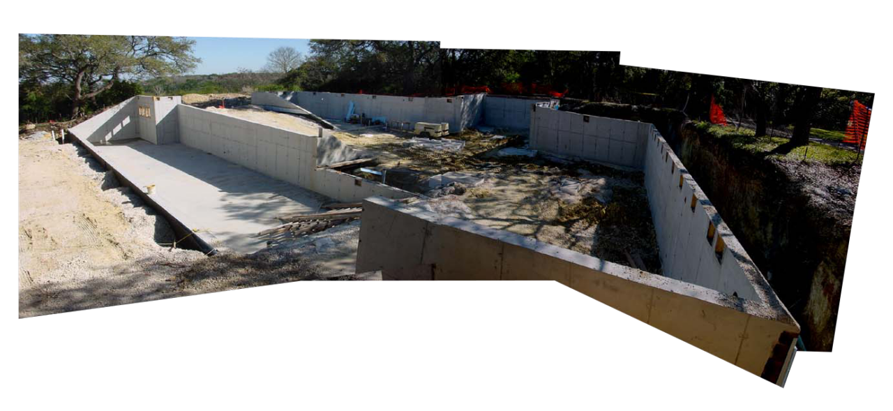
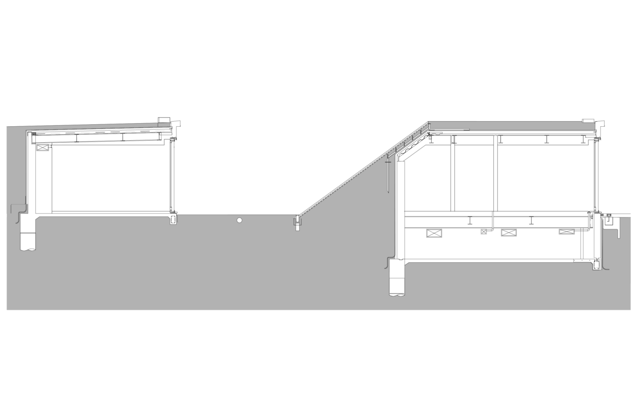
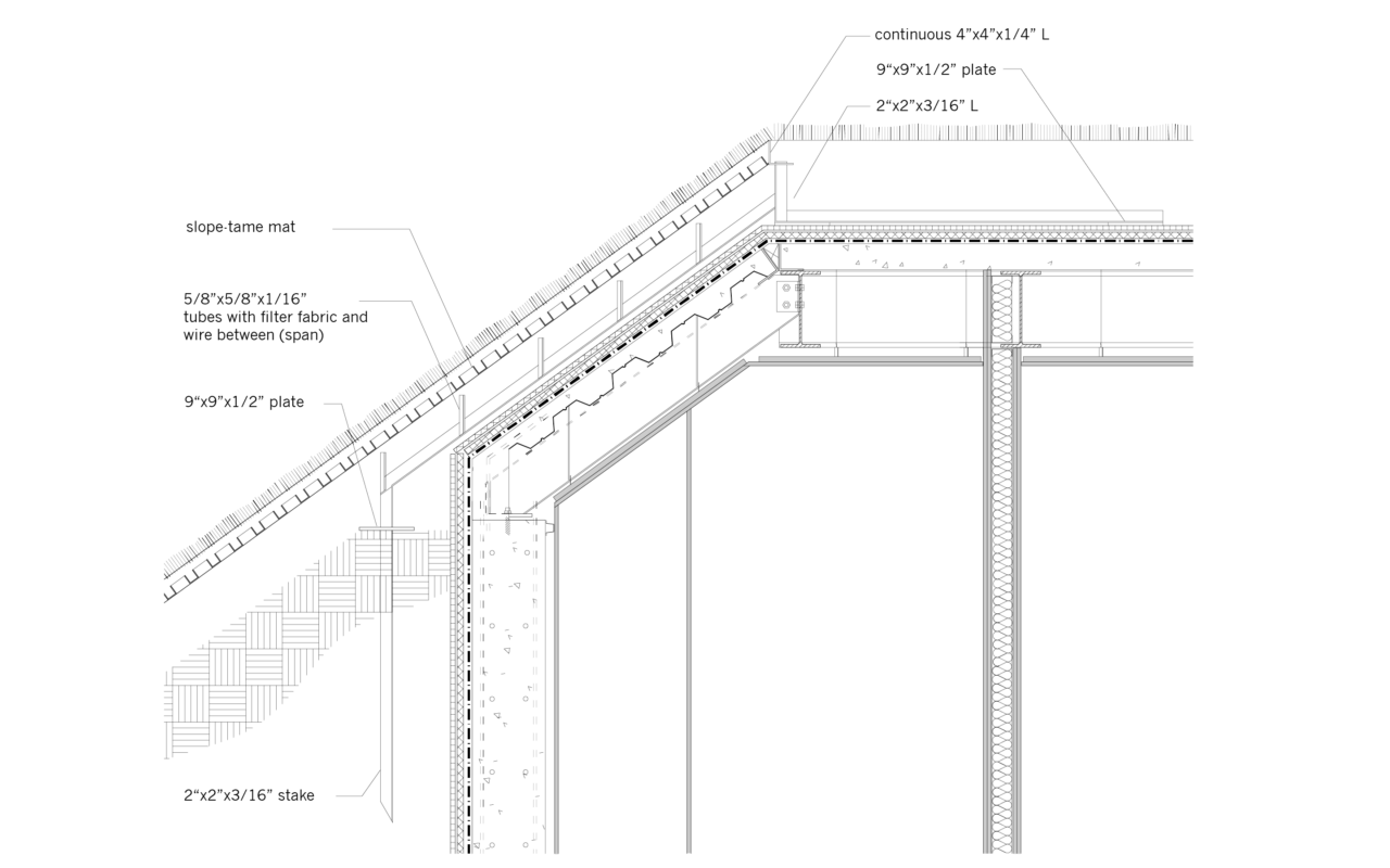
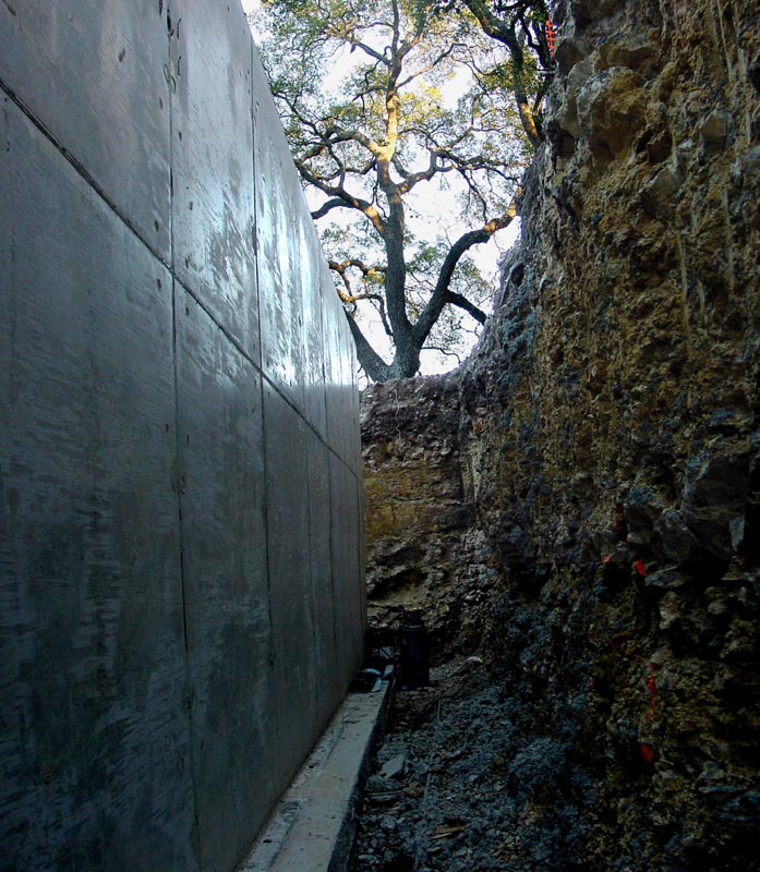
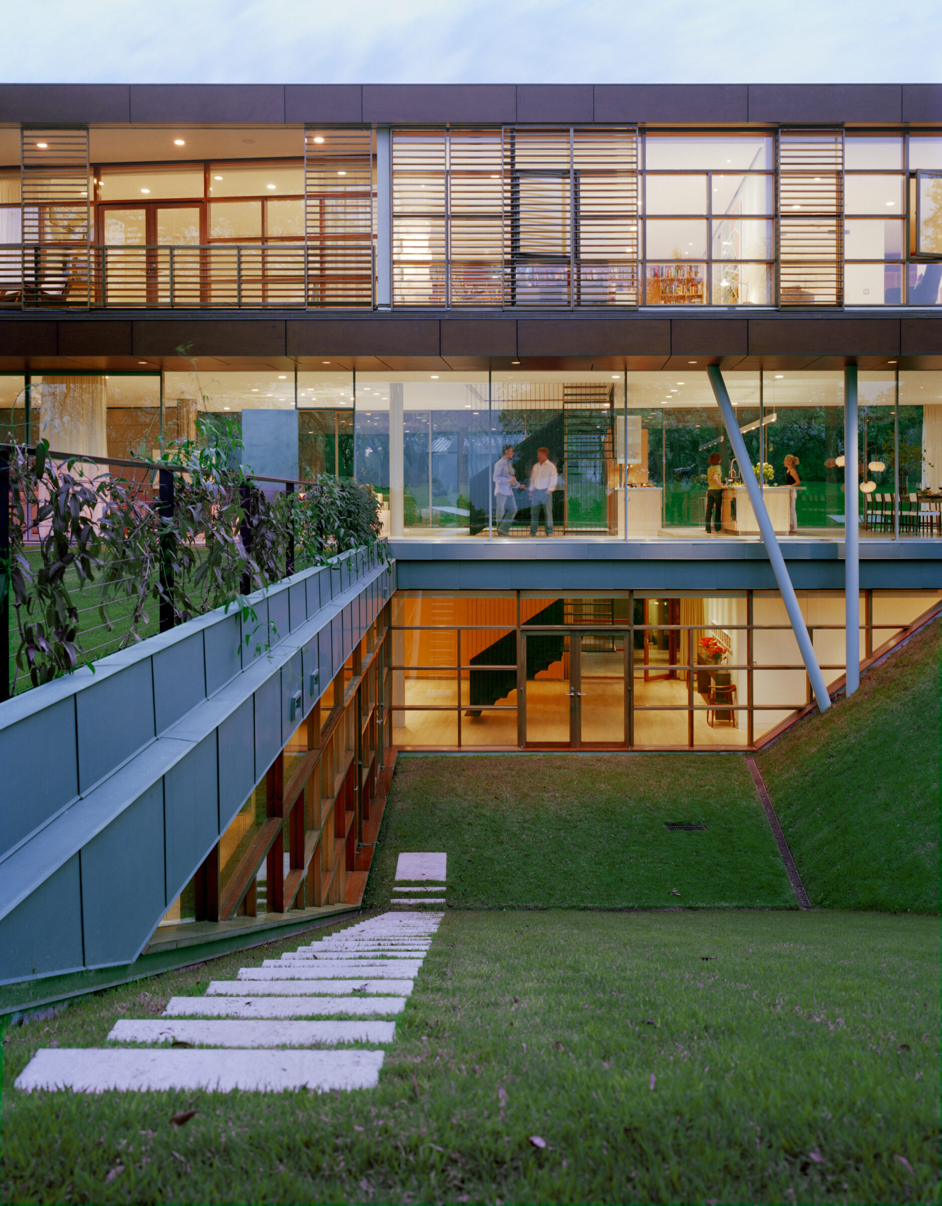
Even though it might appear aloof, levitating above the earth, Floating Box House maintains a close relationship to the ground. To protect the roots of dozens of landmarked live oaks, the team executed a surgical excavation of 7,000 yards of rock. The rock’s stability permitted sharp vertical cuts, allowing the house to nestle close to the trees and the architecture to mingle with the original woodland.
The sunken courtyard, formed by a precise cut in the earth, connects to the pool and the ground level lawns via an upward-sloping grass ramp. This inclined surface serves as the roof of the buried sections, with skylights cutting through the grass to provide natural light for the spaces below. An underground garage ensures that the landscape remains free of automobiles and driveways.
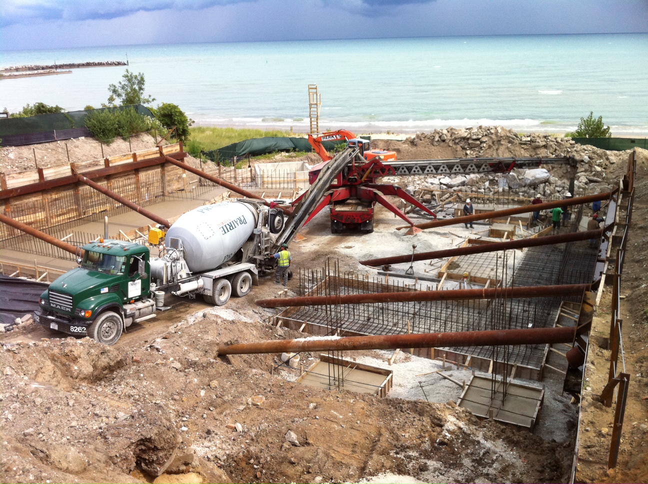
The large amount of excavated material was sold to another contractor who needed fill, thus cutting the cost of digging.
“Burying” the project works on multiple levels: it is energy efficient, allows the house to sit lightly on the landscape and creates an architectural tension between the clarity and purity of the hovering volume and the concealed existence of the spaces below.
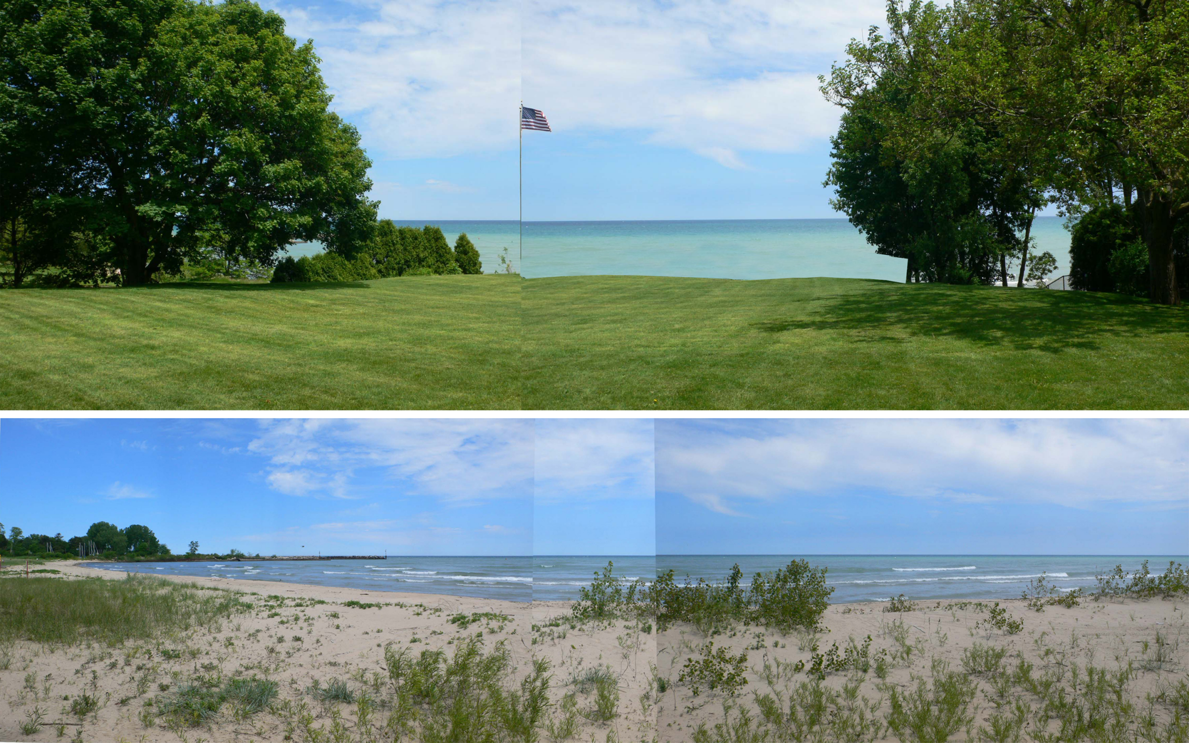
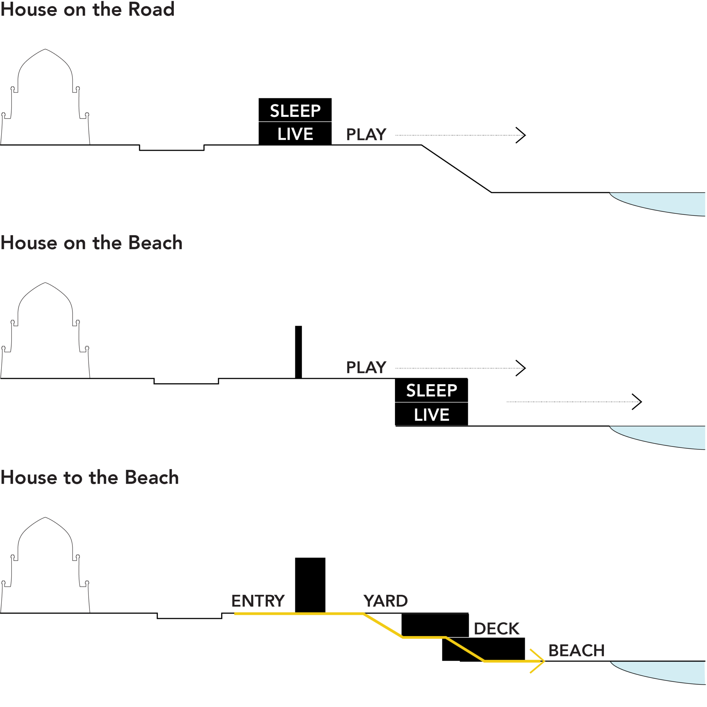
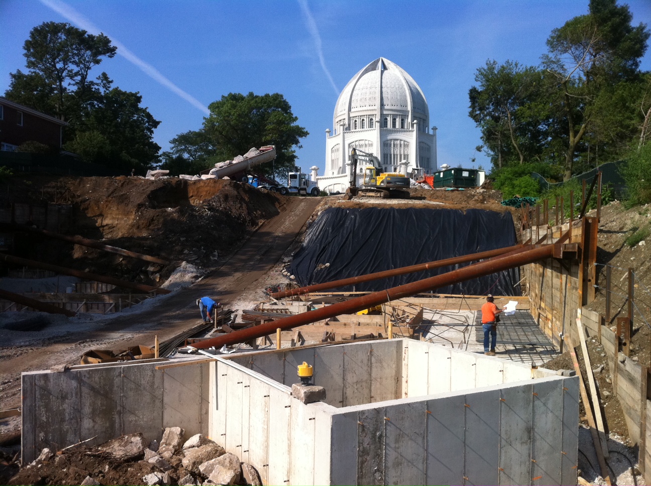
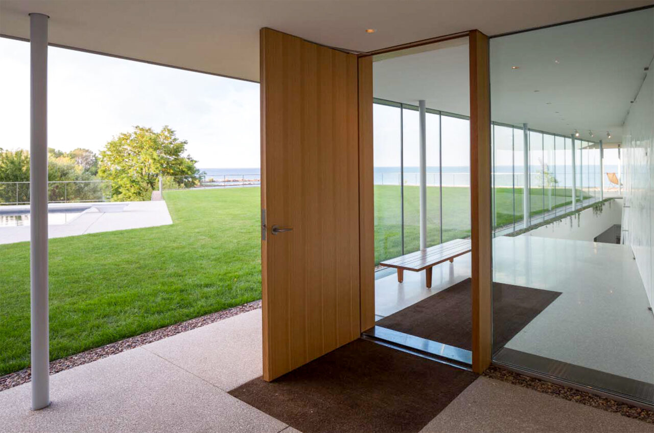
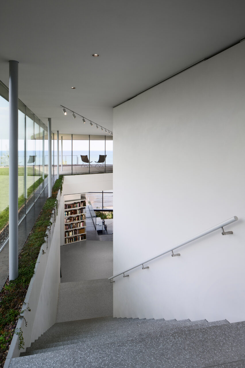
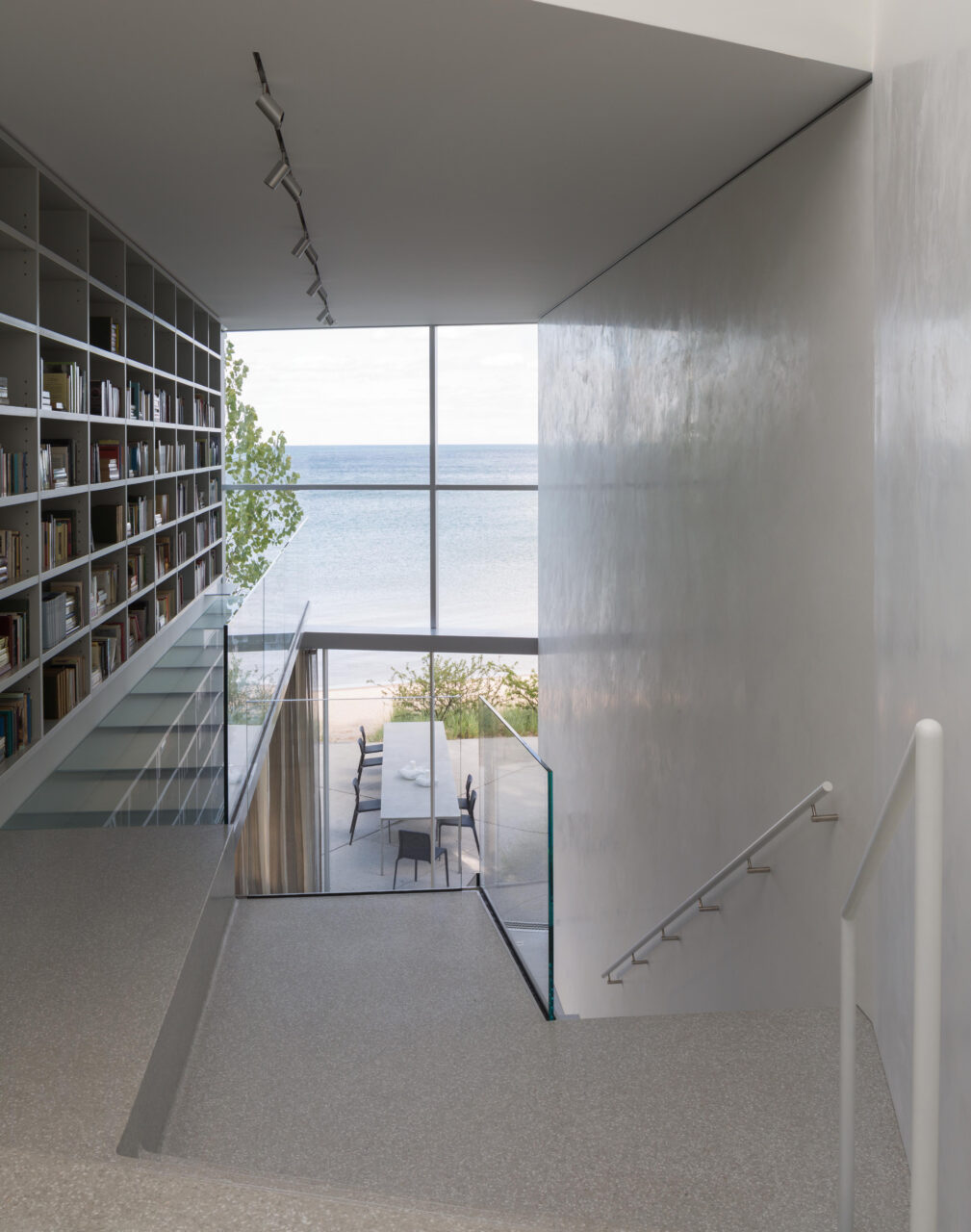
The idea behind House to the Beach is simple yet ambitious: views from the bluff and an intimate relationship with Lake Michigan. What brings together these two different conditions, and what made the project feasible in the first place, is the architectural concept of the house itself.
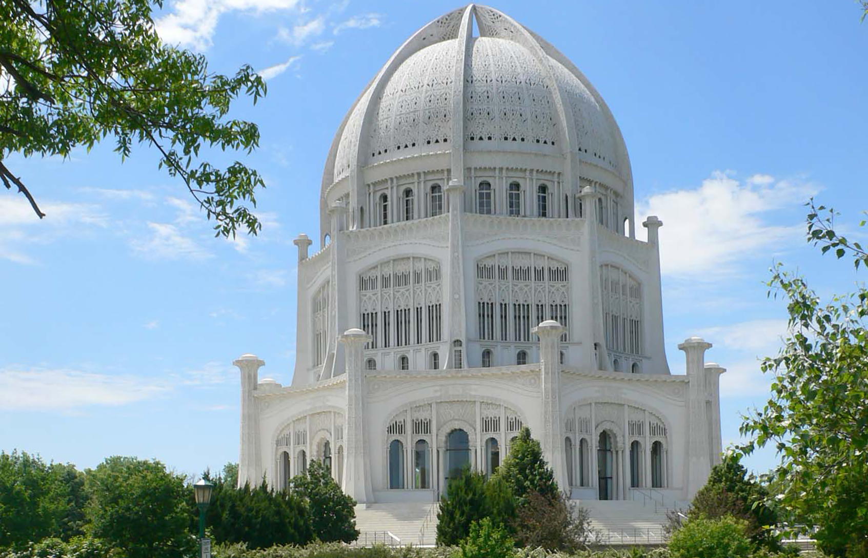
The easiest solution would have been to build the house on good fill, close to the busy street and uncomfortably near the gigantic temple. Moving the house closer to the edge of the bluff would have required an enormous amount of soil removal, replacement, and compaction—an expensive prospect given the depth of 30 feet.
By splitting the program and burying half the house on the bluff, we were able to stretch the structure out over the entire property, replacing the fill with living space. As one descends the processional, light filled stairway, private spaces remain hidden from the main circulation, while public living and dining rooms reveal themselves on the way down to the beach, allowing for more diverse and more specialized relationships of the building to the environment.